Branding
My (extremely belated) take on Winter Park’s new logo.


BLANCHARD
So, remember how Winter Park dropped a new logo?
And remember how I said that I was going to chew on it for a bit before weighing in?
And remember how it’s now been three months since the launch?
Well, after the busiest fall I can remember…I’m ready.
Before
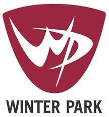
Let’s start by taking a quick look at the old logo.

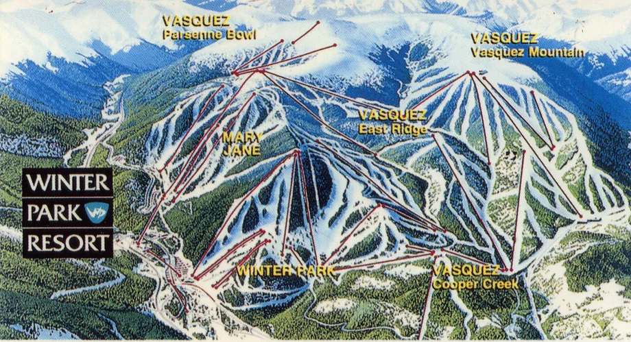
Now, I could be completely wrong here, but when I look at Winter Park’s logo my gut has always said that the design of the mark came from one era and the text came from another. They just didn’t seem to match. As far as i can tell from this 1981 trail map shared on Curbed, that seems to be the case.

So let’s take what we have in the old mark:
- Color: brick red
- Shape: sort of a rounded crest type thing
- Mark: swoopy 60-ish era lettering combo
- Font: narrowed variation on (possibly) the original serifed face
- Overall: maybe an outdated match between mark and font
There are some marks that were made 50+ years ago that, for whatever lucky reason, have remained sharp and relevant as time as passed. You could put on those 20-20 hindsight goggles and try to say why, but the truth is more about chance than anything.
Some designs match where design trends go. Some don’t.
Winter Park didn’t seem to be so lucky, so I think they were spot on to attempt a redesign.
After
So let’s talk about that redesign.

I’ll point out a few things that stood out to me.
#1) What Changed
Obviously a new typeface and a new mark. You can read into logos as deep as you’d like, but I do like the slightly playful (not sure that’s the right word) way the slab serif breaks out of the lines to both stack neatly and create a nice frame for the word “RESORT” and mark’s place on the right.
#2) What Didn’t Change
But you’ll quickly notice that the color hasn’t significantly changed nor has the shape. That same rounded crest remains with a cleaner, updated mark that, based on logos that have stayed relevant like Arapahoe Basin, I think will stand the test of a time a bit better than the previous.
#3) Hidden W
I gotta say, I like how that snowline in the mark makes a nice hidden W.
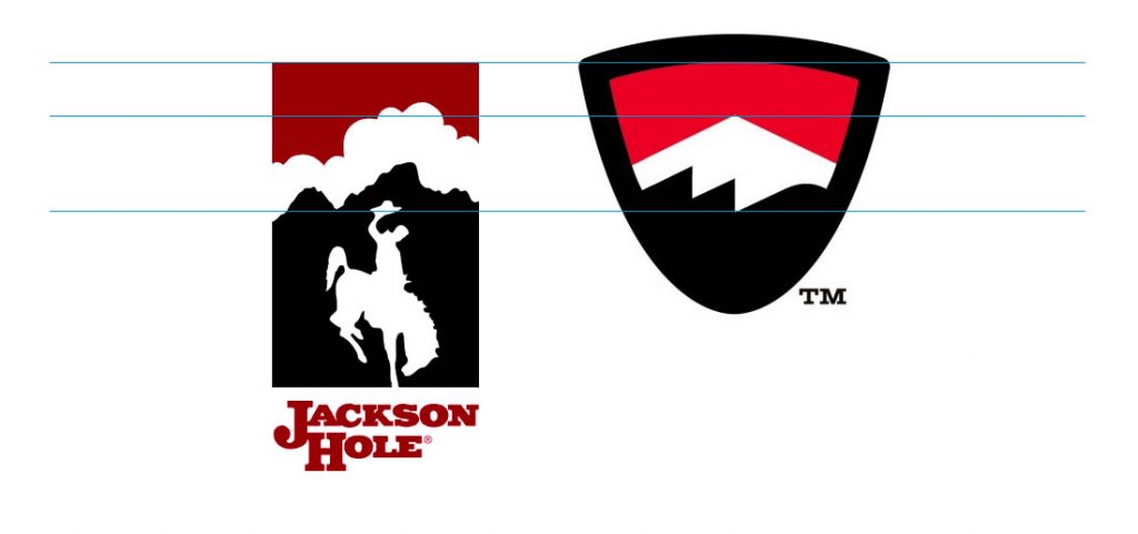
Yes, as I pointed out when it first released, it does have the same stacked red->white->black feel as Jackson Hole…

…but I read more that this design style works, stands the test of time, and shows up in many places, NOT someone copying something else.
I Like It
The more I see it, the more I like it. It’s:
- A solid choice of font
- An upgrade to the mark without ditching the classic shape
- A proven design style
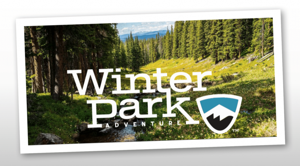
One other thing I dig is something we’re seeing more and more resort logos adopt: the ability to toggle colors for summer months. For example, this image shared by Sky-Hi News.

Overall I think the execution is good, the timing is smart, and the rollout has been extremely well done. You can never please everyone with a logo update, but I’ve got no complaints and plenty to smile about on this one.
Great work to all involved.
About Gregg & SlopeFillers
I've had more first-time visitors lately, so adding a quick "about" section. I started SlopeFillers in 2010
with the simple goal of sharing great resort marketing strategies. Today I run marketing for resort ecommerce and CRM provider
Inntopia,
my home mountain is the lovely Nordic Valley,
and my favorite marketing campaign remains the Ski Utah TV show that sold me on skiing as a kid in the 90s.
Get the weekly digest.
New stories, ideas, and jobs delivered to your inbox every Friday morning.
