A few of my favorite snow report pages to inspire your own.
 Gregg Blanchard /
There is no such things a perfect snow report page. Let’s just make that clear up front.
Every resort is different, everyone’s goals are different, every designer will have a different visual idea they begin with. So rather than declare some sort of winner that weighs the sum of one set of elements against the some of another’s, I’m going to pull out three things that I like from each of five snow report pages that I think are worth a closer look.
Are they the best? There’s not such thing, but, as far as I can tell, they accomplish their tasks pretty well. Let’s jump in.
Mt Hood Meadows
I noticed this one from a tweet Peter Landsman shared recently because of something he liked, so let’s start there. First, Peter’s favorite part was that it they not only shared whether a lift was open or closed, but also when and why. I agree, that’s a really nice addition and something I’ve personally looked for in the past and had trouble finding.
Second, I’d add that I really like the way they’ve broken up these updates into various buckets, but I especially like that there are indicators for parking. I think a bunch of resorts would do well to add this sort of granularity to their parking updates. Some are doing fullness-meters – which is great – but in some cases being able to park in that close lot versus take a shuttle (or some similar inconvenience) is a really nice thing to know and this does that well.
Third, the last thing I’d mention is the combination of color and donut charts for each area. This makes the whole things really glanceable and just more interesting as it breaks up the necessary tables and lists that you need for this sort of information.
Alta
In a word, I love the visual nature of Alta’s snow report page. There are three visuals in particular that I really like. The first is the year-to-date snow total chart. This is a big, important number for Alta and I love that they show that in a nice, visual way.
The second is how they use a bar chart to show monthly averages. This chart will hardly change throughout the season, but it does a fantastic job of fighting that idea that once March rolls round there’s no powder left to be had (I’ve actually had my best Utah powder days in March partly because it used to be to uncrowded during spring snow storms).
The third is a goggle recommendation. Yeah, that’s a little niche that only works for a place with as many core skiers as Alta, but I think that’s a clever, relevant thing that could inspire lots of simple ways the resort could take in current condition information to spit out a clothing/gear recommendation that helps skiers have a better experience.
Sun Valley
Sun Valley has a really nice conditions page, but three things stand out to me.
First, I love the mountain grooming map. If the quality of the grooming and snow surface is what you’re selling and making part of your brand, then it absolutely makes sense to add a data layer to your website that allows you to showcase those conditions in a clean, interactive way.
Second, I love the inclusion of the events calendar. Snow is a big factor when people are deciding whether to visit, but events play a big role as well. I love having a dedicated, visual content block that lets you put those events in front of folks who are making that kind of decision.
Third, I appreciate that the groups of runs are collapsed by default. Sun Valley has a ton of runs, so the scrolling could get out of hand. Collapsing helps folks get to where they want to go quickly on a page that sees a bunch of different reasons for visiting.
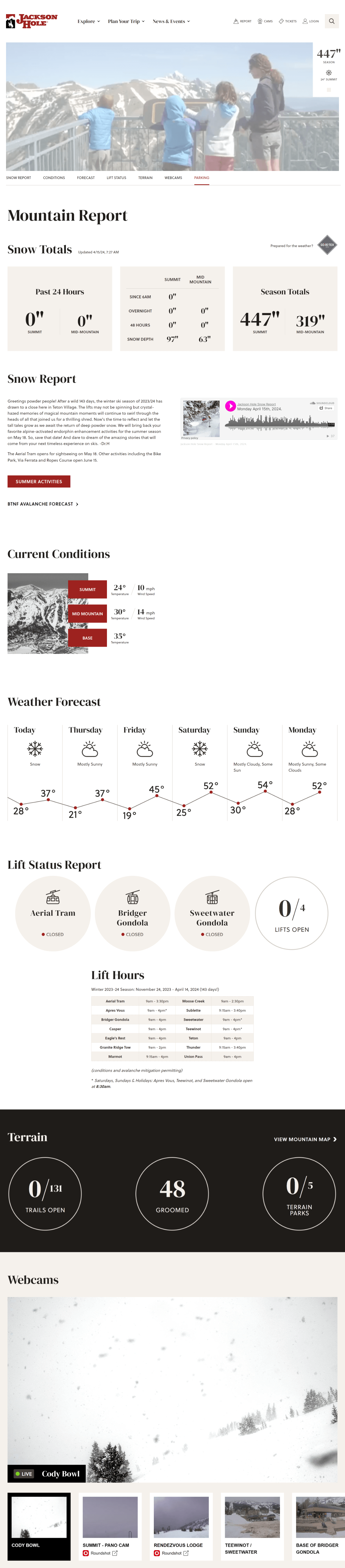
Jackson Hole
There are a few things I like about Jackson Hole’s, but the first is the fact that they embed an audio player with their daily snow report. Not every resort does these, but if you’re going to I love putting this audio right on the page so someone can pop open this tab, hit play, and get a summary of what the rest of the page is covering without having to read.
Second, I think Jackson Hole does well to add a little layer of transparency by showing their mid-mountain season snow total. Yeah, the summit number is big and glossy, but I think putting this right up there at the top is a really smart, fair thing to do with a resort like Jackson when the difference in conditions can vary quite a bit.
Third, breaking out lift hours into a separate box. Notice how many different schedules they operate on. That’s important and, as such, I think it’s worth having this information in a dedicated, easy-to-find place which they’ve done a great job of.
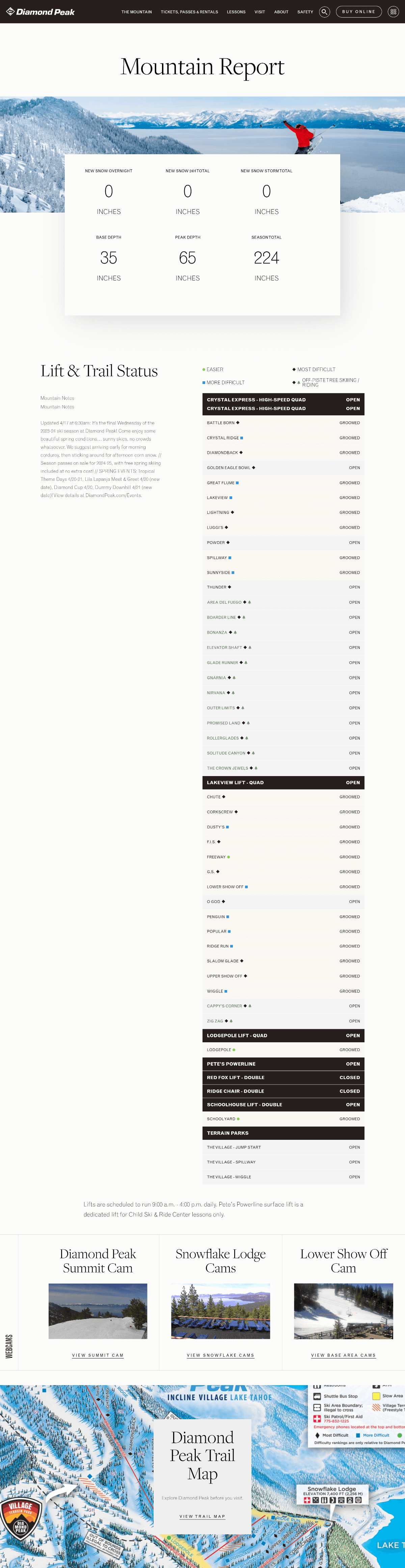
Diamond Peak
So, I lied, there’s really just one thing I like about this report rather than the three I promised you, but it’s a big one. This design is really, really clean.
Mountain / snow report pages are so easy to get really big and heavy. Or, at the least, feel really big and heavy. This light-weight version with softer borders, background-colors, and padding makes this information feel less like I’m starting starting to eat an elephant and more like I’m having a quick snack of information before heading on my day.
Snow report pages get a ton of traffic that can be used in many ways – which Diamond Peak absolutely does, not pictured are promo cards below the trail map for buying lift tickets – but the primary information is light, glanceable, and easy on the eyes.
I haven’t featured some of the more prominent styles – Boyne, Vail, Alterra, etc. – but if there are specific ones from those groups or other indie resorts that you like, let me know and I’ll add them.