Branding
Making the MAX Pass: Colors, Logos, Brands, and Widgets – the Design(ers) That Made it Happen


BLANCHARD
The MAX Pass came out of nowhere with a unique strategy built on new tech and designed based on lessons from the past. This week I’m covering three aspects of how this pass, sale, and brand came to be.
Today’s insights on design actually comes from two sources. First, we’ll get some perspective on the logo and brand from the talented crew of Randy Rogers at Grenadier. Then I’ll shift gears and talk to Chris Hess of Mondo Robot about the sales page they built for the pass.
Let’s start with Randy.
—
Gregg: Let’s start with the name. Walk me through some of the reasoning behind MAX. Was finding something that was also an acronym a requirement or somewhere lower on the priority list? On that note, how important was the length of the name?
Randy: When you have a lot of parties involved in launching a brand – and in this instance there were twenty-two mountains owned by three different holding companies – it can be difficult to get harmonious agreement. Naming is such a subjective task. In this case, the trick is to create a name that’s straightforward and descriptive while also being easy to hold in your head. We started with the simplicity of MAX PASS because we liked what it connoted, and then assigned a finer point to it with “multi-alpine experience”. “Multi-alpine experience” is more than just an acronym; it’s a pretty perfect description, which can play a role in our efforts to introduce a totally new pass product folks are unfamiliar with.
Just as folks took to shortening something like Federal Express to FedEx, in the future the marketing will help MAX PASS come to represent the ultimate opportunity for skiing adventure without anyone having to utter the phrase “multi-alpine experience.” Having a one syllable name doesn’t hurt. It’s easy to remember and looks strong and authoritative on paper.
Gregg: Talk a bit about colors. Both the Epic and Mountain Collective use some form of an orange/blue combo. Was any of the reasoning behind the pink and Twitter-like teal to differentiate or was that motivated by something else entirely?
Randy: When you work in a specific category, you tend to take cues from the experience itself. We worked with a team a iChimp to help us find out what the best color palette for our product would be. We came up with, I think, great results. Blue, or some variation of it, is almost always associated with skiing because the ultimate experience is that bluebird powder day. And of course, you’re always looking for a way to be slightly different and more memorable.

By using straight up cyan, magenta and yellow it makes a more vibrant visual statement and works as a reflection of the more vibrant experience you’ll have by visiting all of these unique and varied mountains.
Gregg: From my limited experience with logo design and speaking with logo designers, it seems the process starts with a sort of feeling-driven goal for the meaning it should convey. What were some of those pieces you were working toward with the MAX logo?
Randy: Sometimes these pass products can be daunting. Each has their own set of rules: black out days, unlimited here, weekdays there, every other Tuesday when the moon is full. It’s important to immediately set the tone of simplicity, even if the pass itself is not simple. In this category keeping things visually simple will engage the consumer quicker and put them at ease. After all, they are about to spend a lot of money.
Fortunately, this pass product is pretty straightforward and easy to understand: 22 mountains. 5 days at each mountain. The name itself is purposefully simple, so to over design it would be a mistake. The “MAX” is reduced to a series of rectangles with rounded corners with the “M” creating a stylized nod to side-by-side mountain peaks . Clean, bold, simple and elegant. Ultimately, you have to ask yourself the time-honored question of, “Would I wear this on a t-shirt?” One part of this exercise was to place the logo on all sorts of apparel and see if it would hold up against other known brands.
It passed that test in our minds and shows how the physical pass can become more than just something to gain access to these great places; it can become a brand you’re proud to wear on the mountain. It shows others you endorse travel and a sense of adventure. In the end, you want your logo to represent not just a product, but a lifestyle.
—
And now, for a take on the website, Mondo Robot’s Chris Hess.
—
Gregg: Mondo Robot also did the Intrawest Passport site, I believe. Did you learn any lessons about pass sales design that you implemented with The MAX Pass?
Chris: We actually learned a lot about the user behavior on the Intrawest Passport site that was then we applied to evolving the user experience on The MAX Pass. A key area of opportunity involved return visitor behavior and how we could optimize and streamline the purchase process experience. To do this we provided users that had abandon their cart for whatever reason, both a pop up window on their return visit and shopping cart icon on the page.
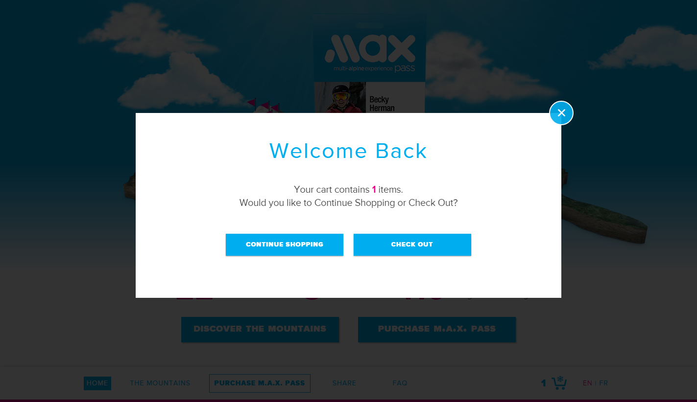
The pop up window indicates the number of items that were previously placed in their cart and provided a direct call-to-action (CTA) to check out. Users can also select the shopping cart icon and get a summary of the items that they have in their cart with a CTA to check out.
Another opportunity we’re taking advantage of on The MAX Pass site, is post purchase sharing. So once a user has purchased a pass they are encouraged to share their new pass purchase with friends via email, Facebook and Twitter.
Gregg: Likewise, both designs featured really nice widgets for loading up a cart with passes. Did any UX/UI lessons from the first round influence how you designed the MAX widget?
Chris: Although both sites were built for pass products, the offers were very unique and required a custom approach for their respective booking widgets. Fundamentally we wanted to encourage users to purchase a pass by making it extremely easy for them configure a set of options that suited their specific needs. We also wanted to make pricing and the total cost of the purchase transparent early on in process.
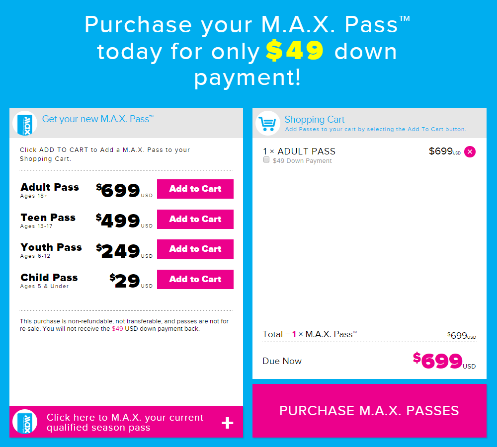
This transparency builds trust and communicates the value of purchasing either multiple passes in the the Passport instance, or the low costs of applying a deposit with the The M.A.X. Pass. In addition we utilized animation and interactivity to make the widgets more engaging and enjoyable so users had fun interacting with them.
About Gregg & SlopeFillers
I've had more first-time visitors lately, so adding a quick "about" section. I started SlopeFillers in 2010
with the simple goal of sharing great resort marketing strategies. Today I run marketing for resort ecommerce and CRM provider
Inntopia,
my home mountain is the lovely Nordic Valley,
and my favorite marketing campaign remains the Ski Utah TV show that sold me on skiing as a kid in the 90s.
Get the weekly digest.
New stories, ideas, and jobs delivered to your inbox every Friday morning.