Data
Fifteen Resort Marketers and Designers Had a Blank Slate and 24 Hours – This is What They Created


BLANCHARD
I love ideas. In fact, some of you know about my “ideas” folder where I’ve built a growing collection of 30+ web app, business, and marketing tool ideas.
But the most exciting part of any idea is the moment it crosses that line from idea to thing.
That’s why I loved the “24 Hour Design Challenge” at Destination Summit last year, and that’s why I loved it even more this year. Here’s how it went.
The Rules
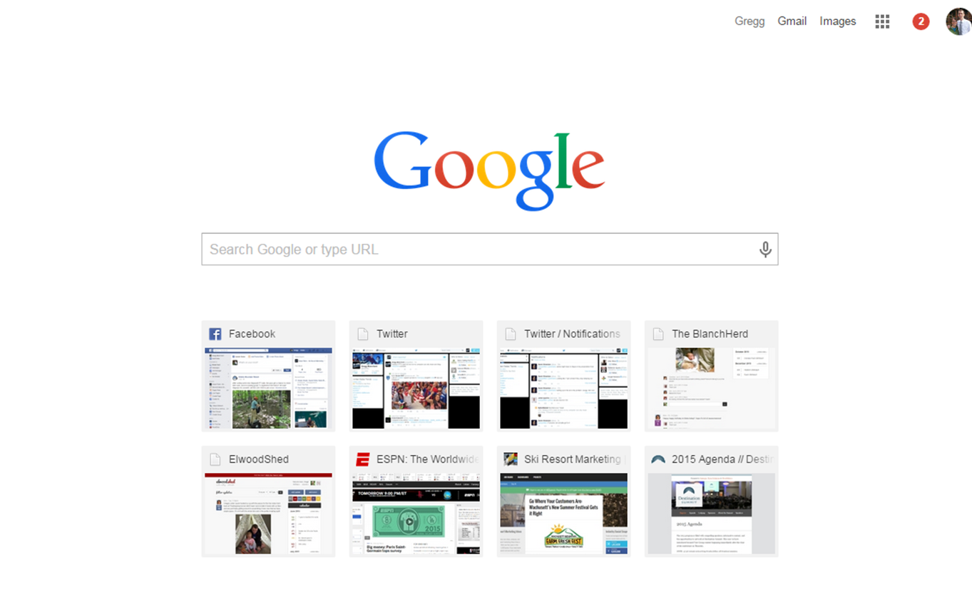
It was pretty simple. Teams of one designer and 3-4 marketers were formed and given a simple task: create a browser start page for the brand you were assigned. For example, my start page usually looks like:
But with a plugin like Momentum it looks like this:
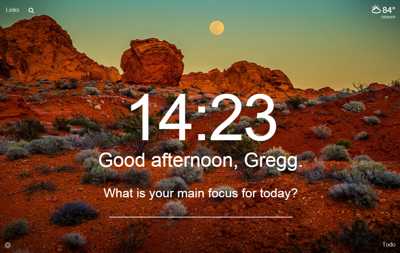
That’s what I wanted these teams to do: build a page that could tap any and all guest-specific or generic data sources in a form factor that would be seen over and over again throughout that person’s day.
Results: Team Dirigo
This team’s brand was that of a downtown hotel with the team made up of:
- Jessie Lacey (Designer) – Dirigo
- Michael Fass – Aspen
- Matt Schwartz – Intrawest
- Kim Trembearth – Copper
- Andrew Lanoue – Jay Peak
And, drumroll please, their design…
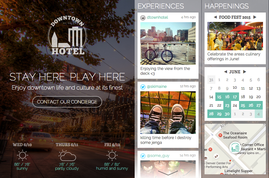
Not bad, eh? I love the way Jessie kept it simple, made sure there was always a clear call-to-action that got the majority of the space, but then used widgets that could scroll vertically to allow virtually unlimited integrations of real-time data or content.
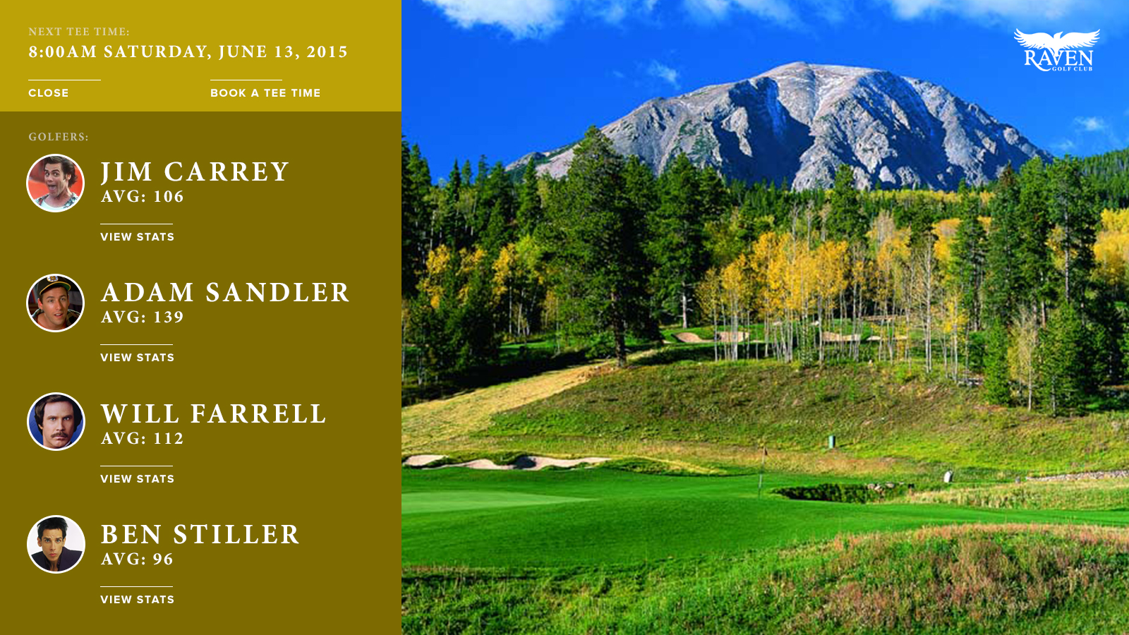
Results: Team Mondo Robot
This team’s brand was that of a golf resort with the team made up of:
- Garrett Wieronski (Designer) – Mondo Robot
- Greg Fisher – Peak Resorts
- Kimberlee Karr – Winter Park
- Ned Wonson – Jackson Hole
- Tracy Smith – Squaw
And, drumroll please, their design…

Start with a big image and left hand content area that includes help information and guest-specific data like upcoming tee-time details…
Add in the ability to virtually play the hole and visualize your round from a desktop…
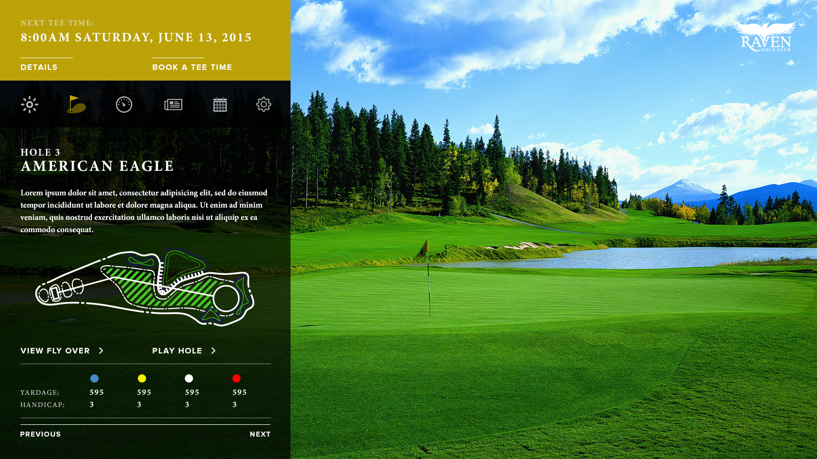
And recent headlines and news…

And you’ve got a really, really sharp design that also has a ton of utility. Great work.
Results: Team LazBro
This team’s brand was that of a beach resort with the team made up of:
- Chris Glover (Designer) – LazBro
- Francois Kimpton – Mont Tremblant
- Eric Kerr – Red Mountain
- Jake Hamilton – LazBro
And, drumroll please, their design…
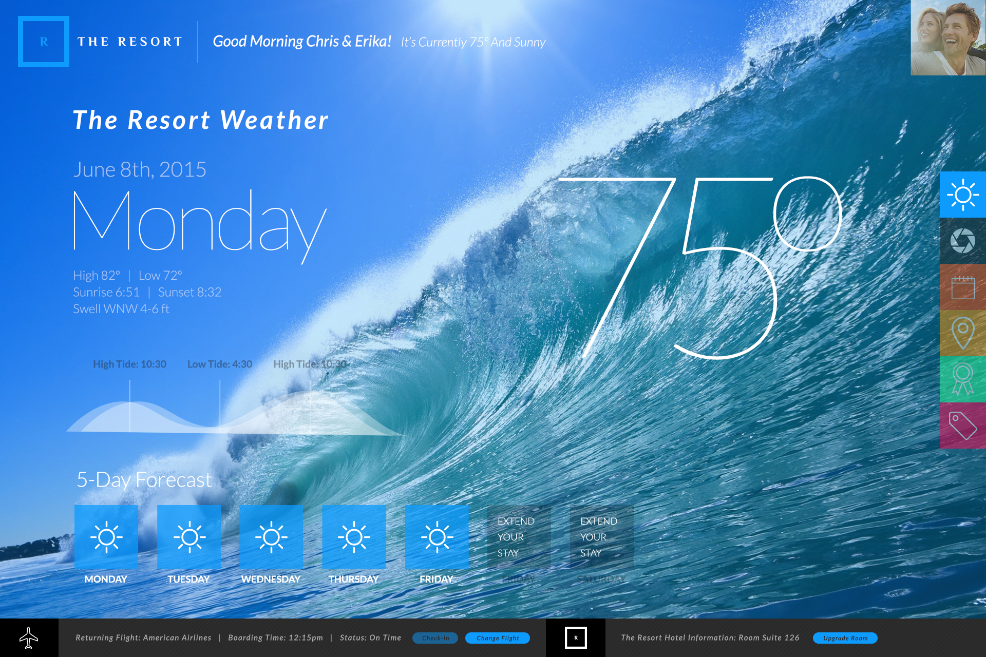
These guys started with a beautifully designed dashboard featuring location specific data and a column of icons that could expand to fill the screen together…
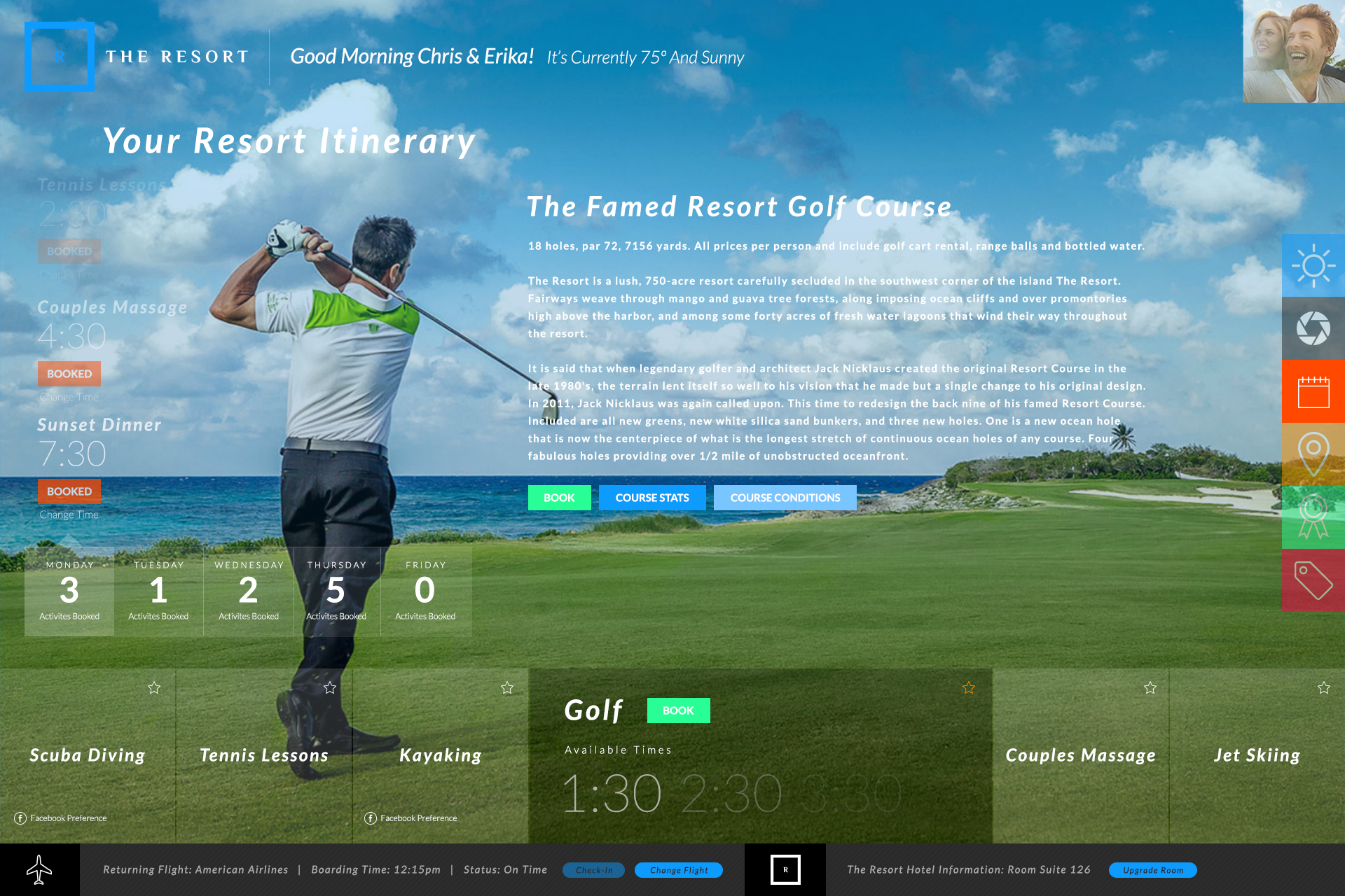
Or fill just one page at a time with guest-specific data.
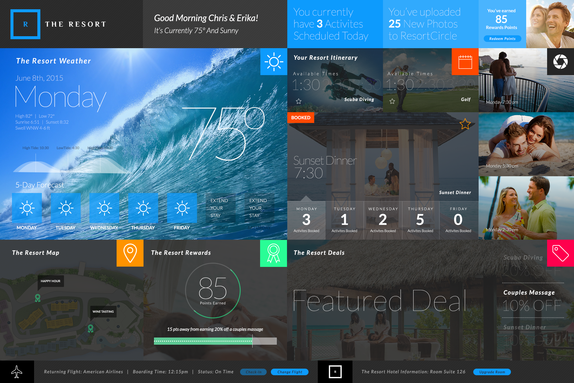
And, why not, an awesome mobile version as well all based on the idea this could be used on kiosks around the resort and in rooms.
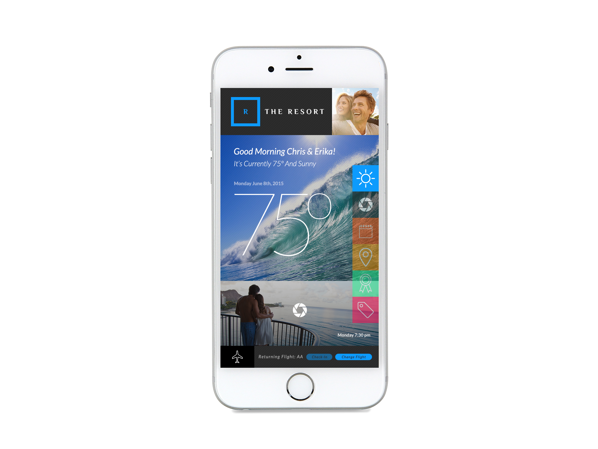
Chris went all-in and spent nearly 15 hours of the 24 designing this masterpiece.
Second of Many
With two rounds in the books and lots of lessons learned from each one (as well as really positive feedback), the design challenge will be back next year.
I honestly can’t wait.
About Gregg & SlopeFillers
I've had more first-time visitors lately, so adding a quick "about" section. I started SlopeFillers in 2010
with the simple goal of sharing great resort marketing strategies. Today I run marketing for resort ecommerce and CRM provider
Inntopia,
my home mountain is the lovely Nordic Valley,
and my favorite marketing campaign remains the Ski Utah TV show that sold me on skiing as a kid in the 90s.
Get the weekly digest.
New stories, ideas, and jobs delivered to your inbox every Friday morning.