Branding
A few thoughts and highlights from the new Squaw Valley brand.


BLANCHARD
I didn’t envy the Squaw Valley team last year when they announced they’d be rebranding the resort. It was absolutely the right call, but it didn’t make their task any easier.
Every rebrand is tough. This was set up to be off the charts.
After a year-long process, they’ve crossed the finish line of one process – choosing – and the starting line of another – rolling it out and giving it the meaning they hope for. There is a lot to talk about, but there’s only so much we can chat about after a few hours, so let’s dig in and see what we’ve got.
The Name
The name they chose is Palisades Tahoe. A nod to a well-known zone within the resort, I like that it builds on a word that is already known to locals.
But that word – Palisades – is an interesting one too because when asked what it means, most of us won’t have much of an answer. It’s why so many people have had to google definitions of it as folks debated the change this morning.
That combination of both a word that’s known to their market (and has a positive association) but one that doesn’t mean anything to everyone else is a really powerful combination. I love blank-slate names, but usually that takes creating your own word (Twilio, Zillow, etc.) to get that opportunity.
Adding Tahoe…
Also, side note. It was exactly a decade ago that Northstar at Tahoe changed their name to Northstar California. In this case, the resort added Tahoe to their name and, at least anecdotally, I think it makes good sense. I was way too many years old when I finally realized that Squaw Valley was actually right down the road from Tahoe. The first time I visited the area as a teenager I didn’t even think to look for it.
I have no idea how common my perspective is, but if it’s at all representative of folks outside of their traditional market? Then this is a solid move or, at the last, a tool they can use as needed (ie, just Palisades in more established markets) to drive home that point.
The Logo
I’m leaning more of the knowledge of others here than my own insights into the area, but Dave Amirault pointed out on Twitter the connection between the mark and Shane McConkey.
https://twitter.com/ozskier/status/1437432307539800067
Even as someone that’s not in their market, who has only spent a day on their mountain (well, Alpine Meadows), and doesn’t know much of their history, I still know that the connection between the resort and Shane is unbreakable. This is a really savvy move and one I’ve seen a lot of people pick up on as they’ve chimed in with their thoughts on the change.
Side Notes…
If the first and last “A”s in the logo look familiar, you might be thinking of Arapahoe Basin and Mt Ashland.
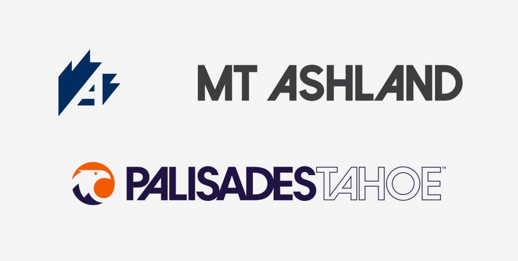
One difference, however, is that the middle A in Palisades is not slanted like Ashland does. I haven’t seen any reason for the difference but I have seen at least one person ask about it.
My best guess? Both slanted As follow an overhanging letter – P and T. The other A follows an S. The mismatched styles let me keep nice, consistent kerning throughout the word mark that would be lost if they forced it to follow the S. Speaking of which, notice how this logo was designed to be stacked. Not just the matching slanted As, but also the alignment of the L/I in Palisades with the H in Tahoe.
The mark is still growing on me, but I do like that it’s simple with heavier shapes so it will be easy to use solo or overlaid on photos. This was something I think was a great move with Schweitzer’s update.
The Colors
I may be proven wrong on this one once the color palette shows up more in the wild, but I really like the fact that the logo appears to be more violet than blue. Here’s what the TinEye color extractor analysis showed, for example.
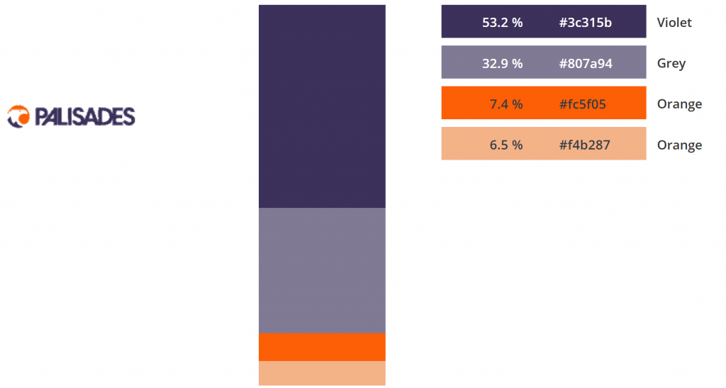
On my screen, it looks violet which is very unique in resort marketing. We’ve got a ton of blues, reds, greens, and even some yellows in resort market. It’s why Loon stands out because they went all-in on orange. This violet could be a similarly handy tool if played right.
Side Notes…
I said that I “could be proven wrong” because if it ends up being more blue, than they’ve got something pretty close to the EpicMix scheme with that darker orange. It’s hard to tell from some of the pictures coming in from the wild, though.
https://twitter.com/skiingrogge/status/1437465387268919296
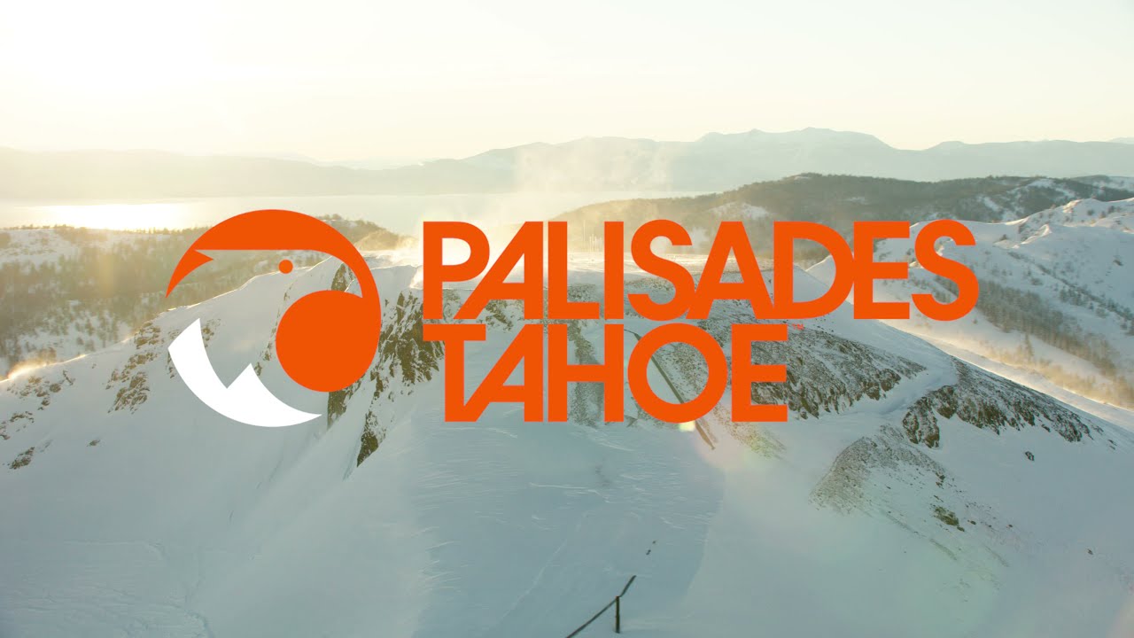
And it’s also yet to be seen how/when they use both colors. For example, the logo used in their announcement video doesn’t include the violet at all, just orange and white. Either way, that serifed typeface they appear to be using below the logo in Mike’s photos above will certainly help differentiate.
Good Pieces
Like any rebrand, there’s a long road ahead.
The team still needs to use it enough in the wild that they become comfortable with the name and colors and story and typefaces. This, of course, will take some time. But Palisades Tahoe is full of some crazy smart people. Once they get a feel for it, I think we’ll be pleasantly surprised by what they do with this new identity.
To those people I say, congrats on the launch and good luck with the rollout. And maybe stay out of the social media comments for a few days. :)
About Gregg & SlopeFillers
I've had more first-time visitors lately, so adding a quick "about" section. I started SlopeFillers in 2010
with the simple goal of sharing great resort marketing strategies. Today I run marketing for resort ecommerce and CRM provider
Inntopia,
my home mountain is the lovely Nordic Valley,
and my favorite marketing campaign remains the Ski Utah TV show that sold me on skiing as a kid in the 90s.
Get the weekly digest.
New stories, ideas, and jobs delivered to your inbox every Friday morning.