Print Ads
Telluride Releases 2011-2012 Print Ad Marketing Survey

BLANCHARD

When it comes to choosing your print ad lineup for the year, there are always risks involved. How will people react to the headline? Will they read the text you spent hours rewording and tweaking? Do people even like the picture we used? With so many unknowns, Telluride has launched a simple survey to get the feedback they are looking for long before their ads go to print.
Format
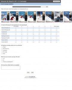
Their format was fairly simple. The majority of the pages showed two similar, yet different ads and asked the following questions:
- Did the headline(s) appeal to you?
- Which headline did you prefer?
- Did the ad text appeal to you?
- Would you take action on the package offer?
- Rate the primary image in each ad. (1-10 scale)
- Rate the inset image in each ad. (1-10 scale)
- Which ad appeals to you more?
- If neither appeals to you, what would you suggest?
Issues
While I love the idea, the biggest issue I had was the way things were presented. In each step of this survey, you were asked about which headline, main image, inset image, and text paragraph you liked. That’s four different elements. Then you were asked which of two ads using these elements you liked best. With four different elements, you can have as many 16 combinations, why ask for my advice on two different ways they are combined if I just told you my preference? With Survey Monkey this may not be possible, but I’d love to see that last “which ad appeals to you more” question moved to the next page where the marketing teams favorite ad is compared against an ad that is automatically generated to match their responses as an evaluation of their opinion of the parts as a whole, not just individually.
I found that on many of the “which ad appeals to you more” questions, the ads were 6’s because each had elements I liked and disliked. I’m having trouble of seeing the value of the data from that question as it stands. Also, it may just be a typo, but for the first set of ads the questions about the headlines referred to headlines that didn’t appear in the image. These headlines did, however, show up later on.
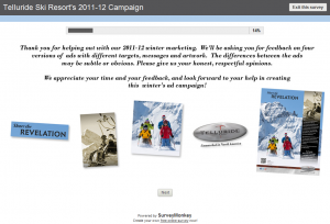
Step 1 – 14% Complete
 Just a splash screen introducing the survey and the role participants will be playing. Starts with the progress bar at 14% perhaps as a sort of “free meal punch card with 2 holes already punched” motivator.
Step 2 – 29% Complete
 Just one headline in this version but two options for the rest (main image, inset image, text). The headline, “Share the Revelation” doesn’t really mean much unless you read the paragraph text or know about Telluride’s Revelation bowls. And even then, does that make the headline any better?
Step 3 – 43% Complete
 Similar to step 2 but a different headline, “Unmatched in North America”. This is the standard tagline that you see in most of Telluride’s marketing communications. Not my favorite, but much better than the first.
Step 4 – 57% Complete
 This time two headlines are used, “Reaching the PEAK has its benefits” and “Reaching the APEX has its benefits.” Referring to the Apex glade on this one, subtle play on words. Clever, but not sure how effective it would be at breaking through the clutter of magazine ads.
Step 5 – 71% Complete
 This was my favorite because it combined something realistic (people hiking to hit the chutes, not just bottomless powder turns) and a headline that was also a call to action, “Discover Telluride’s Gold Hill Chutes.” Says to me there is something new at the resort to discover, asks me to do it, and gives me a realistic image (with amazing views and rewards) that I can relate to.
Step 6 – 86% Complete
 Now, out of potentially 60+ possible ads, you are asked to rate your favorite without being able to read the paragraph text and offer on each one. Good for an overall snapshot of which headlines and photos stand out, but still, no control. If I like picture 1A and headline 2B, which one do I rate as my favorite? Can’t see a lot of accurate data coming out of this step. They do, however, ask about QR code awareness. I’d be interested to see the numbers on that one.
Step 7 – 100% Complete
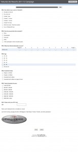
 Last page, just some demographic information so they know how old and rich you are…or aren’t as my case may be.
Overall, I really do love the concept. I think it is a great way to have some confidence as you drop a big wad of bills on Freeskier’s desk this fall. The one thing I would like to see changed is a bit more method to the survey so the data can paint a more accurate picture.
About Gregg & SlopeFillers
I've had more first-time visitors lately, so adding a quick "about" section. I started SlopeFillers in 2010
with the simple goal of sharing great resort marketing strategies. Today I run marketing for resort ecommerce and CRM provider
Inntopia,
my home mountain is the lovely Nordic Valley,
and my favorite marketing campaign remains the Ski Utah TV show that sold me on skiing as a kid in the 90s.
Get the weekly digest.
New stories, ideas, and jobs delivered to your inbox every Friday morning.
