The right (and wrong) way to think about buttons on your resort’s website.

The other day I had a marketing nerd-out session with Origin’s Digital Marketing Director, David Kenworthy. The topic? Websites. What came from that conversation was a set of three simple topics that we both felt were misunderstood or overlooked by most resort marketers. So we decided to try something new: co-write a blog post to cover each. After publishing those all in 2021, I’m doing so again as some of these topics continue to come up. This is the second part in the series.
—
I want you to imagine that the pandemic is over and you’re heading to your first in-person conference in 18 months. You stop by registration and pick up your name tag, grab a swag bag, and then flip open the program to see who is speaking.
But instead of the usual agenda, you see a list of 200 time slots and each one says the same thing:
- Keynote!
No titles, no descriptions, just “Keynote!” and the name and photo of the speaker. How useful is that? Obviously, not at all. Given no information, no reason to join and honestly, a feeling of overwhelming choice, I imagine the default reaction would be to head right to the bar. Yet when we look at some websites, this is eerily similar to what we see.
Why? Because of buttons, man – and a few issues in how marketers use them.
#1) Sell Me First
This is, perhaps, the thing resort websites are most guilty of. You have to give people a reason to buy (or click) before you ask them to buy (or click). Just because you followed all the rules, made it some magical size and hex color and sat it “above the fold” means nothing to the visitor if you haven’t sold them on why they should click.
Here’s a quick, two-step gameplan to help address this.
First, review some pages on your site by asking where a visitor might be in the customer journey when they’d arrive at such a page. If they have just begun their research, they may be looking for videos or pictures of my zipline tour. If they are looking to plan that trip, hours of operations, age restrictions and tactical information might be at the forefront of their mind. What’s important to remember, is that only when you get past all of these stages does the buy button matter.
Second, keep in mind that – maybe – 1 in 50 people visiting this page – or your site in general – will be ready to purchase. You’re always going to have many more people visit a page who need to be told WHY they should buy instead of HOW or WHEN. Think about the sales funnel and take a few minutes to write copy that sells them on this product and, in turn, gives them a reason to care about HOW or WHEN to buy it (your button / CTA).
Think of this as the title and description in the little metaphor we started with. You’re not going to attend a session (and your visitors aren’t going to buy something) without first having information that shows you why it would be useful.
#2) Hierarchy
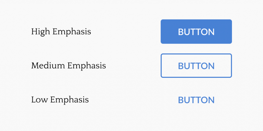
Buttons should not just be optimized per page, they should also be looked at sitewide. When looking at your site holistically, you should have levels of importance for buttons.

We should be able to then look at our core website goals and pair these with CTA styles. High emphasis may be placed on monetary transactions, medium on things like newsletters and secondary goals, and low on things such as price lists or internal linking.
In the metaphor we started with, this is calling everything a “Keynote!”. If there’s no hierarchy to show me which is most important, then nothing is.
One last thing to think about here. If people aren’t clicking your buttons, the first thing to consider is, are they obvious enough or are they in the right place, NOT do I have enough of them! Speaking of which…
#3) Quantity
If you write a sentence with one bold word, you pay attention to that one word.
If every other word in the sentence is bold, it becomes overwhelming , the whole sentence is “important”, and you are left with no idea where to focus your attention.
This happens when we have too many of any type of CTA’s, but especially buttons if they are conflicting in what they are trying to get me to do. Kaleigh Moore from Sumo put this really well .
Ever look in your closet (which is almost always chock full of outfit options from shopping trips past) and thought to yourself: “I have nothing to wear?” You might be falling into the decision fatigue trap, which triggers analysis paralysis. When you’ve experienced this, I bet you’ve just fallen back on that same pair of old jeans you’ve worn every other day this week. You may be activating the same phenomenon for your visitors with your website, by overloading their brains with too many possibilities.
My advice would be this: Set out a clear goal for every page. Don’t have a page that tries to do too much all at once and make sure the user can clearly identify what they should do next, not just a massive list of things they could do next.
This is the list of 200 sessions from our metaphor. You’ve got to make it simpler for the user to take their first, or next, step.
Your Homepage
Which leads us to our final point and a place where these issues crop up most frequently: resort homepages.
We get it. Every department thinks they should be front and center. So you try to make everyone happy and give everybody a big chunk of real estate with a big heavy button. But do you know who isn’t happy in this situation? Your website visitors.
As a Marketing Director or VP or CMO, one of your primary jobs is to be aware of all those stories from all those departments and then act as a filter for what messages are most important for the resort. It’s why you send emails to 100,000 people about lodging deals, but not about the discount on gloves in the gift shop. You have to do the same thing with your homepage:
- Give all visitors a reason to care, to stay, and to keep scrolling/reading
- Make it clear what their next step should be
- Don’t confuse them by giving them 100 choices
Start with your homepage, but then move to other high traffic pages and ultimately to the rest of your site. You may not be able to solve all as is, but this will give you a perfect mindset going into your next redesign to ensure you come out on the other side with a site that lets you maintain focus on what matters most.
 Gregg Blanchard