With diverse guests, Targhee smartly groups info by visitor type.
 Gregg Blanchard /
As I mentioned in my last post, Targhee’s site starts in a really intriguing way. But the more I dug into their design, copy, and navigation the more I found myself nodding in agreement to some of the decisions they’ve made.
There are a lot of examples by this, but I want to share one.
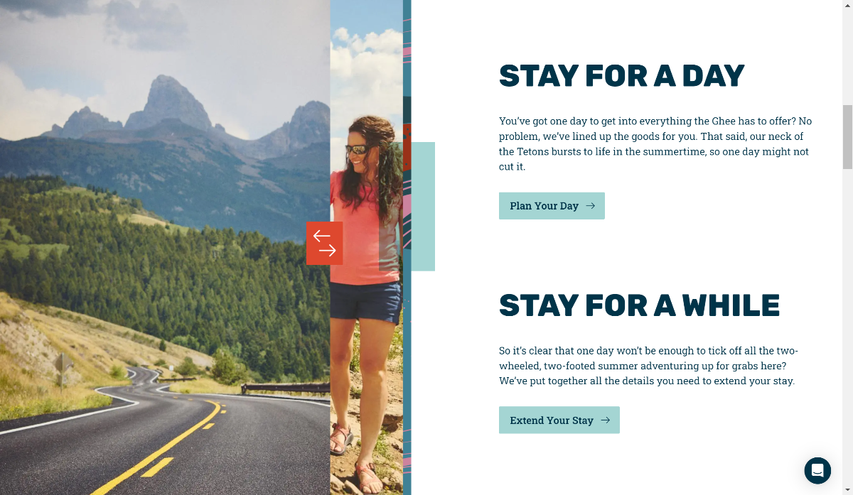
I’m a big believer in giving potential guests recipes. In taking this grocery store of things someone could do at your resort and simply grouping some of the common, complimentary ones in a way that makes it easy for folks to see what an experience at your mountain could look like.
So when I saw these CTAs right below their “here’s why to buy our products” info block, I was instantly intrigued.
Those two links head to two simple pages that simply put links to key info:
- Lodging information
- Summer activities that are availbale
- Lesson information
- Reasons to visit
Into a single block of content that is designed for a specific type of user – day visitors versus destination guests. For example, here’s the page for day visitors.

Using some of the beautifully designed content blocks in their design, the content flows really well and looks fantastic.
If you have a few minutes, explore Targhee’s website. It’s a really nice concept that blends traditional header navigation with some modern content blocks and very succinct, light copy to create a really nice site that’s easy to find your way around.
Here’s the link:
https://www.grandtarghee.com/