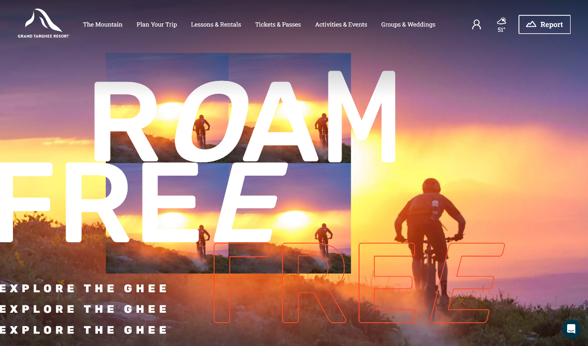
Grand Targhee’s website hero drops the CTA and leads with brand.
 Gregg Blanchard /
I’ve talked a lot about the top of resort homepages.
For example, in a post I wrote nearly 10 years ago on this topic I dug into an approach I see all over the place with these spaces of web real estate:
“What’s missing is copy for people who ARE NOT already sold on your resort. Instead of selling the value behind an offer, these headlines seem to assume the visitor is already hook-line-and-sinker on your mountain and are simply telling them what to buy.”
But what’s missing in my perspective is an alternative to selling people on products. Because not all resort marketing is about driving a purchase today, right? Sometimes it’s about a brand. A feeling. A higher-level message.
I hadn’t seen too many resorts do this…until a few weeks ago.
The top of Grand Targhee’s homepage feels much more like a glossy magazine ad than the hero area of a website. It’s much about emotion, setting a tone, and getting a feeling across than either telling people to buy or giving them a reason to buy.
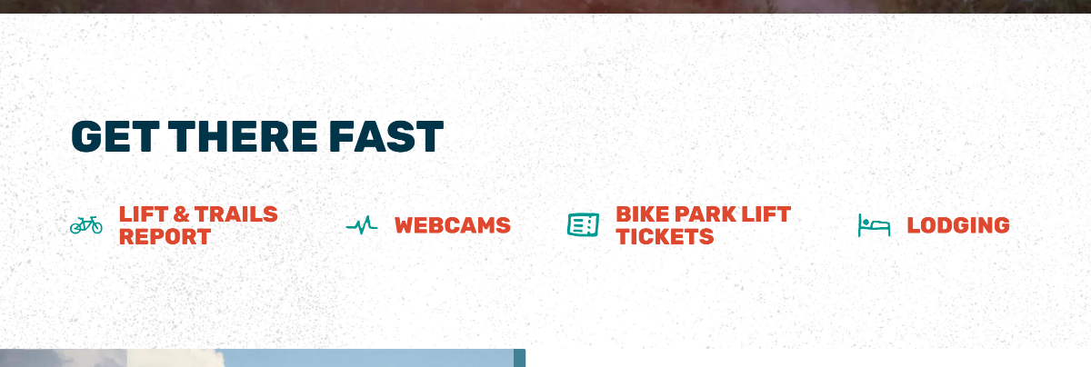
Yes, the next block down is a clean block of links helping folks get around who are sold and just need to get to where they can buy stuff…
…but before that – before the CTAs – they start with brand.
And, man, it’s super intriguing to see an example of this approach in the wild. Good stuff, Targhee team.