One Simple Reason Why I Love Schweitzer’s New Website
 Gregg Blanchard /
So, a while back I wrote about something. A tweak, specifically. But not just any tweak, a website navigation tweak.
In my own words (if you haven’t figured it out by now, I secretly enjoy quoting myself), I said:
“the average resort website has 8.12 elements in their nav menu. I first published that number over two years ago, but ever since I’ve been wondering if there is a better way…so, what if you… shorten the list and make every link a call to action?”
The idea I shared at the time was using just four, nav elements:
- Come for the Day
- Plan a Vacation
- Learn How to Ski
- Explore the Resort
In other words, I grouped things by guest type and turned each one into it’s own call-to-action.
Atta-Boy Schweitz
I doubt anyone actually calls Schweitzer “Schweitz”, but I just did because we’re very close. And why do I feel such a bond to a resort I’ve never visited? Because this is the first time I’ve really seen something close to my idea in the flesh:
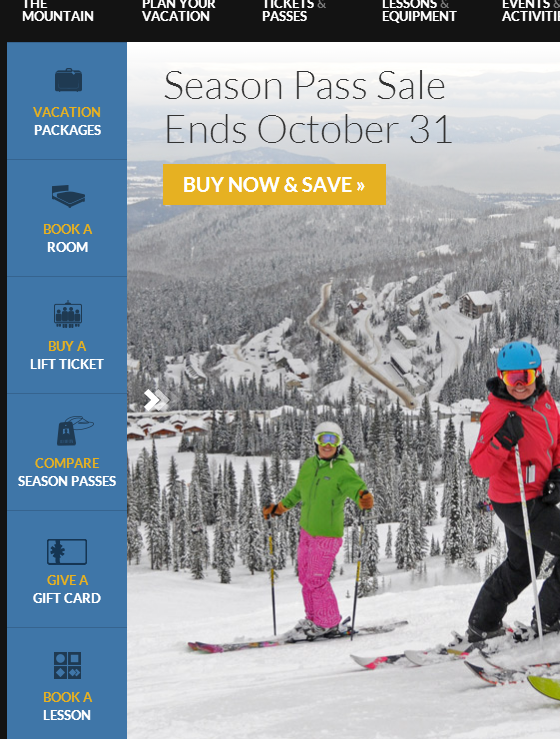
See that, in the blue area on the left-hand side? Links that aren’t just links, but calls-to-action for various types of guests.
It’s not “Tickets and Passes”, it’s “Buy a Lift Ticket”.
It’s not “Lessons and Rentals”, it’s “Book a Lesson”.
Now, you may be saying to yourself, “Um, Gregg, ‘Vacation Packages’ isn’t a CTA.” And you’re right, it’s not. But when there’s a feeling that skiing is often a logistical nightmare, I’m totally fine with the fact that the first step gives someone a starting point to plan a vacation around deals and packages rather than just a lodging search form (which also exists).
Old and New
Another thing I like is that the old-style top nav is still there to cater to both old habits and new ideas.
It’s a sharp looking website with a simple tweak that, I believe, could pave the way for improved efficiency as Schweitzer moves visitors around the site to accomplish their goals.
Good stuff.