A resort brochure lesson from a time I honestly needed resort brochures.
 Gregg Blanchard /
I’ve covered brochures a few times in the past, but I wanted to share a really simple insight from a recent trip to Oregon where brochures were exactly what I need in real life.
The trip began when we arrived on Monday and planned to spend a day in Portland before heading to the coast.
Unsure how close we were to anything that resembled cut trails and triple chairs and not having looked en-route due to my full attention being directed toward keeping a 3 year-old’s underwear dry, I did what I often do as soon as I checked into the hotel: made a bee line for the brochure rack.
After perusing, I found two from ski resorts.

One was a state, a province, and a country away. The other was just close enough that it bordered on possible.
But, as I’ve mentioned before, I always try to pay attention to my behavior in these scenarios. And, so doing, I noticed something interesting about these two brochures I found.
The Questions
What I realized as I scanned the racks was I really only had two questions:
- Where is it (/how far away)?
- What can I do there?
That was it.
As I alluded to earlier I eventually found answers to those questions, but I’ll get to that in a minute.
The Constraint
The other thing I noticed about my behavior was that faced with so many potential options, I was looking for simple answers to those questions rather than an in-depth look at a destination.
I wasn’t going to take 15 minutes to carefully read each one, I was going to take 2 minutes, find a few brochures, and quickly compare my options. These brochures were, in a way, or sort of offline Google result where you scan titles, pick a few up (click), but move on if nothing matches my needs.
So, two questions and just a few seconds. I’ll let you guess which one did better.
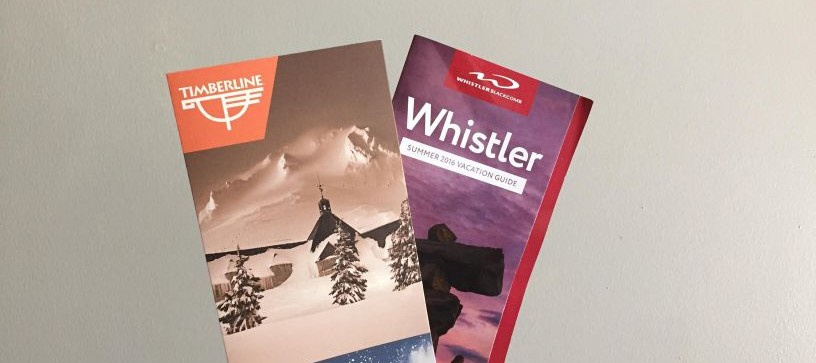
Timberline
Timberline’s was a simple, double gate fold setup on a heavier cardstock.

It was clean, to-the-point, and well-designed.
Whistler/Blackcomb
Whistler’s was much more of a booklet than a brochure. While the same size to fit in the rack, it had ~20 pages of detailed information about nearly everything at the resort.


If I wanted to book a room right then and there, I’d have just about everything I’d need to do so.
Winner?
The winner, however, was a combination of neither and both.
Timberline’s had the simple, browseable form factor but was a bit more about their story and brand than the actual things I could do there. Whistler’s had the content but needed a table of contents to find what you were looking for. Somewhere between the two – concise but focused on the product – would have been perfect.
Like I said, a simple lesson but a valuable one. Some marketers love long and detailed, some love short and story-driven, but for me in this moment, I needed a happy medium.