Print Ads
Design Pros Weigh in On Core Principles That Drive an Effective Cover Layout


BLANCHARD
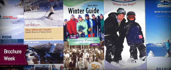
It’s brochure week! Can I get a heck yeah!? No, I said heck yeah. Come on, there could be kids reading this post.
Anyway, today, we’re gonna tackle the front cover.
The Principles
Facing the fact that I am clueless about the principles of brochure design, I reached out to a few pros who weren’t and also had experience with resort brochures. On the topic of front-pages, here’s what they said:
Matt Thompson, Story & Co.
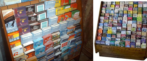
“Brochures typically sit in racks, stacked amongst other brochures. There’s usually 3″ at the top where you should have the logo, resort name and geographic locator. Those two items are ciritcal. In addition, you may have space for a tagline or headline. Smart design keeps this area as simple as possible, as simplicity speaks confidence, especially amidst the carnage of crappy design so ubiquitous amongst resorts. It takes boldness and confidence in a brand in order to roll with simplicity. But it has dividends. Your singularity through simplicity may just inspire a viewer to pick your brochure up and read it.”
Michael Panich, Bolder Design Studio
“When designing the cover of a brochure we are trying to appeal to such a broad market in a roughly 4″x 9″ area. However, We need to capture attention amongst all the chaos of the competing brochures in the rack, which leaves us with the top 3-4” of the brochure to get someone interested in grabbing our brochure. Image selection is typically the first step. We try to select images that present the fun, and feeling of excitement one gets when skiing/boarding at the area, but at the same time avoid presenting ourselves as “Extreme” or “beginners only”. There are several items that need to be kept “above the fold” or in this case exposed when displayed in your typical hotel lobby brochure rack. We aim to keep the resort logo, location and a portion of the main image exposed when stacked in the rack.”
The Lessons
First lesson, there’s a “fold” created by racks where only a few inches at the top of a brochure are visible, the rest is hidden behind the brochure in front of it. This 3″ gap be the right place for the logo and good portion of the main image.
The second seems to be a focus on simplicity. You have limited space to work with so keep it simple and don’t try to put to much onto a cover that may only occupy a couple dozen square inches of real-estate.
Third, anyone and everyone could see this, so you are forced to keep it somewhat general but still appealing to a broad audience.
The Collection
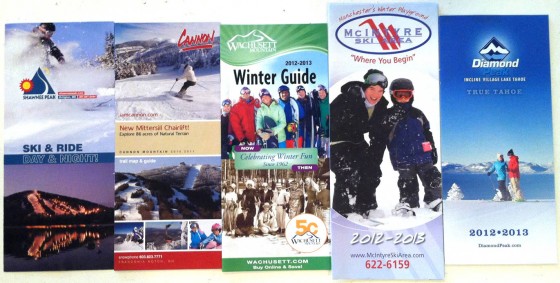
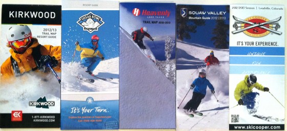
So, with basic ideas in hand, let’s take a look at the 10 brochures I chose to analyze this week.
On point #1, keeping important stuff above the fold, pretty much every brochure nails it. The logo (or resort name) is high and most have an image that extends most of the way to the top. I must say that I like Sugar Bowl’s use of a thin area right at the top that tells what the brochure actually is (trail map, guide, discount book, etc.).
On point #2, simplicity, again, most have kept their brochures simple and to the point. Heavenly, Squaw, and Diamond Peak probably come in at the top of that list, with Sugar Bowl, McIntyre, Kirkwood, and Shawnee Peak right behind.
On point #3, appealing to multiple audiences, I think, again, most have it right. I must say that I especially like Diamond Peak’s because it doesn’t represent any level of ability or quality of snow, it simply shows the skier’s perspective.
The Best
If I had to pick my favorite, I think I’d probably say Diamond Peak. They’re all pretty solid, but I do like the simplicity of the design.
I also like the fact that it’s not looking at the skier, but rather, it’s showing what the skier is looking at and illustrates the amazing views. The rest could all have equally great or boring views, so seeing both a skier and the view makes that brochure a winner in my book.
Do you agree?
About Gregg & SlopeFillers
I've had more first-time visitors lately, so adding a quick "about" section. I started SlopeFillers in 2010
with the simple goal of sharing great resort marketing strategies. Today I run marketing for resort ecommerce and CRM provider
Inntopia,
my home mountain is the lovely Nordic Valley,
and my favorite marketing campaign remains the Ski Utah TV show that sold me on skiing as a kid in the 90s.
Get the weekly digest.
New stories, ideas, and jobs delivered to your inbox every Friday morning.


