Mondo Robot’s Scott Bright Gives us a Glimpse Behind the Scenes of Whistler’s New Website
 Gregg Blanchard /

No matter how much I pore over Whistler’s incredible (and I don’t use that word lightly) new website, there’s one chapter in the story I’ll never read: why it looks the way it does.
Because behind even the simplest feature is often a long trail of iterations, user-testing, trying and failing, before the end result is achieved. Rarely is the first iteration the final iteration, and the versions and reasons for each charge are fascinating tales in design and user behavior.
Recently, Mondo Robot’s Scott Bright reached out and offered a behind-the-scenes look at two such design decisions. How could I say no? Take it away, Scott.
—
In Gregg’s previous post about Whistler Blackcomb’s new website he pointed out several specific design features that drew him in and positively influenced his browsing behavior. While this is great feedback to receive, the truth is these design successes are the product of some failure and much iteration. In the case of Whistler Blackcomb, user testing was leveraged to identify what worked and what didn’t work. Below is a selection of user feedback for specific design elements and a summary of the changes we made as a result.
Winter/Summer Toggle
Like many resorts, Whistler Blackcomb has two distinct seasons with a wide variety of season specific offerings and content. To fully immerse users in the seasonal experience, it was agreed that a toggle between winter and summer content would be an ideal solution.
Before
In testing, users were asked to locate a specific activity in summer months. This process required users to switch from winter to summer, and tested the effectiveness and intuitiveness of the toggle design. The initial design used in testing looked like this:
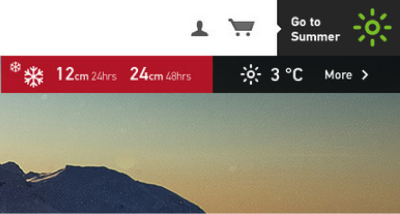
The original toggle was positioned in the top right corner of the site and required users to click on it to switch seasons. Despite what we considered to be an easy feature to use, only 23% of users successfully completed the task. User feedback around the feature suggested the design did not standout or seem like an actionable button. However, once users were shown the toggle, the general consensus was that it was, “ a really cool feature,” but needed to be made more obvious.
After
From user feedback we were happy to hear that users loved the idea of a toggle, but also recognized some changes needed to be made. In response, we updated the design to the one currently visible on the website:
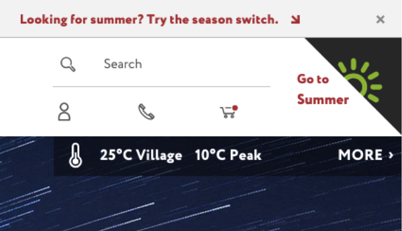
While the toggle has remained in the same location on the site, we made several key changes to increase its visibility to users. This includes making the toggle larger, using contrasting colors, and including a top banner with explanatory text of how to use the toggle.
Top Menu Navigation
Creating an experience that was simple to navigate had always been a top priority. Given the large amount of experiences and services Whistler Blackcomb offers visitors, the challenge from early on was finding an effective way to present and organize content in the top menu.
Before
Prior to user testing, the top menu had already gone through several iterations, but we were still curious how users would respond to it. The initial design used in testing looked like this:
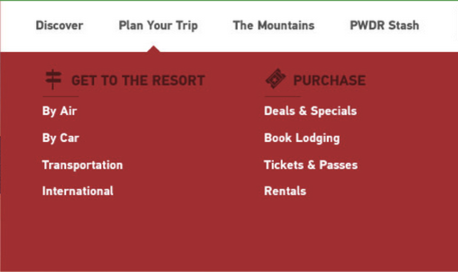
The design used in testing organized all content under four main items: ‘Discover’, ‘Plan Your Trip’, ‘The Mountains’, and ‘PWDR Stash’. Throughout the test users were required to interact with the menu to locate content. Many users experienced difficulty locating specific items in the menu, often giving up and scrolling down the page instead.
In other cases, users suggested certain information should be placed under a different menu header. Lastly, users expressed confusion over the heading ‘PWDR Stash’, which was intended to house all photo, video, and other media content.
After
Based on user feedback, we quickly realized the current menu organization was not working and ultimately created a difficult user experience. We went back to the drawing boards to rethink the menu. The result of these efforts is the menu currently available on the website:
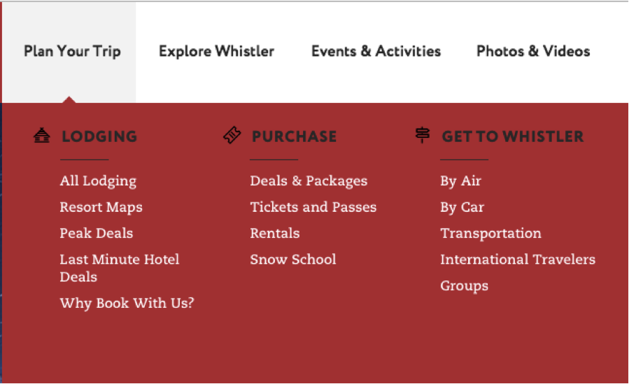
The changes were relatively drastic, with three of the original four menu headers being either removed or renamed. Additionally, the information under each header was completely reorganized to address user feedback and testing patterns. The original menu header ‘PWDR Stash’ was simplified to ‘Photos & Videos’ in order to minimize any user confusion that may occur.
Key Takeaways
User testing was a crucial step for us in redesigning Whistler Blackcomb’s new website. The above examples represent a few of several changes we made as a result of user feedback. Without testing, these changes may not have occurred at all, which could have resulted in an unpleasant experience on the live site.
Testing is extremely valuable because it places your designs in front of the people that matter most—your users. Ultimately, whether you want them to or not, your users are going to judge and critique your site. For this reason, it is essential that you leverage user testing to get critical feedback from users before your site launches.