Incrementally Awesome: Five Tweaks to Note on Whistler’s Incredible New Website
 Gregg Blanchard /

A couple months ago Whistler/Blackcomb launched a brand new website. And boy howdy is it a beaut’.
But beyond the aesthetics are a handful a small, simple tweaks that right off the bad drew me in and influenced my browsing behavior in ways I hadn’t experienced before.
Here are five of these changes.
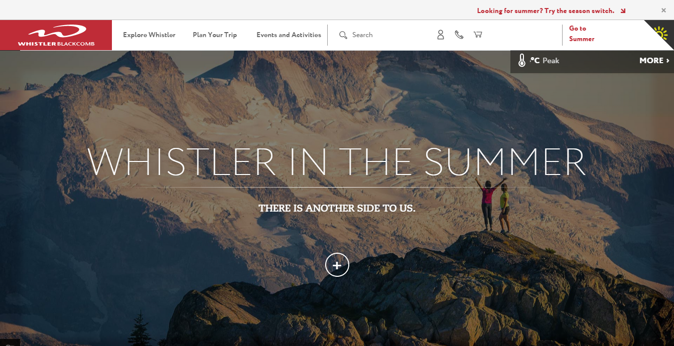
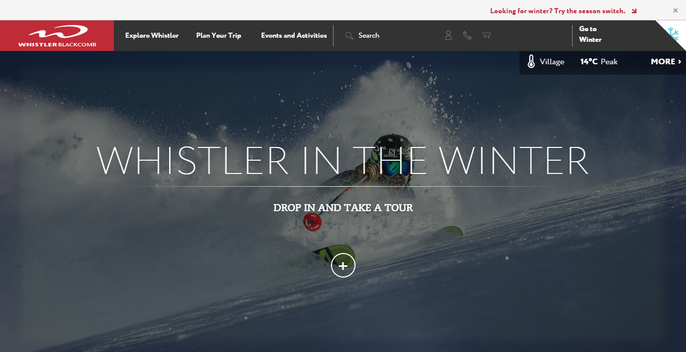
#1) Major Summer/Winter Crossover Promotion
The home page for summer and winter feature a series of beautifully designed cards (which I’ll talk about more in the next point), but toward the bottom of each one is a card for the opposite season as significant as any relevant to the season at hand. I love this emphasis on using one time of year to plant seeds for the other.
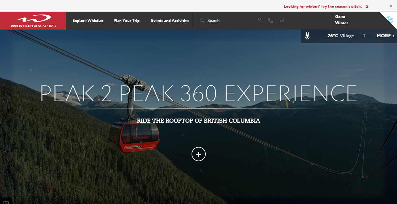
#2) Experiences
Those cards I mentioned aren’t just selling products or deals or nice views, they’re selling experiences. Each with a “call to do” like “ride…”, “explore…”, etc.
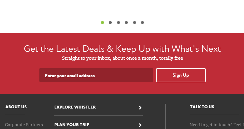
#3) A Reason to Opt-In
How could I not mention this one as it’s something I’ve written about before, but Whistler took their something that carries very little value alone – a newsletter – and supercharged it with what you get, when you get it, and how often it comes.
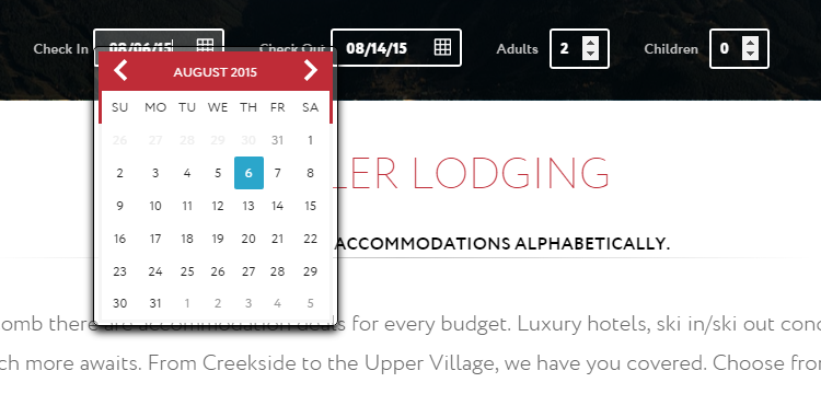
#4) Click-Saving Lodging Search
It’s crazy how simple this is but, at the same time, how it jumped out at me when I used it. The instant you click a date for the first field…
…that calendar is closed and the second pops up with the default date as one day in the future.
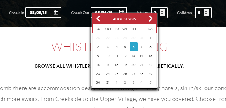
So small, but also incredibly rare and surprisingly helpful.
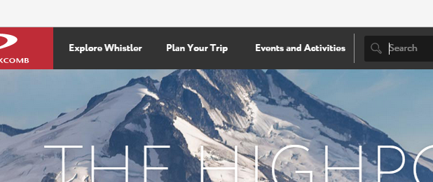
#5) Simple Nav
Despite the site being comprehensive, they’ve also simplified that top nav down to just three options based on actions and guest types: Explore, Plan, and Events.
Incredible design but also amazingly well thought out with an impressive attention to detail.
Huge props to everyone involved in this redesign. Great work.