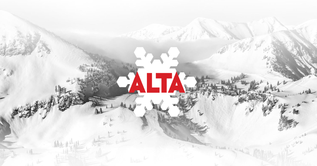
How Alta’s website adds an extra layer of design to match their brand.

Snow, let’s talk about it.
On a summer day with blue sky and uncomfortable heat, there are hard edges everywhere. Edges between colors and between shapes; blue sky, jagged mountains, green trees, blazing sun. Take one slice of a mountain and you’ll have dozens of hues and textures and angles and shapes.
But when it snows? Everything blends together. Hard edges become soft, colors are hidden, textures give way to a monochrome wave that flows between shadowy grays and bright whites.
And when a storm rolls in? All of that flattens even further to where you can’t tell where the snow stops and the sky begins.
A Brand
Alta’s brand is snow. A lot of snow. Deep snow. Snow that arrives through a lot of those white/gray storms that leave soft, smooth, white/gray shapes in their wake.
So being, zoom out from Alta’s website and what do you notice about the background and elements?

Soft whites flowing to soft grays. Edges are softened, colors are hidden, it’s clear you’re moving from one area to the next but gone are the hard lines and contrasting colors we’re so used to seeing.
The vibe is simply, unmistakably…snow. And it’s a message that doesn’t just say snow, it makes you feel snow.
Not Just Web
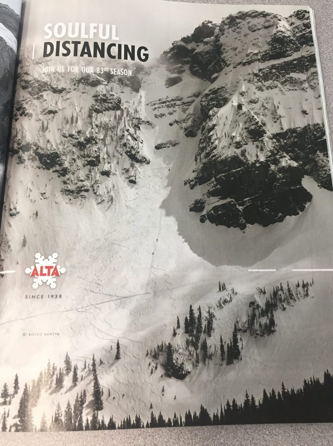
And remember some of Alta’s recent print ads?

Yep, it’s not just web. It’s a beautifully layered message on their core brand message that gently delivered across multiple channels.
Love it.
 Gregg Blanchard