Two lessons from Sugarbush’s recent snow depth chart retweet.
 Gregg Blanchard /
The other day I saw a fascinating tweet from Sugarbush’s John Bleh.
It was the contrast in my feed that first caught my eye – my feed is primarily filled with photos and videos, so a starkly colored chart certainly stood out – but once I realized what I was looking at I kept staring.
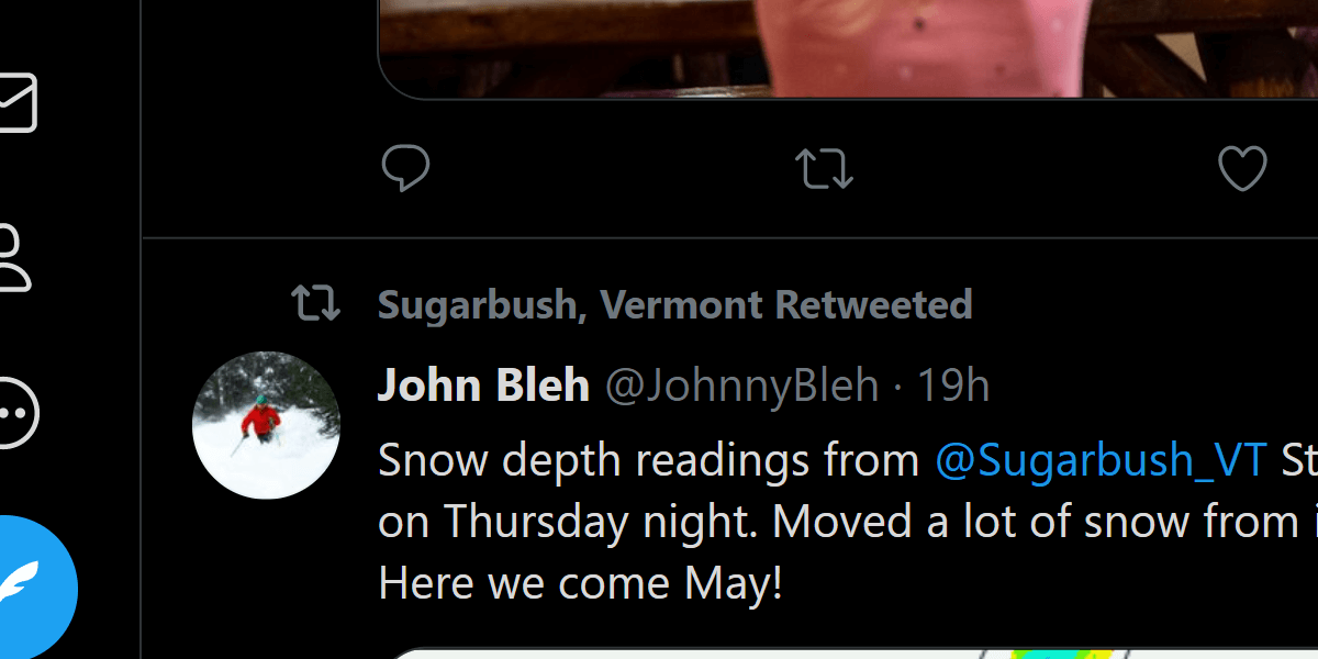
Snow depth readings from @Sugarbush_VT Stein's Run when we groomed it on Thursday night. Moved a lot of snow from it down to Coffee Run too. Here we come May! pic.twitter.com/Hbod35L6g7
— John Bleh (@JohnnyBleh) April 19, 2021
I love this technology and have seen it over the shoulders occasionally of folks in the industry. Or perhaps during a stroll through the tradeshow hall at NSAA.
But I’d never seen it shared by a resort on social media.
Cool Content
I’ve shared this principle probably a half-dozen times in recent years, but sometimes finding cool content is simply learning to see the amazing things around us that we normally take for granted. And charts like this absolutely fit the bill.
You’ve seen thousands of these, but normal skiers haven’t. And when they do? Like me, they stare. They love this chance to see their resort from a new angle.
Human Content
But I love that it was John that tweeted this first. There’s something about seeing updates like these in the voice of a individual person instead of a brand that adds a little bit of frosting to an already tasty content cake.
It takes an intentional approach to this sort of thing so employees feel comfortable sharing certain things and know that the social media manager is watching, but man, I’d be totally okay with a social feed being nothing but retweets of various resort employees sharing their perspective on things as they go about their days.
Good Stuff
This is such a simple tweet:
- It’s a chart that’s already generated and shared internally each day
- John probably didn’t spend more than a minute or two writing the tweet
But that combination of unique perspectives on the mountain told by a unique voice? Both made this the highlight of my feed this week.