Propeller & Schweitzer Innovate Unique Website Functionality

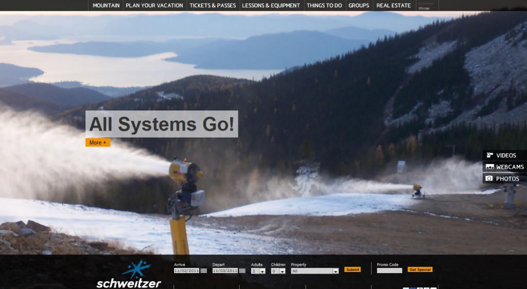
I’ve been meaning to blog about Schweitzer’s website for a while now, since August actually when i started writing a post about it. A post I never finished. Until now. This site, created by Propeller Media Works, is not my favorite from a design standpoint, it’s good, but that’s not why it stands out. When you first arrive, it’s clear the site is very different on a few levels. Right off the bat, having the logo on the bottom is something I wasn’t expecting.
There are lots of unique and innovative features on this site, but let me pick out three that I thought were especially interesting.
#1 – The Image and Nothing But the Image

Skiers are visual people which is why I love the way most sites feature a large image at the top of the design and then add elements around that. Schweitzer’s site takes that to the extreme: you can’t scroll…at least on the home page. Now, the menu contents and placement could be argued, but I love how one simple offer at a time is shown in front of a high quality, edge-to-edge image. Even important images and headlines can be lost in the maze of content on some landing pages. Not so with this design. They just started making snow, as the image above illustrates, a fact that is virtually impossible to miss.
#2 – Always Visible Booking Form

The point at which someone is sold enough to make a reservation could happen at any time during a visitor’s stay on your site. If the booking form is always visible, whenever someone is ready to make a reservation, they can get started instantly. A lot of sites push booking on the landing page but then stick the form in random spots throughout sub pages. If online reservations are a priority, then I like the priority it is given on the site.
#3 – Toggle the Content On/Off


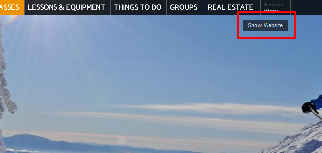
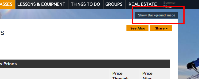
Many sites have some pretty sweet pictures of powder slashes or immaculate corduroy that are hidden by the main content areas of the page. Some make those regions semi-transparent to partially reveal what is underneath, but Schweitzer’s site uses a simple snow/hide toggle button. Click it once and the content disappears, letting you enjoy the background image in all its glory. Click it again and your content is back. I’ll tell you one place I’d love to see this implemented: Twitter.
It’s fun to see innovation. Maybe the site doesn’t convert the best or lacks some conventional flow elements, but you’ve gotta give them props for breaking out of the box and trying something new and different. If they stick with this layout for future versions, I’d love to see what changes and improvements they come up with based on a year or two of data and feedback.
 Gregg Blanchard