The Five Best Summer Ski Resort Website Designs
I’ve been scouring the ski web as of late grabbing a bunch of tidbits from a long list of resort websites. As I’ve gone along, every now and again a site design stands out, “breaks through the clutter” as they say, in a way that is both refreshing and reassuring. Most of the websites I have come across which have stood out of the bunch belong to the UK website designers, as these sites have an extremely simple user-face and the amount of information given on those sites is also perfect cause over sharing at times just makes a site look cluttered. With most of these sites in summer mode, I thought I’d highlight my top five from a pure design standpoint. While it’s hard to separate marketing elements from design elements, I’ve done my best to judge these solely on appearance (for me that’s easier said than done).
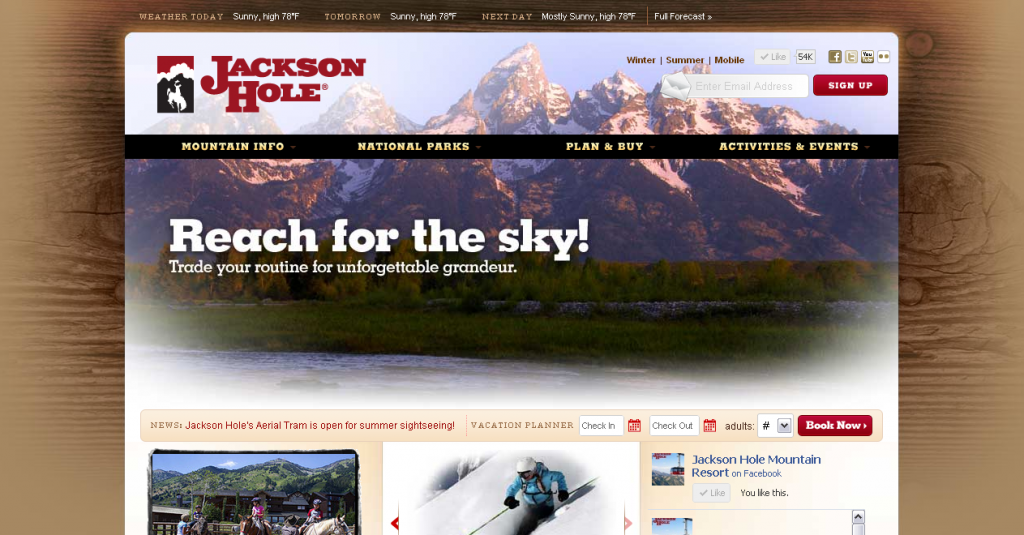
#1) Jackson Hole
I’ve always loved this design, and perhaps this shows a little bias as I do dig me some Joe Myers work. Clean, simple, and colors that match not only the resort but the look and feel of Jackson and Teton Village. Awesome.
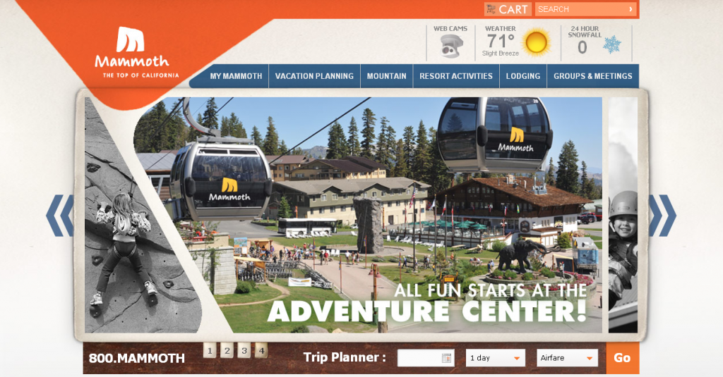
#2) Mammoth Mountain
The visual layout of this page is incredibly unique. Lines at angles I’m not accustomed to seeing, combined with rounded corners and a lot of color somehow compliment each other to make a really sharp, fun design.
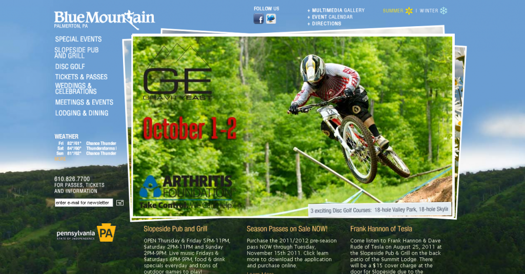
#3) Blue Mountain
Now, the winter side of Blue Mountain doesn’t quite work as well, but I love the way the mountain itself creates a two-tone background. Centered around a series of rotating images, I think I may have picked this design over others just because this resort achieved this with a much smaller budget than others.
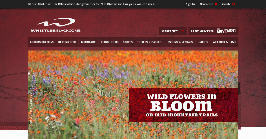
#4) Whistler Blackcomb
Using the same color scheme from winter, Whistler has a great series of photos and headlines for their summer lineup. Sharp, simple, and easy to navigate are what really catch my eye.
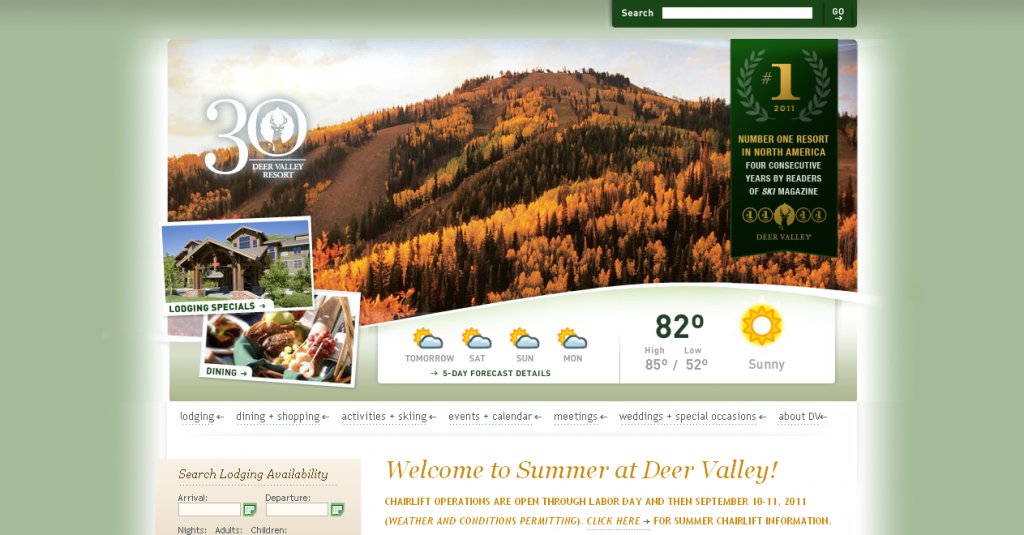
#5) Deer Valley
The design is a couple years old, but I’ve always felt this design matches the feel of the resort and brand that Deer Valley has more than most other sites. Classy and clean, the photos and tweaks for their summer site really look sharp. Learn more on web design at https://www.sandcastle-web.com/services/app-development/.
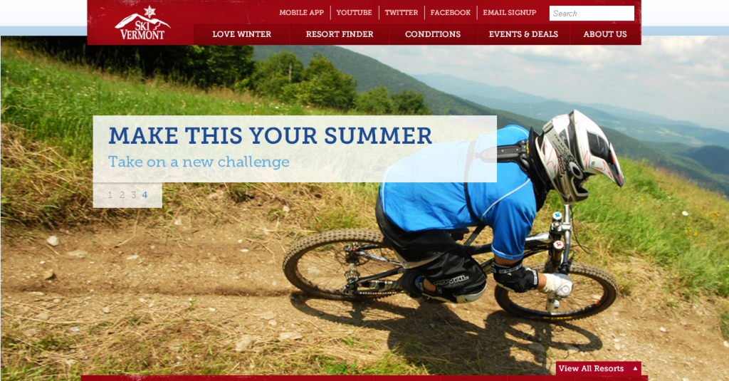
Honorable Mention: Ski Vermont
Last year, I believe, Ski Vermont updated their website. While they aren’t a resort, I thought I’d add them as well because I love the way they’ve combined a large, edge-to-edge image with simple headlines and a nicely structured layout.
 Gregg Blanchard