The 14 Steps to Avoiding a Website Navigation Disaster
Originally, I was planning on doing a post about The Canyon’s honor roll season pass program that gives kids with good grades a chance to ski on the cheap. Along the way though, I found something new to write about. As I tried to find information on the student season pass. I found the path a bit long. Fourteen steps long in fact, with the same button taking me to different pages along the way, and I still hadn’t even paid.
IMPORTANT NOTE: I love The Canyons and, thanks to their honor roll season pass, spent 100+ days on their mountain in high school. This is not meant to be an attempt to slam their web marketing, heaven knows how hard it can be to customize a shopping cart system. I am simply hoping to illustrate a common problem that leads to a high cart abandonment rate.
1) Getting There
I type, “www.thecanyons.com” into my web browser address bar and hit enter. This could have been an extra step but I already knew the addresss.
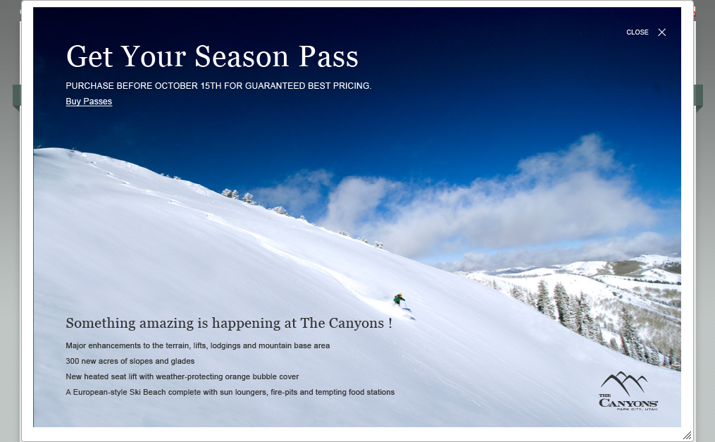 2) Landing Page Popover
I am greeted by a popover on the mainpage that actually gave me a link to the season pass page. What luck!
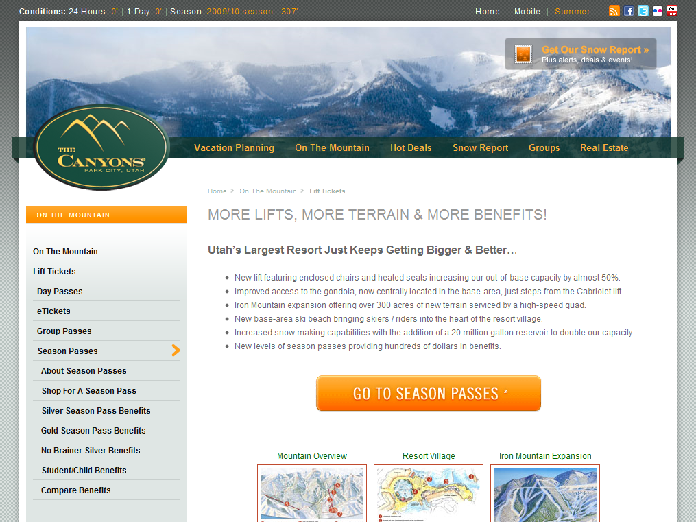 3) Mountain Improvements Page
Arrived at a page that wasn’t about season passes but about mountain improvements instead. Luckily there was a ginormous “Season Passes” link I could click to take me to the pass page.
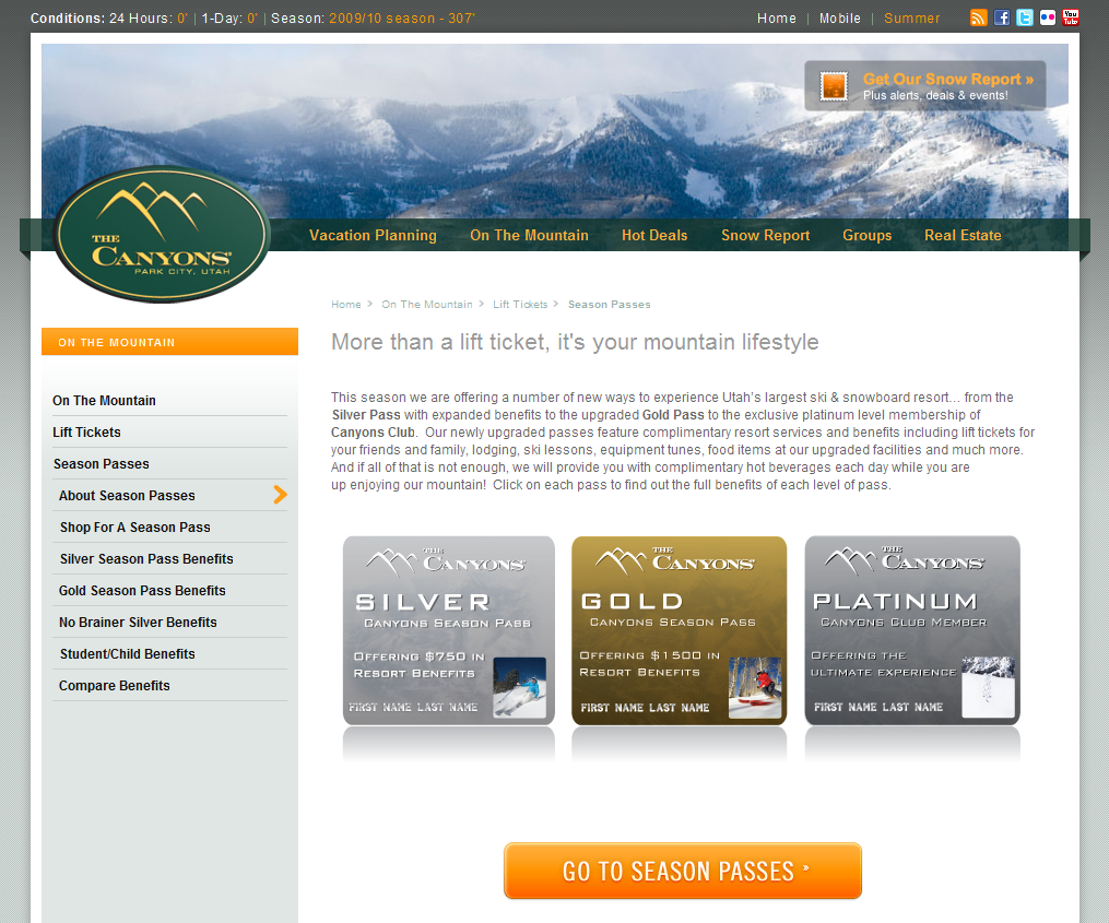 4) Three Passes Page
Land on a page with three pass options, none of which I am looking for. I see another giant orange link, identical to the first one in shape and text. Wondering if it will take me to the same page I am on, I click.
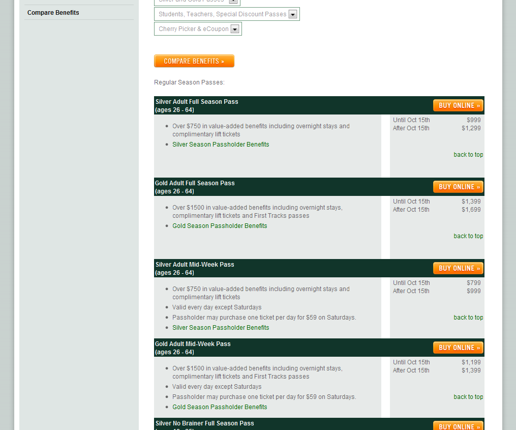 5) Options Page
Finally, I see what resembles what I am looking for: a listing of their different pass options. Except for one small thing, there are 29 of them. Overwhelmed and not interested in sorting through all of them I pull up my Firefox search bar and search for “student”. The first result is a sidebar link for “Student/Child Benefits”. Close enough. I click.
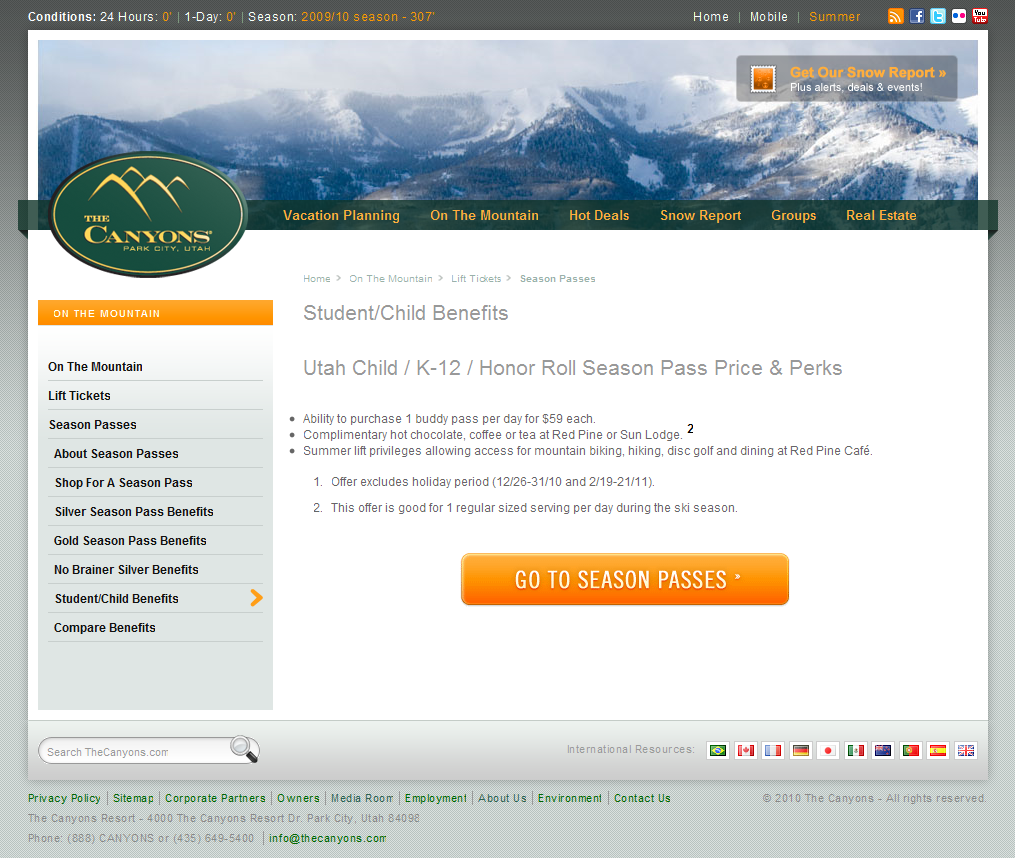 6) Benefits Page
The page I have now come to is a brief explanation of, in fact, benefits, just like it said, but no information about the pass itself. Luckily though, my friend, the giant orange season pass button is still there. Having clicked on this twice already and landed at two different pages, I hesitantly click again.
 7) Options Page
I’m back at the 29 pass options page and resign myself to scrolling through the page to find the student passes. Inspiration strikes after a small amount of scrolling and I type “honor roll” into the FireFox search bar. Bingo.
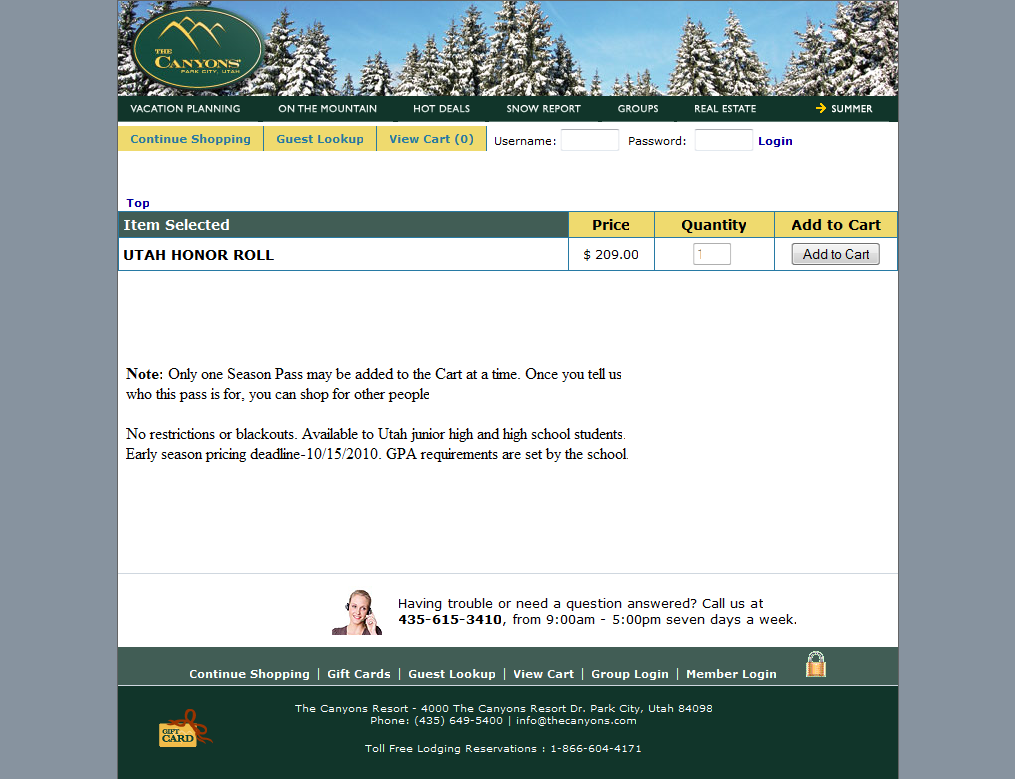 8) Mismatched Checkout
Interested to see how long this will take me I click “Buy Online” and am taken to a checkout system with a different design and color scheme. Also, it now is giving me the option to add a pass to my cart which I figured I had just done by clicking “Buy Online”.
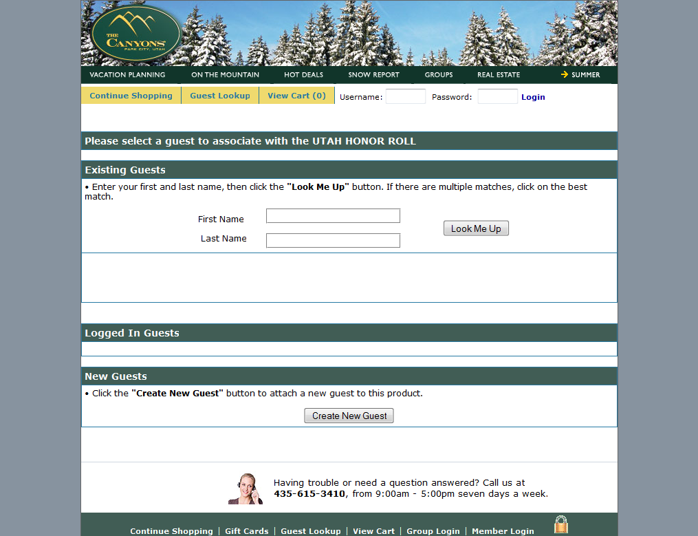 9) Sign In Page
I am now asked to sign in to my account or “Create a New Guest” (does that mean account, I wonder?). I click on create a new guest.
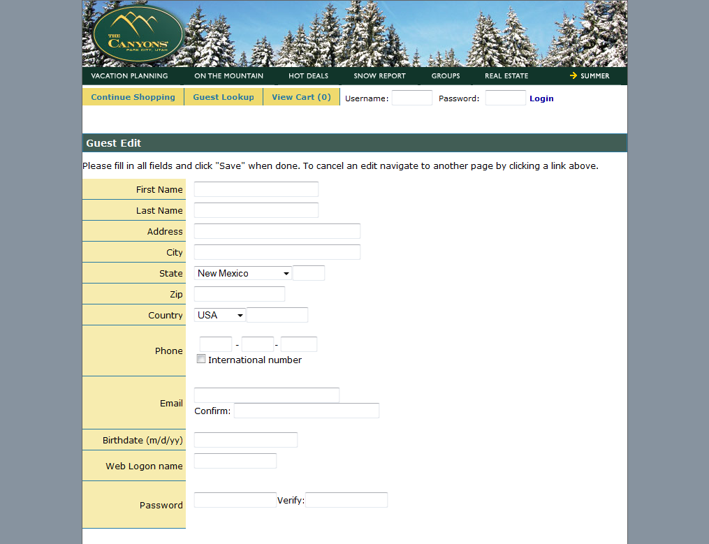 10) Create a New Guest
Sure enough, it just meant “Create a New Account.” I fill it out. At the bottom I must choose a password that has an uppercase letter, a lowercase letter, a number, and must be 8 characters long. Not even my bank requires that. I figure out some password (that i’ve already forgotten).
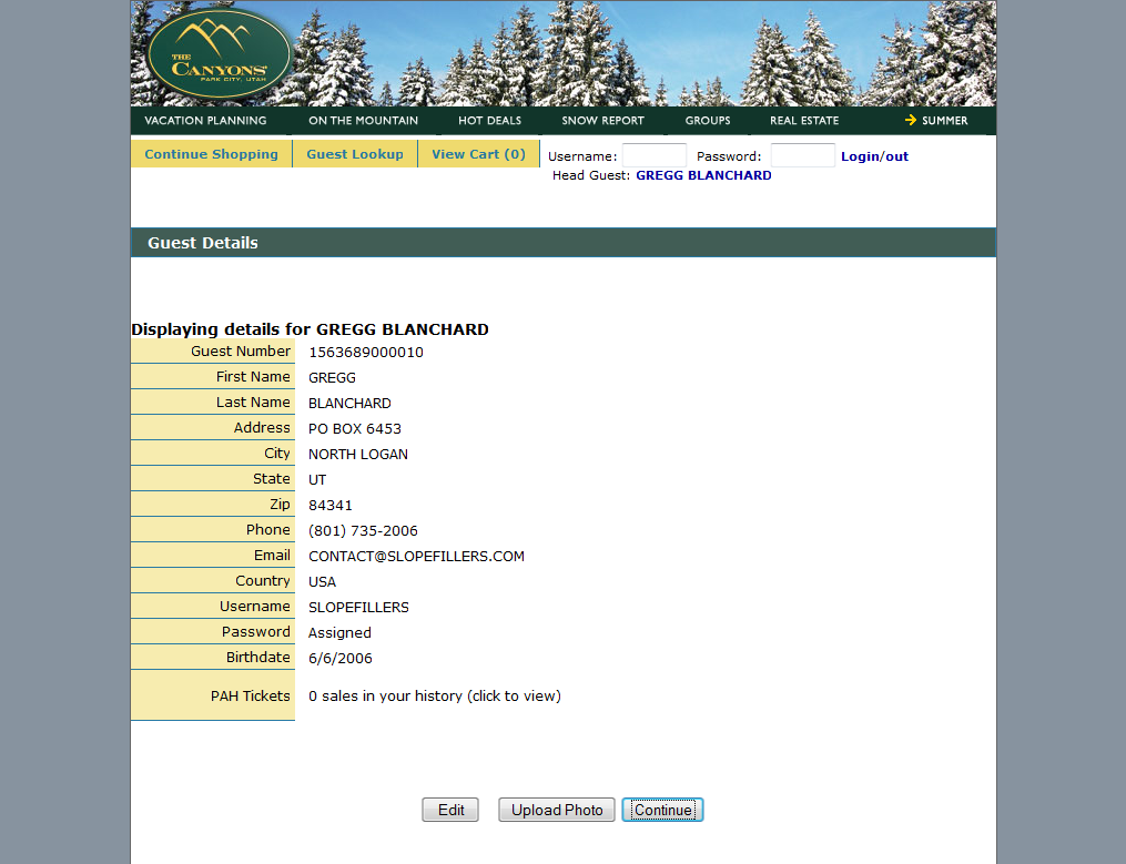 11) Review Information Page
Wanting to make sure my information is correct, it shows me a review page before I continue.
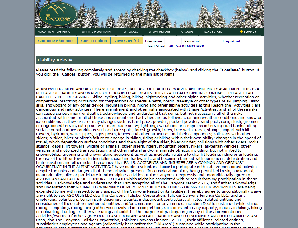 12) Liability Release Form
A long liability release form appears next. I read it extremely thoroughly and click “Accept”.
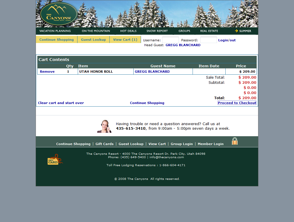 13) Shopping Cart
Woot! Finally it shows my pass in the cart, I am ready to buy!
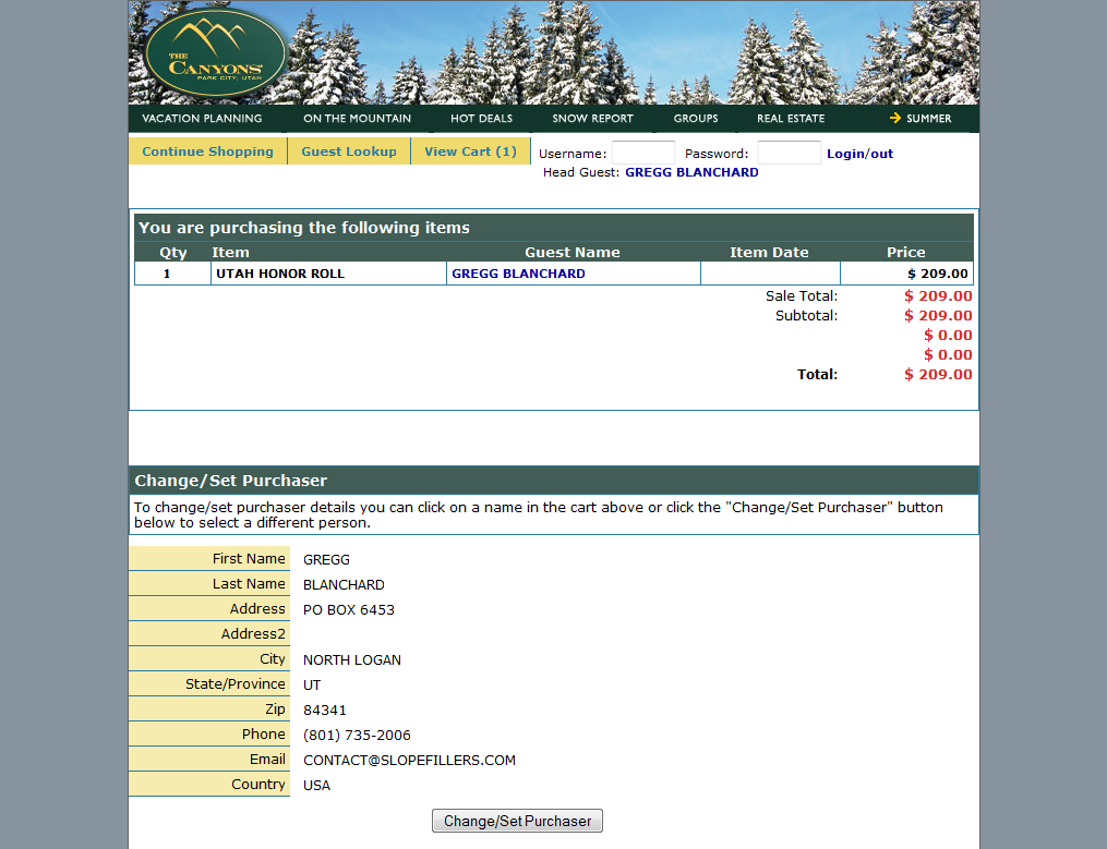 14) Make Payment
Not wanting to pay for a pass I can’t use, I abandon my cart, unsure of how many more steps there might be to setup a shipping address, and print a confirmation. Whew.
Is there not an easier way that doesn’t require a massive overhaul of the shopping cart system? What would you do to simplify this process?
 Gregg Blanchard