Taking FB’s New “Talking” Metric from Worthless to Priceless

There is an fundamental problem with most social media stats. It’s not that they aren’t interesting, helpful, or valuable, it’s that they aren’t AS interesting, AS helpful, or AS valuable as they could be. The issue lies in the lack of context these numbers are presented in. If I call a meeting with close friends and 5 show up, and you call a similar pow-wow but 50 show up, what conclusions can you draw? Almost none. Because we have such a small piece of the puzzle, these numbers don’t mean anything. Maybe I live in Dangle, ID and I only invited 5 people. Maybe you live in Syracuse, NY and you actually invited 250 people. Suddenly, my turnout looks a lot better than yours. The context gives the numbers meaning.
“Talking About This”
On your Facebook page, and in your page insights, there is a number called “talking about this,” a running, 7-day total of interactions with your page and it’s content. Every day it refreshes, adding yesterday’s numbers to the total and dropping off interactions from 8 days ago. The metric counts likes, comments, shares, fans posting on your wall, etc. Like friends responding to party invites, it’s virtually impossible to compare to other resorts. So, how do we give this number meaning?
Meet TAP (Talking About Percentage)
The solution might be this: divide “talking about this” by your page’s fan count to give yourself a talking about percentage, or TAP. This number, because it is a ratio, can be compared to any other page’s TAP, regardless of total fan counts. It’s not perfect, but is probably the best, free, public way to see how well your page is performing when it comes to engagement and how it compares to other resorts.
Compare to Any Resort(s), Starting Tomorrow
I mention this metric because tomorrow I am launching a new version of the social media dashboards. I’ve given a few of you a sneak peek, but tomorrow it will be live and public for all to enjoy. My main goals with the update were:
- Grab data every day for resorts instead of every month
- Grab more metrics for each resort, not just fans or followers
- Allow resorts to create their own “rankings” by comparing themselves to other, similar resorts
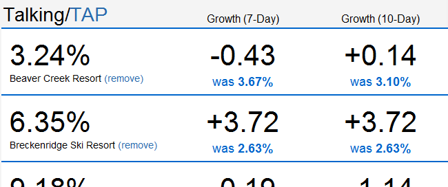
Here’s a quick screenshot of a TAP comparison for a few of the Vail Resorts:

Industry Trends
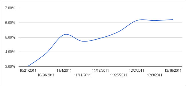
The graph below shows TAP for the North American ski industry as a whole since it was introduced.

The one, clear thing this illustrates is something you already know: as the season gets underway, skiers talk more and more about your resort. The trick is know if your resort is keeping up with other resorts? Improving your TAP isn’t enough if your increase is slower than everyone else’s.
Tomorrow, I’ll talk more about this. For now, take a look at your “talking about this” number, think about this idea of TAP (talking / fans) and meet me here in the morning.
 Gregg Blanchard