The Tahoe Super Pass Ups the Ante with a Beautifully Built Pass Sale Website
 Gregg Blanchard /
I’m going to be showing a bunch of screenshots with some token narration along the way, so let me just jump right in.
The new Tahoe Super Pass website is beautiful. But, Squaw, who I assume was the main force behind its creation, did an amazing job on a much deeper level. Because the more time I spend on it, the more simple, yet powerful marketing principles I see sprinkled through its pixels.
Let’s start with what you see when you first arrive on the page:
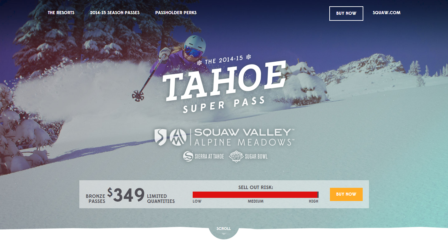
My first thought was, “wait, where’s the headline”, but the logos of the resorts involved and the price overlaid on the product itself tells the story. Plus, the name alone does an awesome job in that regard.
Then, with a hat-tip perhaps to the Mountain Collective’s inventory indicator, the Super Pass website uses something I’ve never seen before: a slider showing the likelihood of a sellout. Not sure it has the same psychological power over my brain as clear quantities, but a very intriguing concept.
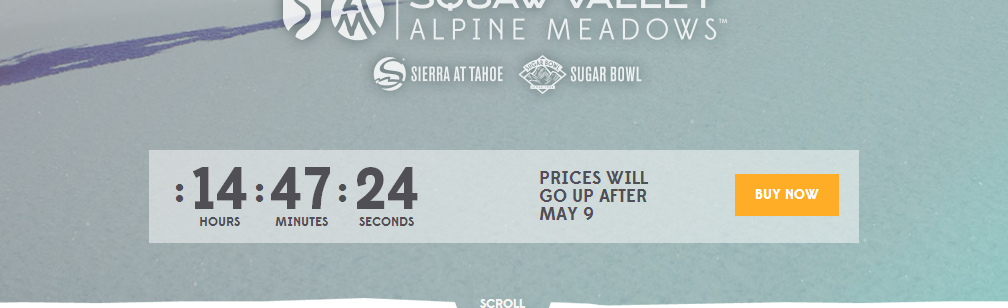
UPDATE: Today is a deadline and thanks to the keen eye of Attitash/Wildcat’s Thomas Prindle, I’ve been informed it now has a countdown timer. Well played!
Next, they jump into the numbers which, as I suggested might be the case with ONE Wasatch, can carry quite a marketing punch.
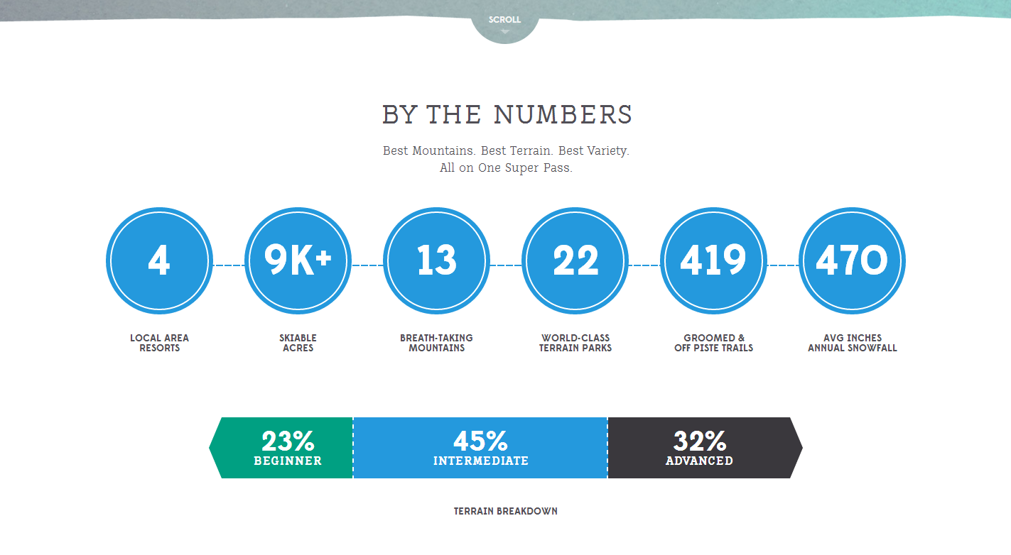
Love the graphic for the division of terrain difficulty. Beautifully simplified.
Next was a short video that combined the emotional elements of skiing with some numbers to seal the deal.
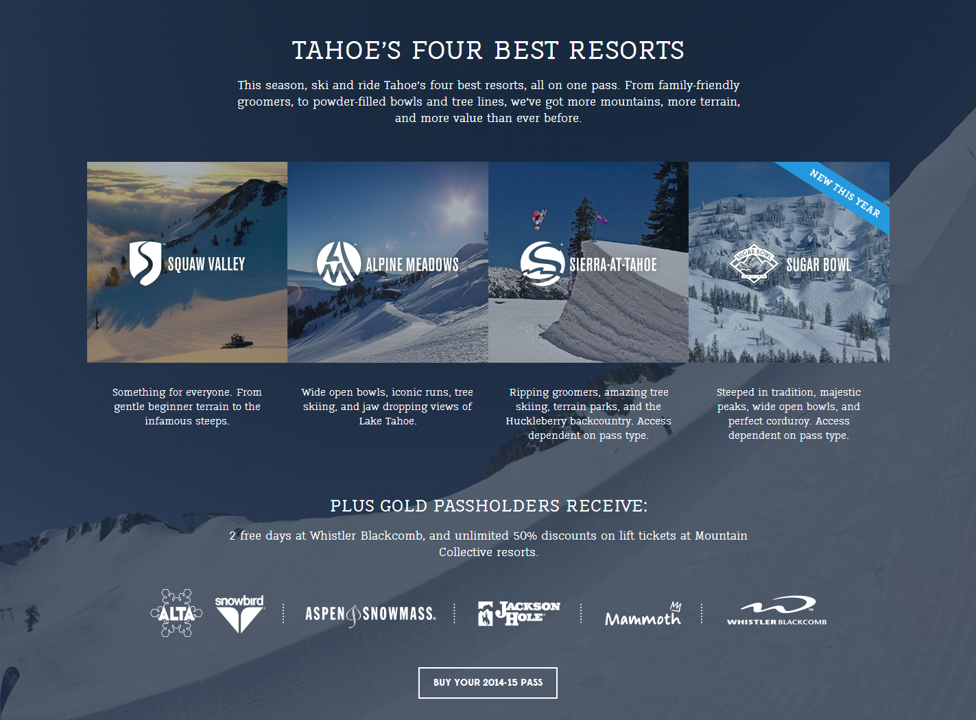
Followed by a well laid-out overview of the variety that exists across the four included resorts. These logos are then followed up with the Mountain Collective’s to harness some combined effects from these brands.
I didn’t realize that hovering over the images would show me the perks (was a little confused why “so many perks, we can’t list them all” would prevent them from listing any at all), but I like the layout and the tie between the visuals and the perk each is tied to.
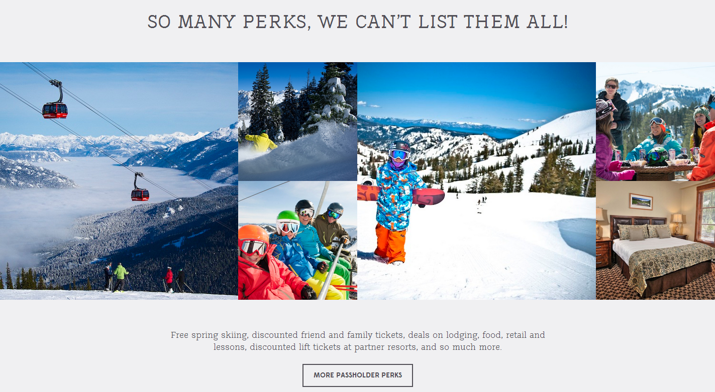
Perhaps requiring a hover to get the core message is where I got hung up (rather than a hover for details), so even just a word like “LODGING” or “FREE” as a placeholder might have helped me know a hover was expected and it wasn’t just a recreation of their Instagram web profile header.
But this next part is my favorite and something I’ve wanted to see more of to remove the complexity that exists within some resort products.
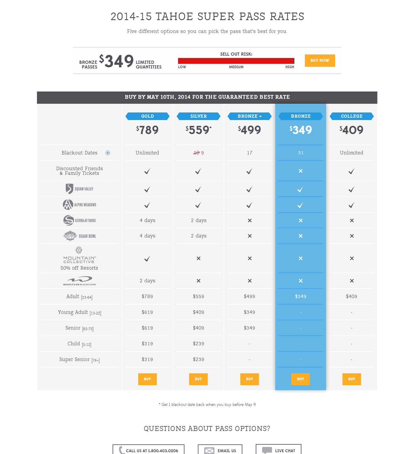
Columns, with a popular option highlighted, with breakdowns, check marks, visual cues, and more in an easy-to-compare format. A really well-executed element.
And then, more perks.
The way that broke up perks into different areas, put the heavy hitters first and then saved the long tail for the end, was brilliant.
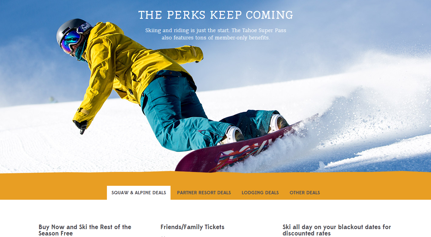
These four groups really rounded out the page and quickly lead to a “Buy Your 2014 – 15 Pass” button.
All in all, a beautiful design with some well crafted marketing elements that flow smoothly from one to another, concise text, well-written copy, and a lovely package that wasn’t overdesigned.
Great stuff.