What I'd Do
Slots & Netflix: Inspiration for the Ultimate Ski Vacation Planner?

BLANCHARD

I sometimes feel I do too much critiquing and too little suggesting. Like, somehow, I’m the 400 pound, mullet-sporting guy on his 3rd beer at the baseball game yelling at the 3rd baseman to hustle. So, every once in a while on a Wednesday I’ll try to balance the scales a bit and put my own ideas up for display, analysis, and critique. (view all ‘WID’ posts).
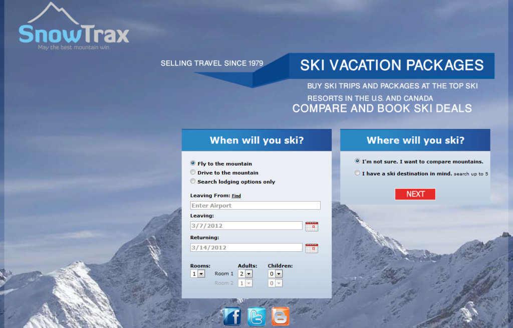
A while back I interviewed a new, somewhat promising company that was gunning to become the go-to OTA for ski vacations. One of my biggest issues with their site was just that, their site. The design was old-school, heavy, and made the experience awful. Fast-forward a year and a couple months and that design has changed very little. I am speaking of SnowTrax and today instead of just saying I don’t care for their site, I’m going to suggest an alternative.
These third party sites can be powerful marketing platform for resorts, but I see no reason this idea (or a much improved version, this is still a pretty rough sketch) couldn’t be used at a resort as well.
What it Looks Like Now
Main landing page. Looks like two forms, is actually one…plus a huge wad of wasted space.
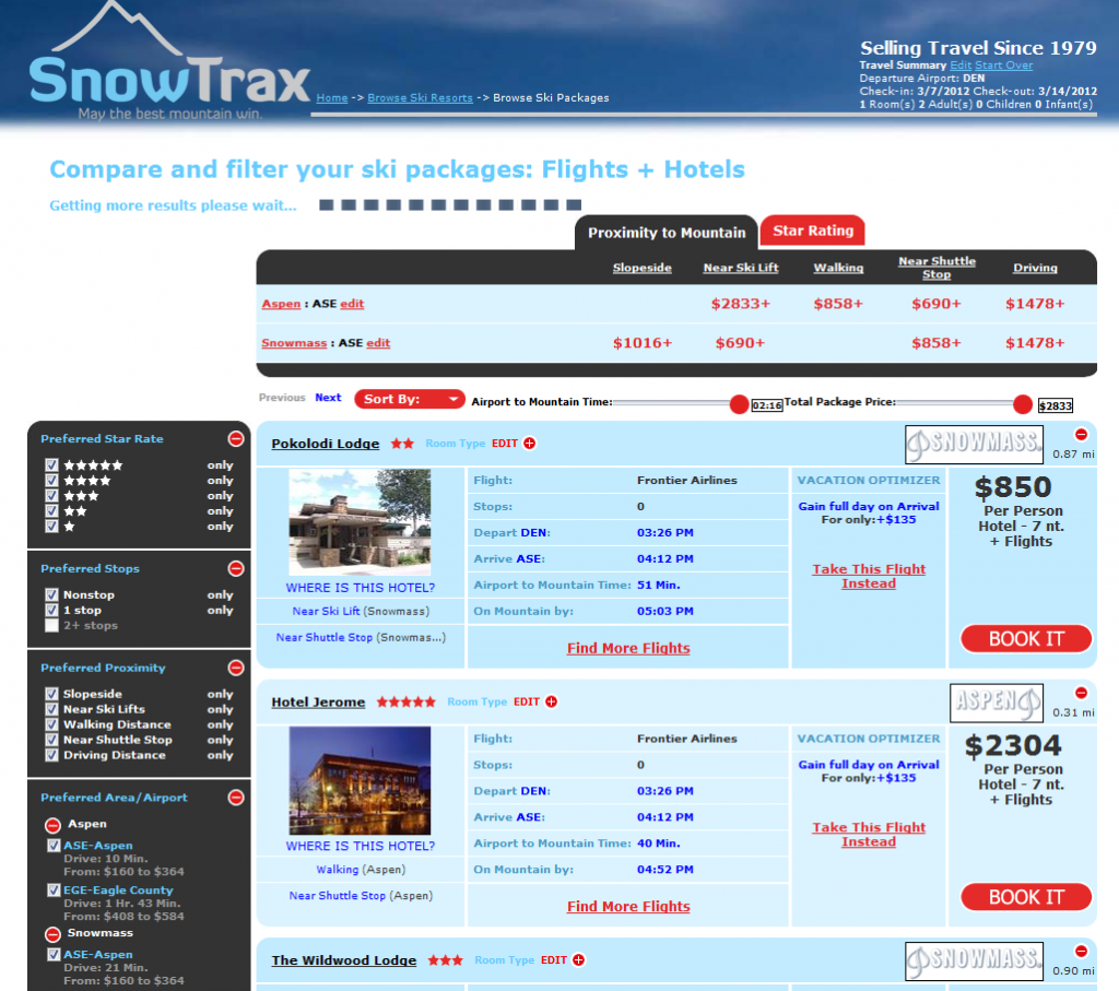
Vacation builder page. not sure who chose the colors…but it’s rather unpleasant. The layout? Unoriginal and uninspiring.
My Idea: Netflix Meets Vegas Slots
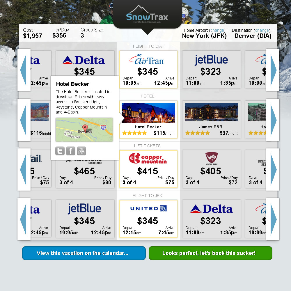
So, remember, I write a post every day, so this design is rough (i’ve already notice things i’ve missed, like the ability to change the group size). This is the result of about an hour and a half or so of work. Mistakes are in there, but the concept should be pretty clear. I’d start with a very simple, three input form based on two questions. I’ll worry about all the pesky details later because much of what I need can be gleaned from these two bits of information.
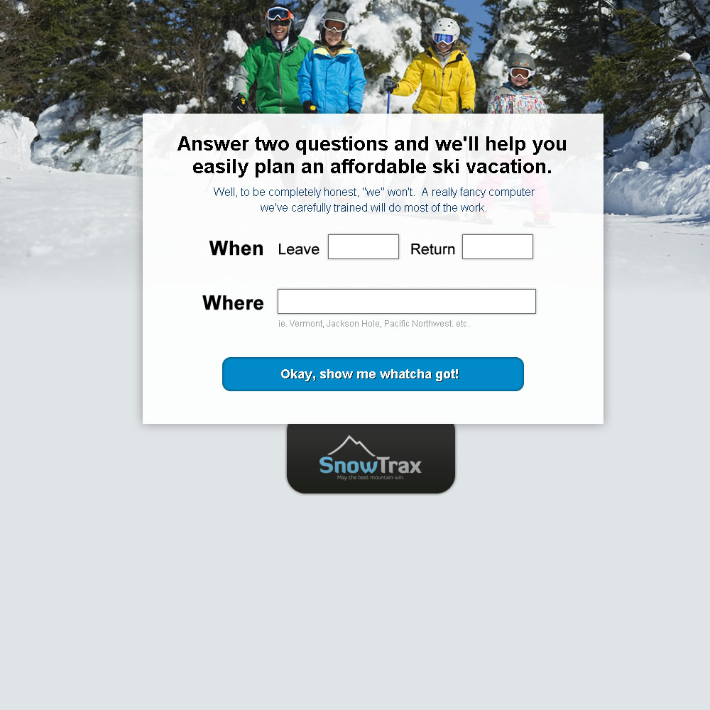
From there, I’d take all that info and stack pieces of their vacation on top of each other like a vertical slot machine. Instead of having the flight as one choice, I’d put the departure flight first, then the hotel they’d stay in, ski passes next, ending with the return flight, in the same order the vacation will happen.
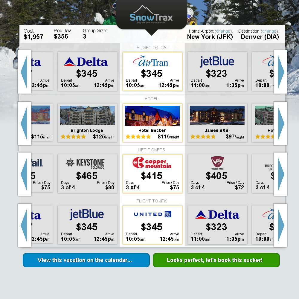
From there I’d use a Netflix like scrolling system to sort through the options, highlighting the center one as their choice and updating the total vacation cost and daily cost in realtime at the top.
If they want more information they can click on (or just hover over) the option and get a popup with a more photos, a map, description, and links to that properties social sites, customer reviews, etc.
Other Features to Add
I may even want to make those rows expand/minimize-able and stick in a couple of pre-minmized rows like rentals, transportation, etc. Adding a save button that would require an email address to preserve their search would allow you to follow up and remind them of their vacation idea, alert them if prices drop for those days, or suggest alternatives to what they had chosen that might be more affordable.
The Bottom Line
This idea makes vacation planning visual, easy to try different combinations, keeps it all on one page, and might just be unique enough to get some attention for a site like SnowTrax. But, like I said, it’s just a quick sketch.
So, there you have it, a rough idea to make vacation planning a little bit easier/fun/more exciting. If I were SnowTrax this is what I’d do. Maybe it would work, maybe it wouldn’t. Enjoy.
About Gregg & SlopeFillers
I've had more first-time visitors lately, so adding a quick "about" section. I started SlopeFillers in 2010
with the simple goal of sharing great resort marketing strategies. Today I run marketing for resort ecommerce and CRM provider
Inntopia,
my home mountain is the lovely Nordic Valley,
and my favorite marketing campaign remains the Ski Utah TV show that sold me on skiing as a kid in the 90s.
Get the weekly digest.
New stories, ideas, and jobs delivered to your inbox every Friday morning.
