Among my favorite logos is a resort you’ve likely never heard of.
 Gregg Blanchard /
Let’s setup this deeply insightful post by pretending we’re having a conversation over dinner at NSAA about resort logos.
YOU: Gregg, give me your top 5 favorite resort logos?
ME: Oooh, where do I start. Man, I think it’d be hard to not put Snowbird at or near the top. I’ve also liked Killington’s – maybe I have a thing for blue and green logos? – Arapahoe Basin would be in there, maybe Loon…
YOU: Hard to disagree, but give me a dark horse. Which logo would none of us expect?
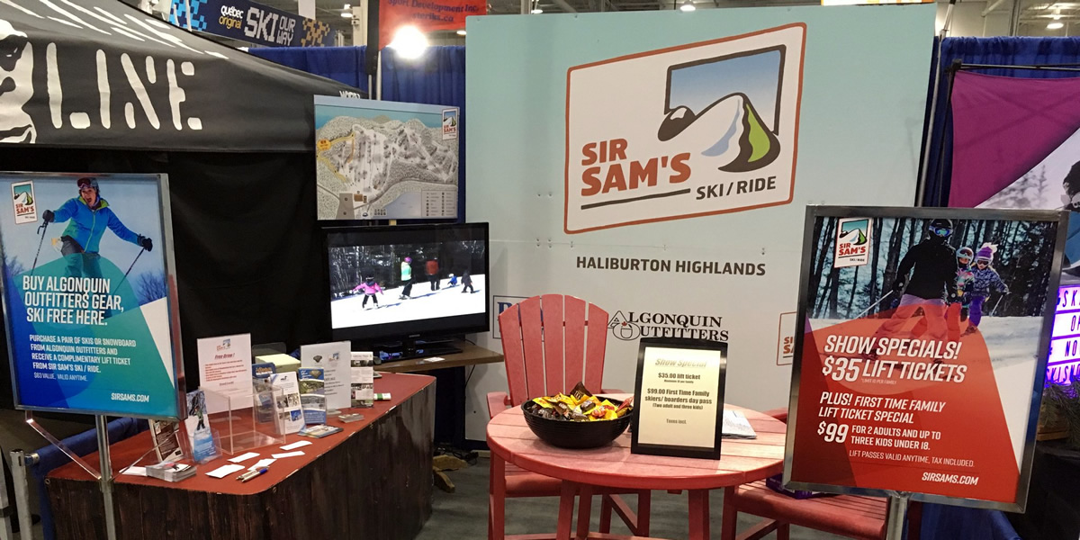
ME: That’d have to be Sir Sam’s.
YOU: Sir who?
Here’s the thing about logos. In the last decade I’ve probably designed close to a hundred. A dozen have seen the light of day through side projects. I’m not great at it, but it’s always a fun process.
Just the other day I was designing one for my brother-in-law’s accounting side hustle. We played with some marks and typefaces, stitched them together and played with new colors…
And about 30 minutes later had a pretty good idea of where we wanted it to go.
But it’s based on my rule of thumb for logos that is, in a few words, keep it simple.
I can create something pretty solid with a single color and basic shapes, but I’m simply not good enough to break outside of established norms.
Noise
Breaking outside of those norms is a big ask, you have to be creative enough to get outside of the box but smart enough to know where to draw the line. You’ve got to make sure that “clever idea” still works in all the situations logos need to be used. Situations that are easily accounted for when you stay within the norm.
It’s part of the reason so many logos look alike, but it’s also the reason some logos stand out.
Logos like Sir Sam’s:
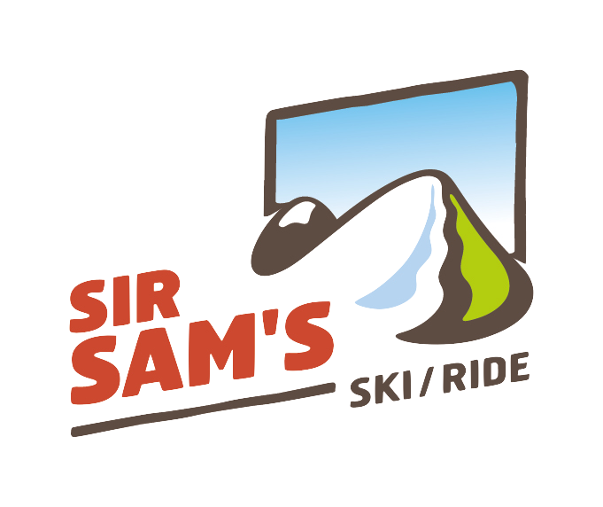
It’s hard for me to really explain why I like this logo as i much as I do, but let me describe four elements that I have identified.
1) It Nails the Tone
I think what’s lost in so many resort logos is a tone that matches our sport. Skiing isn’t serious, it’s fun. It’s not business, it’s play. Yet so many resort logos feel like business logos. They feel formal. Sir Sam’s doesn’t. The colors, the typeface, the graphics, the upward angle; all of these things send a message that this isn’t a stuffy, luxury resort, but a place to have fun.
2) A Scene, not a Shape
I love how much of the story it tells directly in the logo itself. It’s not merely a shape that means something (we all know how many ways mountains have been depicted in logos), it just sets the whole scene. A mountain, blue sky, snow, green for trees and summer, the works. And that angle? Dig it.
3) Feels Simple
But even with so much meaning, it feels simple. It feels easy to grasp and take in at a glance. It’s not overwhelming, it’s a very clean, tidy package. That’s a key element for a logo and really tough to do when you add more elements (hence the difficulty of going outside the norm).
4) Made for It’s Use
Whenever a new resort logo comes out, there’s almost always one critique someone will have:
“Great, but how do you put this onto a ski jacket?”
You could very well say the same thing here. But this logo, you see, has a trick up it’s sleeve. A trick that was designed right into the original package. A trick that ties beautifully back to the early days of skiing.
Because this logo was born to be a patch:
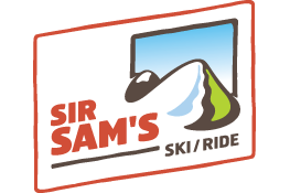
Indeed, if you look on Sir Sam’s website, that’s not just the way it’s used…

…but the actual name of the file: “Sir-Sams-logo-patch.png”. And that favicon? Money.
One More Thing
Perhaps what I like more than anything is the combination of all these paired with the resort who wears is.
Because, in a word, it’s unexpected.
You don’t expect a logo to tell you so much, to have so much meaning and message baked in. And if you were to see that, you wouldn’t expect it to be for a resort that most of you have probably never heard of.
So kudos to Sir Sam’s and the talented folks who designer behind this mark. It’s long been one of my favorites.