Responsive Design: Is This the Year for Resorts to Adopt?
Source: StatCounter Global Stats – Mobile vs. Desktop Market Share
According to Statcounter, Mobile internet usage is doubling year over year. If the trend holds, this time next year could see mobile browsing making up north of 10% of all browsing. With that in mind, let’s revisit a topic that I’ve brought up briefly before, but never given solid attention to: responsive design.
Responsive design is about making your site look the way you want it to no matter what screen resolution or device it is viewed on. My favorite example of this is Smashing Magazine.
Before you do anything else, go to their website and slowly make the browser window narrower and narrower, watching how it adapts to the different sizes along the way:
http://www.smashingmagazine.com/
Cool, eh? Actually, it’s beyond cool. It’s ridiculously useful and effective. No matter what device views their page, they know that their content will look exactly how they want it and that their content will fill the window perfectly.
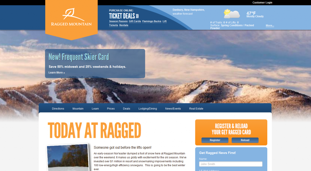
Early Adopters: Ragged Mountain
Jen Mazzei from JMaze design is the first designer I know of that got the nod to implement responsive design for a resort website. Like Smashing’s site, head over and give it a try:
http://www.raggedmountainresort.com/
Here’s what Jen had to say about Ragged’s decision to go with responsive design:
“Ragged decided to go with responsive design because it encompasses all media without thought and presented content. Having a separate mobile site was out of the question because they wanted to display the same content on the mobile as on the desktop but in a format that was easy to read and navigate, and they didn’t want to have to update their site in 2 different places or have limited pages. Responsive design provided the ease of use from an administrative point of view without sacrificing the mobile experience.”
So, central content management, smooth mobile experience on just about any platform, and streamlined experience.
Cost
What does something like this cost for a resorts? Jen weights in again:
“Having a web site developed with responsive design is more costly up front. You can typically plan on about 25% cost increase over regular web site. The reason being is that it takes more planning in the development phase – in essence you are designing the site 3 times. Think of it this way, small = phone, medium = tablet, and large = traditional laptop/desktop. The beauty of it is that you can target your messaging based on the device the viewer is using and manage it without having to worry about how it will look – that has been done already. You also are able to present ALL of the content in your web site without limiting navigation or pages. It is going to present the page depending on the device, with a mobile web site you are limited in pages (sticking to the top 5 – 7 page rule). Like with anything choosing the right solution depends on your needs/wants. Responsive is not the perfect solution for all web sites but a good majority would benefit from it. It will save you time and money because you are not designing for MANY platforms –android, blackberry, ipad, iphone etc etc. what happens when a new device comes out? Responsive design takes the stress away knowing you have a web site that is working at its optimal level on all devices. And its sexy.”
Is it worth it? To pay 25% more to make your content fit perfectly on a growing number of devices with dozens of resolutions and sizes, to me, is a smart move. If you are in the market for a redesign this year, this is something you should seriously consider.
 Gregg Blanchard