The more I see it, the more I love Pleasant Mountain’s logo and brand.
 Gregg Blanchard /
To clarify, I’m referring primarily referring to the visual aspects of what we’d call a brand. Mainly the logo, but also the colors, the design system, the guidelines that guide all of it and work together to make an effective little package.
And effective is exactly the right word for this one.
For whatever reason, this logo and brand speak to me, they stand out from other resort marketing, and they stand out from other marketing in general. I’ve talked about Pleasant’s brand before, but every campaign I see from them makes me love their brand more and more, so let me share more examples to highlight what I mean.
#1) The Logo
With a name like Pleasant Mountain, it wouldn’t make sense to have a harsh or heavy-handed design to serve as a visual anchor for your brand. So while I am a big fan of simple, sorta-retro line art, a friendly tree surrounded by soft, rounded shapes is perfect.
![]()
Even more, it’s super recognizable. There are so many variations of mountains in logos that it’s hard even for me to keep them straight. But this little design is clearly nature and clearly mountain-related, but it does so in a clean, fresh way.
#2) The Colors
Green and orangey brown are not totally unique in the ski industry, but it’s also not anywhere near the most common. Or even in the top 5. So I love the way that Pleasant Mountain has really embraced this unique combination and combined them with soft, complimentary grays in so many of their campaigns.
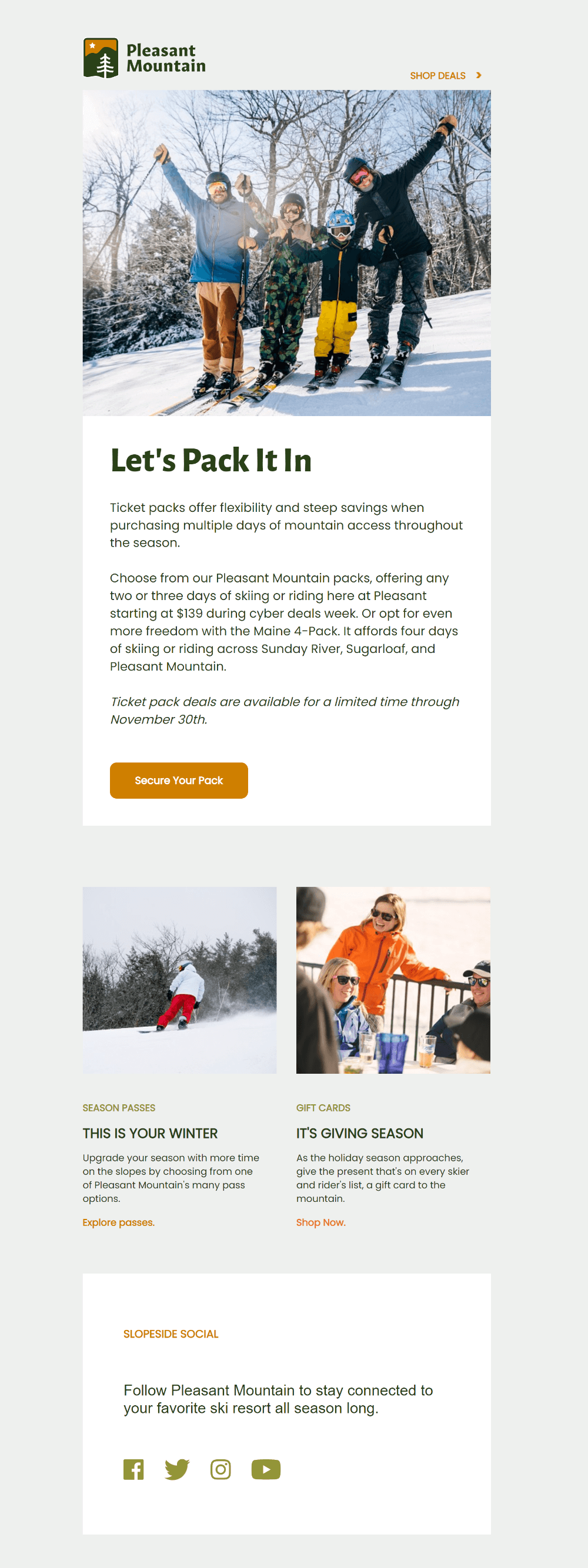
And do you notice how the color of the skier’s jacket in that hero imagine match the brown of the logo? And the green from the other skier match the other primary brand color? That’s no accident. When you look through their emails, that’s the norm, not some coincidental exception.
Though it’s important to point out that when your colors are brown and green, it’s much easier to do this and make it look natural rather than heavy-handed or forced.
#3) Space and Minimalism
There are so many resort website these days that are so incredibly busy. Promo boxes and videos and colors and hero images sit edge to edge in thousands of pixels of visual overload.
But not Pleasant Mountain. They combine those soft, natural colors with generous padding and succinct writing to make every block of content incredible easy to consume. Take that lower section of the email I just mentioned as an example of what I mean.
So many emails would have 200-300 words in this same amount of space, but Pleasant Mountain has just 16. Like Norman McClean’s father in A River Runs Through it, I also believe that the art of writing lies in thrift. And Pleasant’s copy is a beautiful illustration of what this can look like.
More Thrift
I think that motto of thrift is one that more resort marketers would do well to adopt.
It’s so easy and tempting to want your marketing to do everything. I’m guilty of this regularly as well. But there is power in simplicity, in whitespace, and in colors and language and visuals that make your brand approachable and easy to spend time with.
Pleasant Mountain does this beautifully.