A simple, timely reminder about truly great design.

I’m at odds with something I’ve noticed in my own behavior.
On the one hand, I believe in technology. I believe in the power of great visual design. Especially when the design and tech combine in a clean, simple solution to a common problem.
Speaking of problems, there are a few that plague a surprising number of resort websites:
- Clearly listing hours for lifts/operations
- Highlighting the day’s conditions and weather.
- Making visitors aware of upcoming events.
There have been all sorts of efforts by all sorts of resorts to solve this and many of them are incredibly cool.
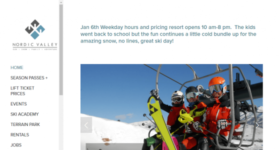
But the one that’s most efficiently, successfully solved this problem for my personal needs is this.
Yes, a sentence of blue text at the top of the site. That’s it.
No fancy widgets, no clever calendar integrations, nothing to break or worry about. It’s just…the information. Pure and simple.
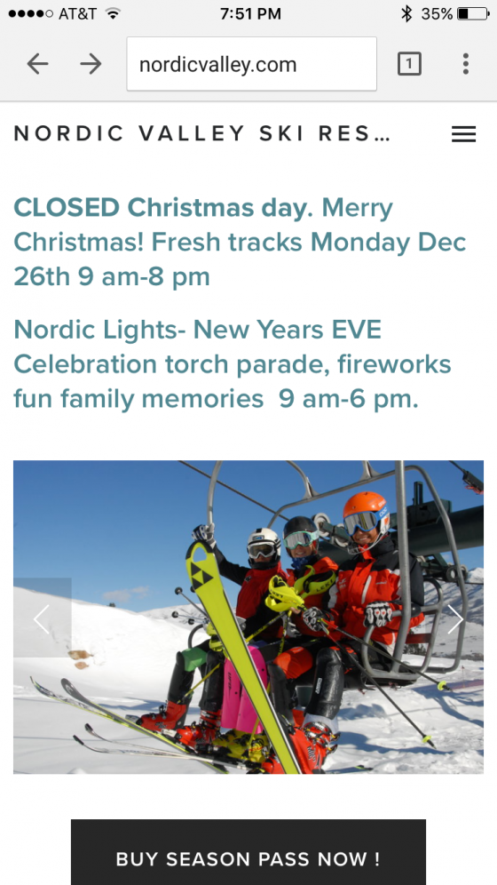
Here’s another example from Christmas eve.
Are they open tomorrow? No. What time do they open on Monday? At 9am. Any events coming up? Torchlight parade, New Years Eve.
It’s so simple it drives me crazy sometimes. And by sometimes I mean daily because, as a Nordic Valley passholder, I find myself checking the site daily. I check partly because I’m interested in the information and partly because I know that in a single page view I’ll see everything I need in the fastest, simplest format I could ever hope for.
At Odds
Like I said, I’m at odds between design that works and design that looks beautiful. It’s something I’m reminded of all summer long as I follow the professional cycling season.
Love that most useful site I visit has no modern design. Cheers, @steephill, for reminder of what makes sites great. pic.twitter.com/WXCaUOunOV
— Gregg Blanchard (@slopefillers) May 11, 2016
It can be incredibly hard to find a ski resort’s hours, sometimes my brain chases somewhat complex (on the back end) solutions to weather and calendars, but then I realize that the most useful thing to me this ski season has been a sentence of blue text at the top of a website that changes every morning.
At times we need complex solutions that are heavy on visual design. But other times, maybe we’re over thinking things. If we have a few things to say, maybe we should just…well…say them.
 Gregg Blanchard
