The subtle, intriguing branding play from Loon.
 Gregg Blanchard /
I often end up writing a post by catching myself being influenced by some piece of marketing, then backtracking to try to unravel why and how that happened.
This is another simple example of this.
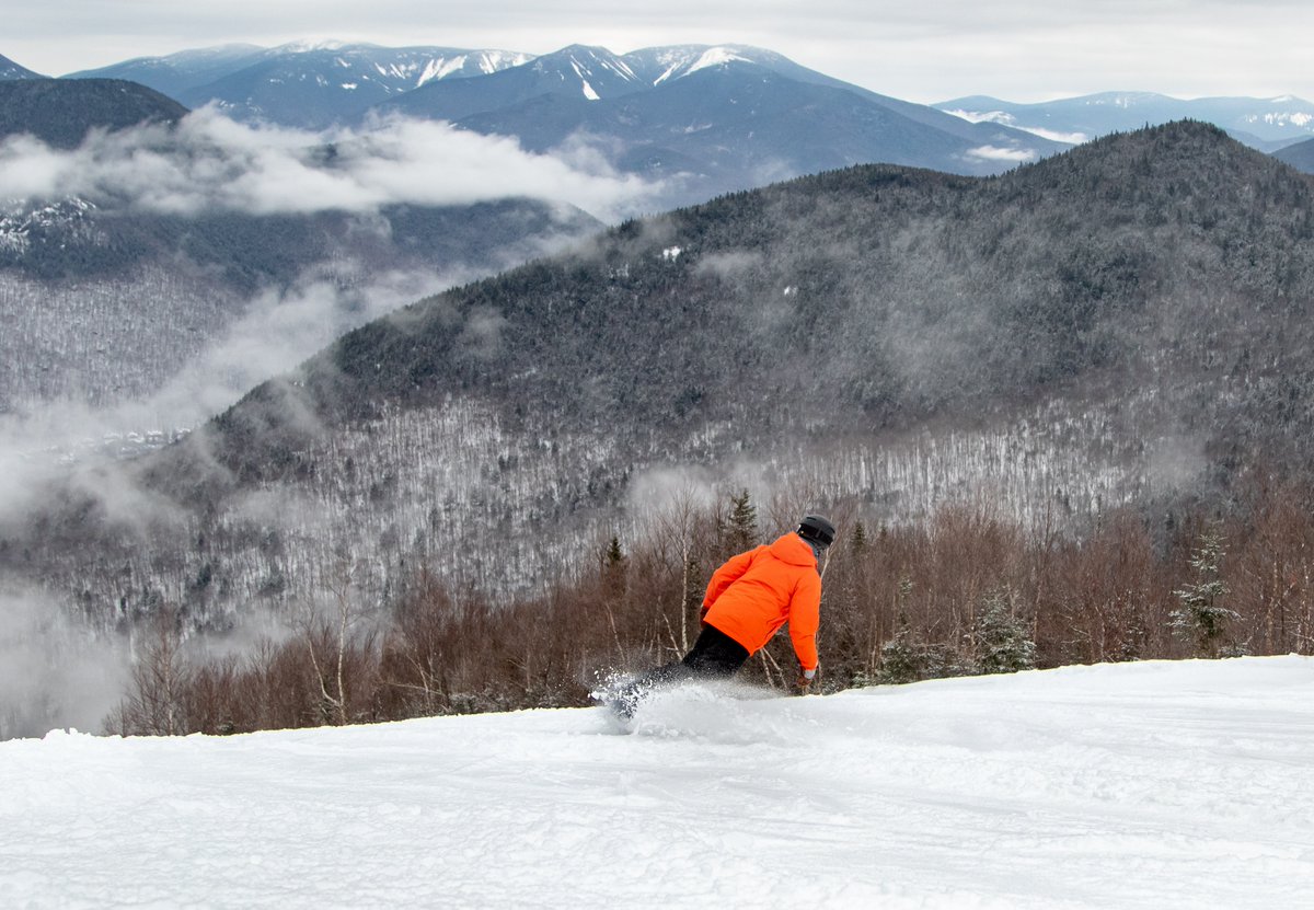
It all started with this photo. The moment I saw it I said to myself, “what do you bet that’s from Loon?”

Turns out, it was. I’m actually not sure how it saw it solo, but was able to track to down in a recent tweet.
https://twitter.com/loonmtn/status/1106214258637967366
So, naturally, I had a few questions about how I knew it was Loon (a resort I’ve never skied and only seen from the base area in the fall).
“Was it because I’ve been following the resort for a while and seen other, similar photos?”
Definitely a possibility. Mountains are distinct, even if you can’t describe why.
“Was it because of the quality of the photo?”
Also a strong possibility. I’ve long been a big fan of Loon’s photography.
“Was it something else in the photo that would signal it’s from Loon?”
This is where the wheels started turning because of the place eyes go: the snowboarder. What color is his coat? Orange. What the dominant color is Loon’s brand? Orange.
Lucky coincidence or clever move?
Well, take a look at other recent photos they had shared leading up to this moment.
Good morning from Loon! We have a great stretch of weather ahead of us with lots of sun and great temps… and 3-6" of snow on Sunday.
✅ 61 Trails (100% Open)
✅ 9 Lifts
✅ 6 Terrain Parks
✅ All trails groomed expect Triple Trouble and Big Dipper pic.twitter.com/4RfnOLwZJE— Loon Mountain Resort (@loonmtn) March 8, 2019
https://twitter.com/loonmtn/status/1103642399174205446
Not all, but many of the photos had a subtle, but clearly visible blob of orange. Sometimes it was nothing more than a zipper pull or sign in the background.
https://twitter.com/loonmtn/status/1105524931255771136
https://twitter.com/loonmtn/status/1106161422218731522
In some cases, I’m sure this was just a coincidence. There is enough orange signage on some mountains that it’d be hard to take a photo that didn’t include this color in your frame.
But, again, let’s rewind again the photo I started with.
With that orange theme supporting the other themes – scenery, quality, etc., what was it in my case that helped me know this was loon?
The answer, of course, is all of these things.
Intriguing Lesson
I’m not saying every resort photo should have nothing but on-brand colors. What I am saying, however, is I don’t think it’d hurt to at least consider scouting not just for scenery and moments, but for color , as you shoot.
Maybe it’d make zero difference. But as I review my own behavior, it definitely appears there’s a potential upside from doing so that supports and compliments all your other branding efforts.