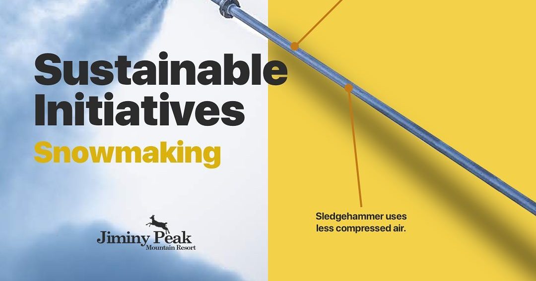
A hat tip to Jiminy’s “Sustainable Initiatives” social campaign.
 Gregg Blanchard /
This will be a quick post today, but I wanted to highlight something that’s caught my eye recently.
I rarely scroll my Instagram feed these days, but when I was doing so this morning I found the usual suspects – beautiful sunsets, smiling people, slushy bumps, etc. – but I also found something that both stood out but fit right in.
Let me know you what I mean and then dissect where my brain went as I pondered deeply (at least as deep as you can ponder on a Friday) the situation.
Notice three things.
First, a great photo.
Instagram is about scrolling through a beautiful feed of photos. So the fact this post starts with a high quality photo is key.
Second, great design.
But then they’ve layered on some clear, sharp visual design to get a simple message across. In other words, they’ve made sure that even though they strayed from a pure image, they made sure the quality didn’t disappear with it.
Third, balance.
You’d never want to fill a feed solely with this type of post, that’s not the primary reason people follow you. So I really like how Jiminy is on a 2:1 ratio with these. Two normal posts, one Sustainable Initiatives post.
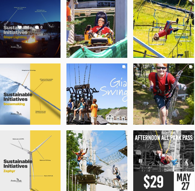
It’s always tricky to balance pure visual branding with your other key messages on channels like this, but I think Jiminy has done a fabulous job.
Strong visual, well designed, not too often. Seems like a good recipe.