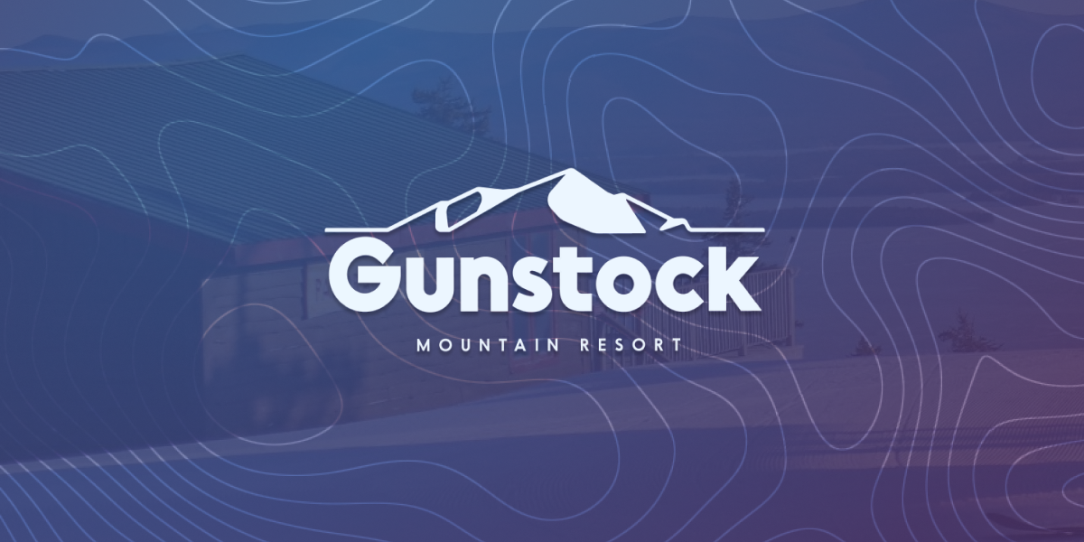
Gunstock shows it doesn’t take a lot of design to stand out.

So you’ve got something to say. You want people to notice it. You want people to remember it. You want people to be able to connect the positive vibes from those words/pictures/whatever to all the other positive vibes from other words/pictures/whatever you’ve shared in the past.
There are many things that can further this mission. One of those things is a little extra design, consistently applied to each such effort.
And it doesn’t take much.
Gunstock
Some of Gunstock’s recent tweets are a great example of this. By using a consistent overlay – topo-map lines with the logo top right – they’ve created a simple, visual pattern to build on.
— Gunstock Mountain Resort (@Gunstockmtn) December 3, 2021
— Gunstock Mountain Resort (@Gunstockmtn) December 1, 2021
— Gunstock Mountain Resort (@Gunstockmtn) December 2, 2021
Sprinkle in some big, blocky letters with the color matched to the subjects in the photo and I noticed multiple of these tweets in my feed.
Not 100% Unique
Have other brands used topo lines? Yes. Have other brands used big blocky letters? Yes. Have other brands overlaid their logo? Yes.
The goal with design isn’t to be a completely unique work of art, it’s to use simple design ideas – like topo lines and blocked letters – consistently so that every post has a better chance to:
- Stand out in someone’s feed, inbox, etc.
- Get the message across
- Tie everything together and back to your brand.
That’s what Gunstock did. And that’s what they got. Good stuff.
 Gregg Blanchard