Websites
Four things I’m digging about Cannon’s website.


BLANCHARD
Websites have been on the mind lately. I’ve covered a lot of resorts’ online homes over the years but I was looking for a little bit of inspiration. So I pulled up 15-20 random resort sites, browsed around and…honestly…was a little disappointed.
There was just so…much. Text. Images. Visual flows. My eyes jumped more than they consumed.
But then I got to Cannon Mountain. And everything I felt like those other sites were missing, Cannon had done well. Specifically, there were four things.
#1) Let the Image Speak
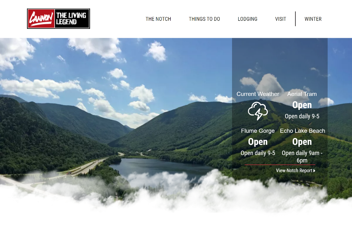
The first is that they used a classic, wide-view shot of the resort for their hero image. As you likely know, I’m a huge fan of these images. Notice that there’s almost text on the image, it’s just a beautiful glossy photo with very little to get in the way of appreciate and being inspired by the view. Even more, notice what they feature in that weather box. I’ll circle back on that later.
#2) Lots of Meaning, Few Words
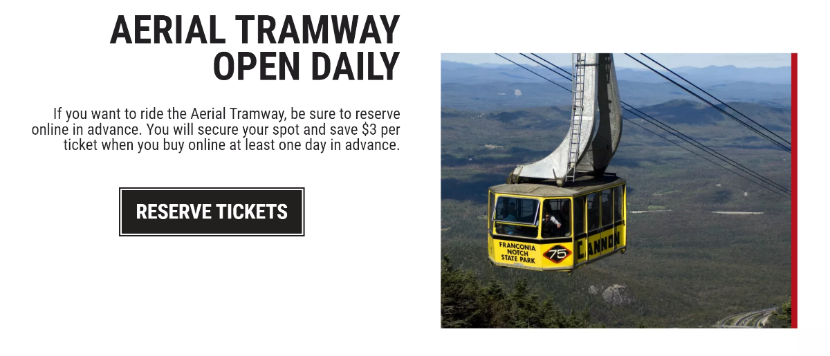
Next the site goes right into a series of content blocks. I love that they’re conveying a lot of information in an extremely small, glanceable area. You see:
- What it is
- Whether it’s open
- Details to know if you’re interested
- Where to go if you’re ready to buy
All in about 35 words. Yeah, I’d love to see just a tiny hint of “give me a reason to care”, but I can’t complain too much about that.
#3) Four Things, No More
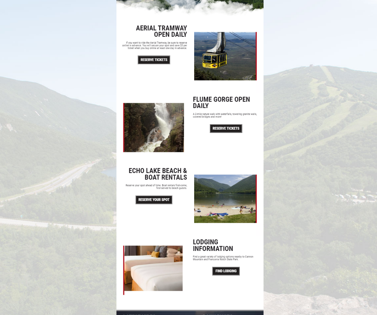
They use to alternating content blocks layouts to add a little visual variety, but with such succinct copy and clear visuals you almost don’t need it. Four items is a great number. It’s not too many that you get overwhelmed, but as a whole, it’s also enough to give someone a compelling reason to spend the day there.
#4) Repetition and Reasons, Not Overwhelm
The footer? More visuals to inspire folks to visit. That’s it. That’s the homepage. It acts as both a sales page as well as almost a sample itinerary. Three items to do and one place to stay. Even more, these are the ONLY things we’ve been promoted so far. Remember that area over the hero? Yep, beach, hike, tram. They’re using repetition instead of just adding more more things into the visitor’s brain.
A Story, Not Just Content
So many resort home pages just try to have something from every corner of the resort: lodging, lessons, tickets, food, another lodging option, passes, weddings, rentals, packages, golf, disc golf, bike trails, winter stuff, summer stuff…the list goes on.
Canon didn’t do that. They boiled it own to four, complimentary things, used repetition to drive them home, and built everything on beautiful photos to inspire folks to act. An inspiring photo, three awesome things to do, a place to stay if you wanna do them, and more photos to ratchet up the inspiration a bit.
Well done, Cannon.
About Gregg & SlopeFillers
I've had more first-time visitors lately, so adding a quick "about" section. I started SlopeFillers in 2010
with the simple goal of sharing great resort marketing strategies. Today I run marketing for resort ecommerce and CRM provider
Inntopia,
my home mountain is the lovely Nordic Valley,
and my favorite marketing campaign remains the Ski Utah TV show that sold me on skiing as a kid in the 90s.
Get the weekly digest.
New stories, ideas, and jobs delivered to your inbox every Friday morning.