Data
Is There Any Value in Facebook Check-ins as a Comparison Tool Between Ski Resorts?


BLANCHARD
Facebook checkins. To be fair, I often forget they exist.
But exist they do. These days, the term “were here” and “check in” is synonymous (at least according to the Facebook api) and isn’t just a reference to actual check-ins, but also tagging the resort as well as a few other factors (though it’s been hard to get a current state of affairs).
With Facebook used by virtually all major resorts and a couple questions coming about why I don’t include this number in the dashboards, I decided to dig a little deeper on this metric to check its accuracy both on an individual resort and industry level.
Let’s Start with the Big Guys
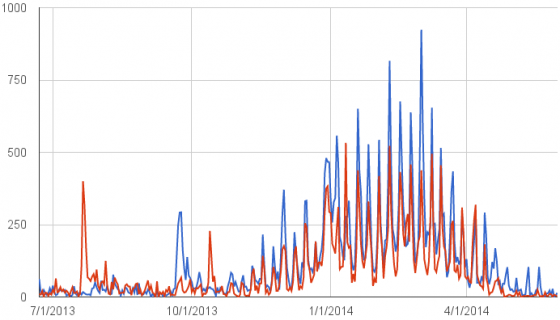
Wanting a resort with a massive annual skier visit number and one whose individual spikes I might be able to recognize, I started with Vail (Red) and Whistler (Blue). Here’s how that looks when the numbers are pulled daily from June 1, 2013 to June 1, 2014.
Pleased with how things shook out, I pressed forward.
Moving East
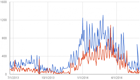
With smaller skier visit numbers in the East, that was my next test. I started with Sunday River (Red) and compared them to Killington (Blue) for the same dates.
Again, not too bad and even comparing it to their larger peers in the West, you can see a larger variance between weekdays and weekends.
The Trick
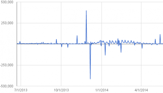
What I didn’t show you on each of those graphs is what they originally looked like because almost every one had at least one data point that was either frozen or totally missing/off on any given day.
Those are easy enough to correct manually, but when you try industry-wide stats you get something like this:
When the blip in numbers was widespread, you get crazy spikes. When it’s localized but affects a large resort, you get weird spikes and troughs. But with so many anomolies, it’s nearly useless on this scale.
One Last Check
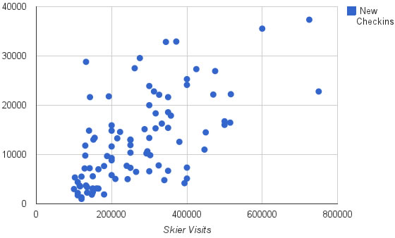
But I had one last question before wrapping this up: Was there a consistent enough ratio between a resort’s annual skier visits and their Facebook checkins to effectively predict an area’s annual skier visits based on this number?
To find an answer I looked at 100 average-sized resorts (100k-750k annual skier visits, based on my numbers), removed some of the outliers, and then compared their visits to the increase in their “were here” number and used a scatter plot to see how closely they stuck together.
Another way to represent this is by taking the ratio between skier visits and checkins (100,000 skier visits / 2000 checkins = 50 on the chart below) and look at the consistency between those.
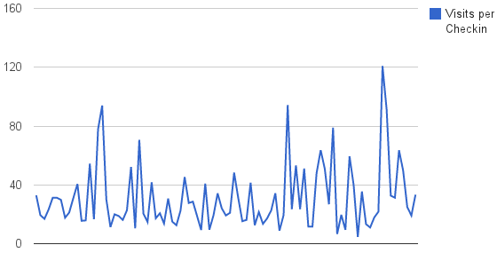
But no matter how you slice it, or how many outliers you remove to make it look like something useful, it’s not. The difference between resorts is too great to use it for any form of accurate prediction.
Yes and No
Is it a valuable number? Yes. With a little bit of manual auditing you can get some really interesting data sets and comparisons between individual resorts.
Is it valuable on a large-scale? Not so much.
I’ll keep my eye on it, but right now it’s a little too inconsistent to depend on.
About Gregg & SlopeFillers
I've had more first-time visitors lately, so adding a quick "about" section. I started SlopeFillers in 2010
with the simple goal of sharing great resort marketing strategies. Today I run marketing for resort ecommerce and CRM provider
Inntopia,
my home mountain is the lovely Nordic Valley,
and my favorite marketing campaign remains the Ski Utah TV show that sold me on skiing as a kid in the 90s.
Get the weekly digest.
New stories, ideas, and jobs delivered to your inbox every Friday morning.

