Websites
A small UX/UI change on Deer Valley’s website that’s worth a nod.


BLANCHARD
Let’s say you’re going to build a new website this summer. And let’s say one of the things you’d like to improve is the top navigation. A large number of sites these days use some sort of hover-effect for this interface. Hover on a link, display a list of second-level links related to the first.
So, here’s the question, what should happen if you click on that top-level navigation text that activated the hover?
- Nothing
- Be taken to the top level page for that topic
You may think this would be pretty straightforward, but dozens of resort websites fall into each of these two buckets.
The Question
Interestingly, the Inntopia website I inherited a couple years ago had a similar approach: hover and reveal the links, but nothing happened if you clicked on the text.
Needing one more element, we extended it using an icon. Initially, just like the other links, this icon was NOT clickable. If you hovered over it a two-item menu would appear. But the icon was hover-only.
Then one day my partner-in-crime Donnie Clapp had a question.
“How many people do you think are trying to click on that icon? We could just make it a link, but what would happen if we just added a GA event to that icon that fired every time someone did so we could get some numbers first?”
It was a great idea, so we added the code and waited. A while later we went back and reviewed the last 1,000 clicks on that part of our nav. And the results were as follows:
- Link #1: 519 clicks
- Link #2: 94 clicks
- Icon: 387 clicks
Yes, 38% of people were clicking an icon that wasn’t even a link. And why wouldn’t they? Navigation means to get to somewhere else. So if it’s in the nav, reason would suggest it’s something you’d click.
Deer Valley’s Solution
There are a few courses of action based on what we found:
- You could just make that text clickable in the first place (which is what we did with our icon, a dead-simple fix)
- You could use a click instead of hover to expand the nav like Sunday River (and other Boyne sites, this is actually becoming more and more common)
- You could show/hide the entire nav on click like Steamboat and include those top-level links in that layout (and other Alterra sites)
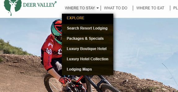
All of these are good options, but Deer Valley added another one I hadn’t really seen on a hover-only nav. They simply put a top-level navigation link (in this case “EXPLORE”) at the top of each list.

Without recreating their whole nav, they were able to give those clickers a simple, clear alternative either before they tried clicking the nav text or after they unsuccessfully tried to do so.
There probably isn’t a one-size-fits-all answer, but I like that simple tweak from Deer Valley.
However you design for it, though, this is definitely something you need to keep in mind. If you have a nav bar at the top of your page, people will try to click those elements. Maybe you embrace that click, maybe you give an alternative like Deer Valley, maybe you do a little of both. But definitely something to design for.
About Gregg & SlopeFillers
I've had more first-time visitors lately, so adding a quick "about" section. I started SlopeFillers in 2010
with the simple goal of sharing great resort marketing strategies. Today I run marketing for resort ecommerce and CRM provider
Inntopia,
my home mountain is the lovely Nordic Valley,
and my favorite marketing campaign remains the Ski Utah TV show that sold me on skiing as a kid in the 90s.
Get the weekly digest.
New stories, ideas, and jobs delivered to your inbox every Friday morning.
