Before & After: Even the Great Whistler/Blackcomb Isn’t Immune to this Issue
 Gregg Blanchard /
Before I get picky, I’ve gotta butter up Whistler/Blackcomb a bit because, well, they deserve it.
They are responsible for some of the best marketing I see online, in print, and in email. I’m constantly blown away by what they do. So, with such a flawless record what could I possibly not like?
Their email sign up form.
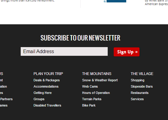
Before
Here’s how it looks now in the footer of almost every page on their website.
So, what’s the problem? Well, maybe “problem” isn’t the right word, but here’s what I see.
First, it’s a blind request: subscribers have no idea what they’re getting or how often they’ll be getting it. “Newsletter” means nothing. It could be worthless garbage five times a day or random yakking once a year for all they know.
Second, they have given a potential subscriber zero reason to give it a try. Will I save money? Will I learn things that help me have a great time?
An email address is currency, there’s no value proposed for someone to weigh against the value of their email address and space in their inbox.
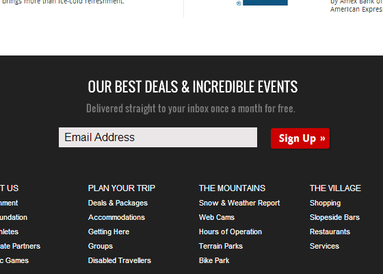
After
To fix this I sketched out a draft that would do two things.
First, it would setup an expectation of both contents and timing.
Second, it would propose a clear value that they could weigh against their email address to see if it’s worth the transaction.
Nearly all resort email opt-in forms are in the same boat. Telling me to subscribe to your newsletter is like telling me to give you my phone number in exchange for a cardboard box. That box could have something useful, worthless, or it could be completely empty.
Fill the box, give it a label, then ask for an exchange.