Before & After: The Email That Tries to Be Everything…to Everyone
 Gregg Blanchard /
I’d describe the way most emails are designed as websites. That’s what they look like. Except they’re not.
Emails are not websites. They’re emails.
Websites are really good and generating transactions, emails are really good at getting people to where the transaction can take place.
Before
A lot of marketing emails I see are just like this one from Beaver Creek. The content is well organized, well written, and placed into a nicely designed template.
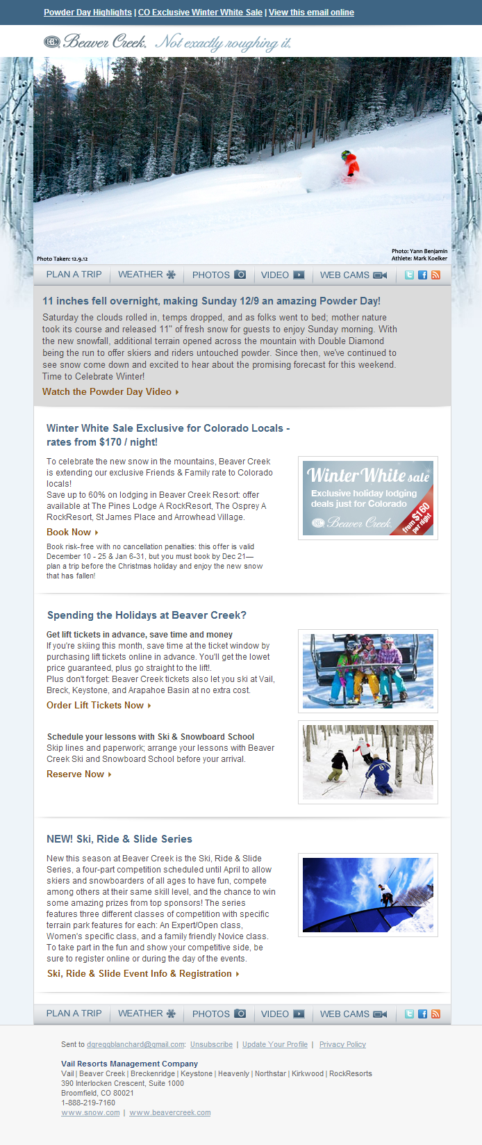
But to me, this is broken. Why? Some of this may seem redundant, but:
- The length and text size make it super hard to read on a mobile phone
- Everything is equally important, and when everything is important, nothing is
- Email isn’t where I go to read lots of pararaphs
So, how would I tweak it?
After
This is what my first sketch came up with.
To me, it seemed the goal of this email was to get people to act on a “Colorado Exclusive: Friends & Family Winter White Sale” and lure them in with the idea of fresh snow. That was my goal, more than anything else I wanted them to get that message and do something about it.
So, I didn’t give them a chance to do anything else and I made sure that if they remembered anything, they remembered the core message.

I got rid of the website-like nav, the “view online” link, the tagline, the footer links, the ski and ride series, the lessons. Everything was related, so I put the two things I wanted to keep (lift tickets and the video) in the paragraph. They consume everything at once.
Jackson Hole is awesome at this, but they are a rare breed. To me, emails with a half dozen equally important options could pack an even more powerful punch with some changes. And I think the solution lies in simplicity.