Websites
One of the best new ski area websites belongs to one of the smallest.


BLANCHARD
I talked about a free golf course in Pennsylvania. Yesterday I talked about community ski areas that come close to offering what that course does.
As I was wandering around seeing what some of those areas were up to, I found this.
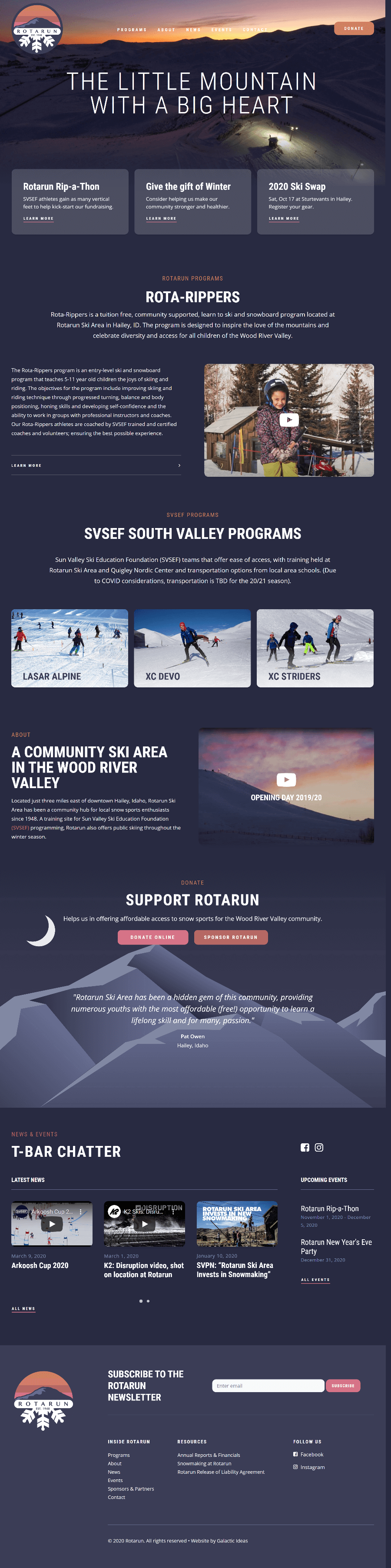
By all accounts and measures, Rotarun shouldn’t have a design and framework that stands out.
But they do. Let me dig into why I do.
#1) Classy, Evergreen Hero
Swapping out your hero image? Nifty. But I think there’s a ton of value in greeting people with that classic, beautifully-framed, branding view. And by sticking with that photo, the designers were able to choose one that incorporated brand colors and flowed elegantly to the rest of the design.
#2) Clean & Readable
The site has a max-width of 1,350 pixels which by itself I like because it keeps the content from spreading too far out on larger screens, but the widest any block of text goes is about 920 pixels with a nice 19px font size. And the font weight? Nothing “thin” or “light”. In other words? It make the content extremely easy to skim, scroll, and, most importantly, read.
#3) One Page (Almost)
I’ve long believed there’s an opportunity for some ski areas to get closer to a one-page design (the belief behind that being we tend to grossly overcomplicate resort websites), and this is right in line with that. The first two nav elements? Internal links to further down the page. Blog posts and events aside, I’d estimate 90% of the key content is right on the homepage.
#4) Little Things
There are so many small touches on this site that I love:
- The purple color and complimentary shades reminiscing of sunset/sunrise that set a clean, warm tone
- The simple elements and lines that break up content areas neatly without the jarring transition of major color or background images
- The use of clean mountain art instead of a background image in the footer and blog posts
If I had to put a sentence to it, I’d say this: it’s not overdesigned.
Evolution of Themes and Agencies
A code-lover like myself can’t help but peek under the hood, and in this case you’ll see that it’s powered by WordPress with the theme built on the popular Uncode platform which the agency behind this site – Galactic Ideas – uses for most of their client work.
Now, part of my wants to claim victory that great resort websites can come from WordPress themes. But these days WordPress themes are much more platforms than one-click solutions.
So I think the real lesson here is the wisdom this agency has in not starting from scratch, but recognizing that this platform has so many great design best-practices baked right in (and a design philosophy that aligns with theirs). And that’s why this works so well: They started with a proven platform to solve many of the problems associated with creating a great website, so they could spend their time on the rest – the ones that are specific to the resort they’re working with.
And the results? They speak for themselves.
About Gregg & SlopeFillers
I've had more first-time visitors lately, so adding a quick "about" section. I started SlopeFillers in 2010
with the simple goal of sharing great resort marketing strategies. Today I run marketing for resort ecommerce and CRM provider
Inntopia,
my home mountain is the lovely Nordic Valley,
and my favorite marketing campaign remains the Ski Utah TV show that sold me on skiing as a kid in the 90s.
Get the weekly digest.
New stories, ideas, and jobs delivered to your inbox every Friday morning.