5 More Original Ski Resort Website Designs Launched
I think it’s important to give a mention to all the veterans whose service we recognize today. I’ve been reading a book this week about the 10th Mountain Division who performed their ski and mountaineering training in the mountains of Colorado. It’s sobering to read first hand accounts of these skiers preparing for battle, fully expecting to die by nightfall. I’ll always be grateful for the ones that have faced that fate so I don’t have to. If you have the time, I’d highly recommend The Last Ridge. Quite the story of skiers serving, and dying for, their country.
Not to move on quickly, but I’ll save my deeper thoughts for another time and place. Hopefully this post will have less repercussions for the designers of the sites shown below than my last round up. Although, I must admit it was kinda fun to see a quick email to Joe about the design rip off turn into a day-long fiasco that ultimately proved two things: Infobytes doesn’t have a shred of credibility, and integrity matters.
Moving along, here are 5 more website designs that just went live:
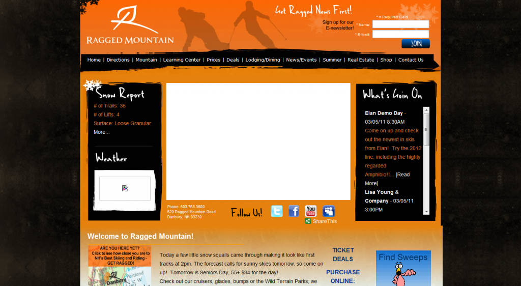
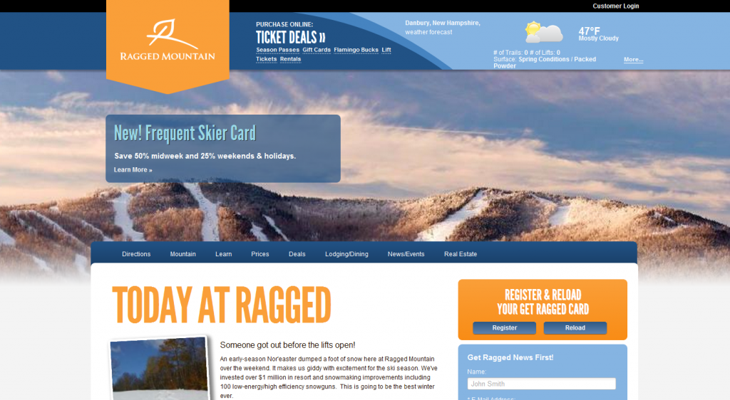
Ragged Mountain – http://www.raggedmountainresort.com/
Design: Jen Mazzei
Gregg’s Near-Perfect Website Improvement Rating (GNPWIR): 8.36
I really like the new look of Ragged’s site. I especially like how clean, yet sharp the design looks without the use of much depth, shadow, gradient, etc. Especially like the photo in the screenshot below.
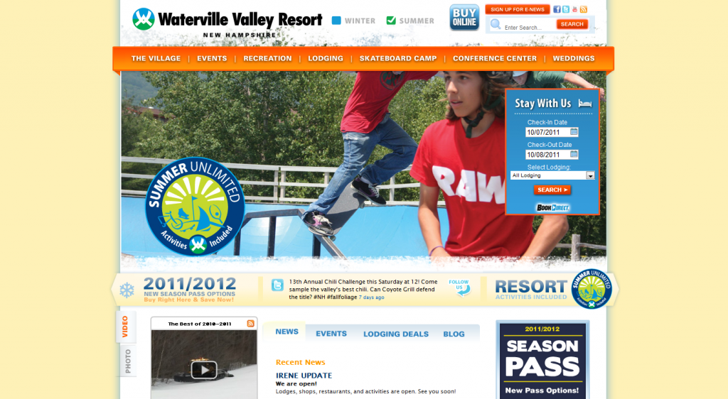
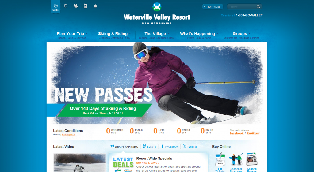
Waterville – http://www.waterville.com/
Design: Joe Myers
Gregg’s Near-Perfect Website Improvement Rating (GNPWIR): 9.2
As usual, awesome work by Joe. To truly see how this site excels you need to head over it and spend a few minutes. I especially dig the “Fall” color scheme. Awesome site.
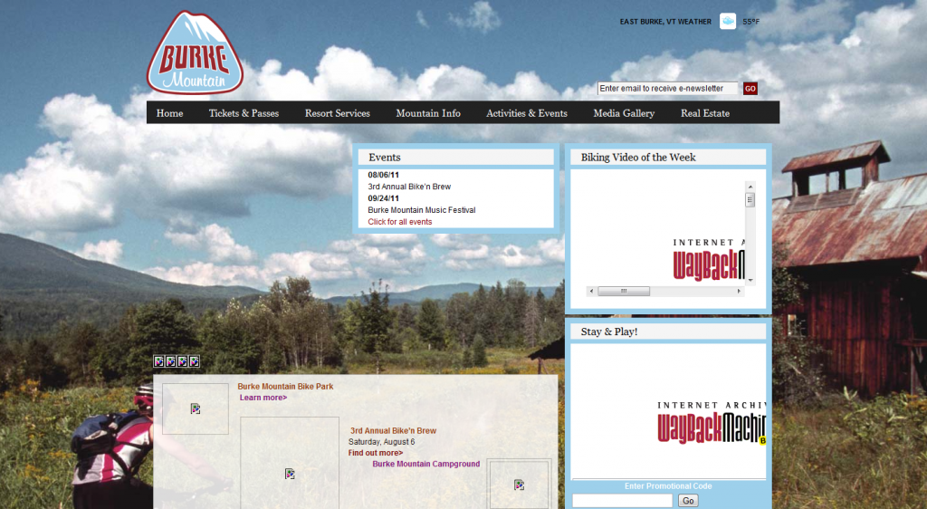
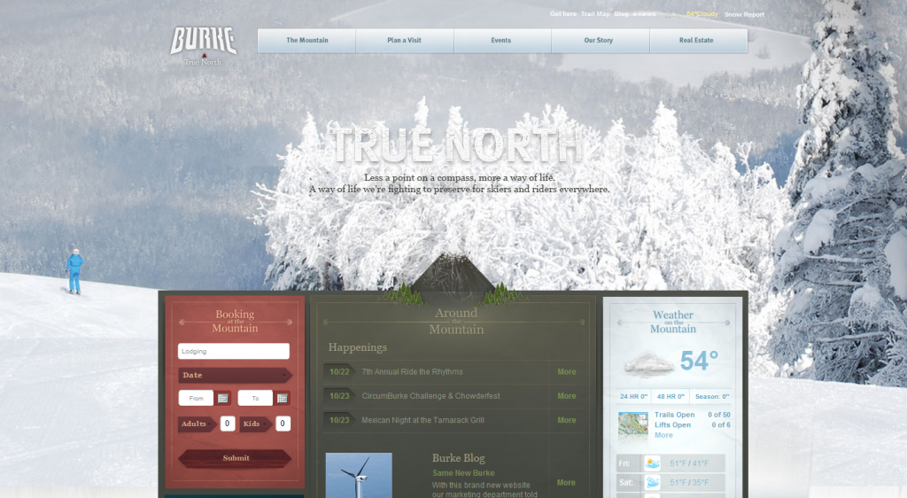
Burke – http://www.skiburke.com/
Design:
Gregg’s Near-Perfect Website Improvement Rating (GNPWIR): 5.3
The design for Burke’s new site looks sharp, but it feels a bit lacking in the usability/readability department. For example, the “True North” tagline (that is apparently shared this year by Okemo (see below), is tough to read, let alone notice when placed against the white, snowy background. It looks great, but with lots of darks on darks or lights on lights, my eyes were all over the place wondering what was what.
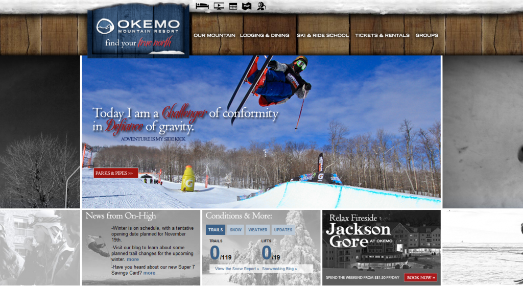
Okemo – http://okemo.com/okemowinter/
Design: ?
Gregg’s Near-Perfect Website Improvement Rating (GNPWIR): 5.9
I didn’t get a screenshot before this site changed and Archive.org isn’t showing the images so I’ll have to just show the “After” here. I like the improvement though it does feel a little bit heavy and dark. An improvement over their last design, but a bit too busy for much “stuff” (wood background, multiple background images, snow on the wood, etc.) for my taste.
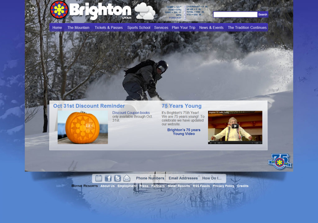
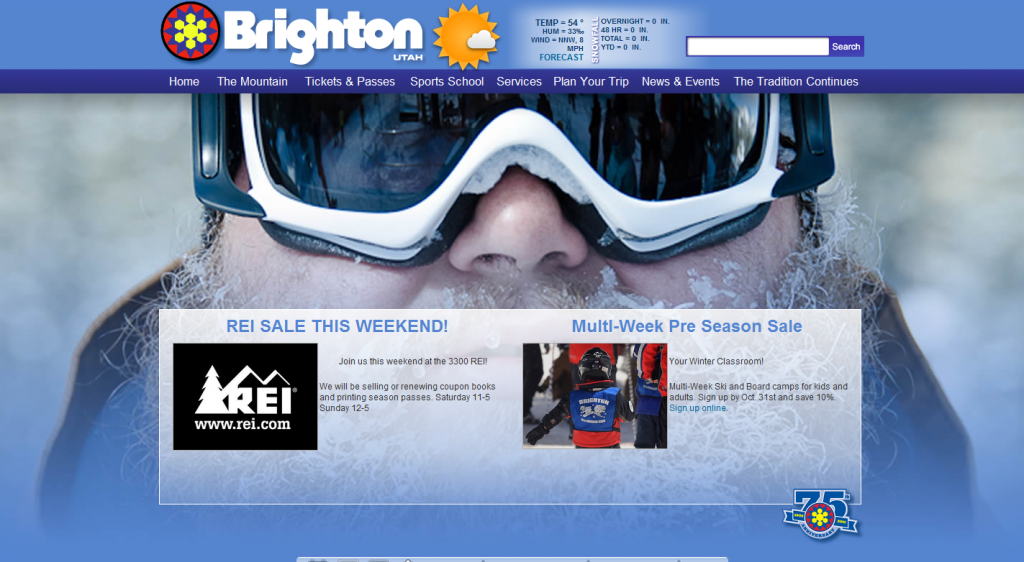
Brighton – http://www.brightonresort.com/
Design: Infobytes
Gregg’s Near-Perfect Website Improvement Rating (GNPWIR): 0.0001
I had to do a followup of Infobyte’s Brighton debacle. In case you missed it, Infobyte’s “award winning designer” completely ripped off Squaw Valley’s website. They even left in original code they copied even though it was no longer being used. Joe called them out on it and, live on the site, changes started to be made. It still has many of the original elements, but they’ve tweaked it enough that it doesn’t look exactly the same anymore.
 Gregg Blanchard