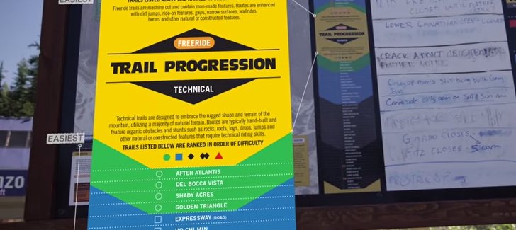
A mountain biking map at Whistler has one of the smartest trail visualizations I’ve ever seen.
 Gregg Blanchard /
Whistler is one of the few resorts that use a completely separate set of social profiles for their mountain bike marketing.
I sometimes forget this. So I sometimes miss some of their efforts.
But when I did notice this video and I did get the chance to watch this guide for beginners to understand how the bike park words and ride smart their first time out, something caught my eye.
The video itself is really well made and the tips are great.
But it was this visual at the 1:20 point that stood out to me because it answers two complimentary questions:
- Where do I start?
- Where do I go from here?
Take a look.
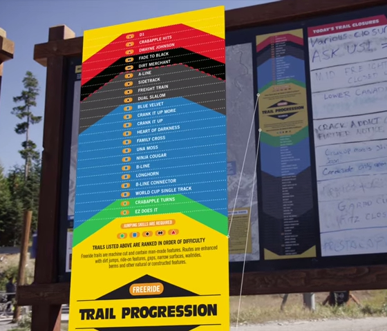
Whether you’re still progressing with your skills or really like a specific trail and are looking for something close to it, I can’t get over how beautifully this illustrates the relationship between trails.
It’s such a great idea and I hope we see the implications for skiing as well.
True most resorts have many more ski trails than bike trails and true there may be a few more variables at play when sliding down natural terrain versus more manufactured routes and traverses where the pitch may be more controlled, but considering our current system…

…there’s surely room for innovation.
Whistler took an established color scheme, applied some creativity, and instantly gave it additional meaning and value without saying goodbye to the colors and symbols skiers and non-skiers alike already understand.
Awesome stuff.