Websites
Three things I really like about the new Aspen Snowmass website.


BLANCHARD
As I mentioned yesterday, some great resort websites have been dropping.
One of the most anticipated – and most prominent – is the new website building on the new logo/brand for Aspen Snowmass that’s been rolling out in recent months.
Here are three things I’m digging about their new site.
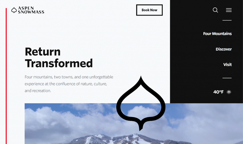
#1) Non-Background Hero Video
Background hero videos can be done well, but they can also be distracting if done poorly and/or make the main headline hard to read. I really like how they’ve placed the video below the main headline. It gives that message space to breath and, because it autoplays, puts just enough motion at the bottom of the visible area to encourage you to scroll.
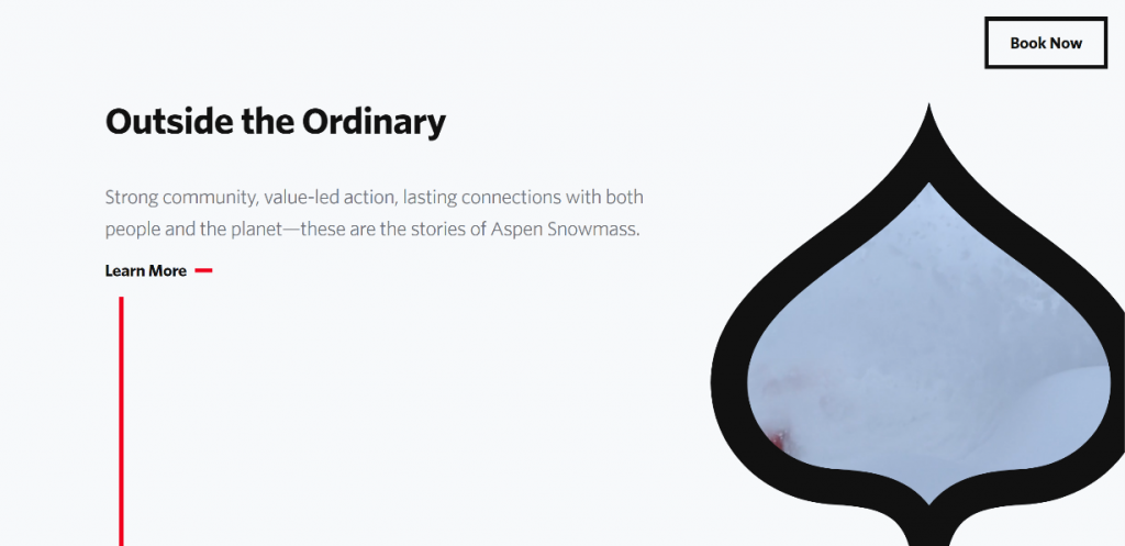
#2) Very Light on Text
It can be hard to distill long messages into meaningful, bite-sized chunks, but that’s exactly what Aspen Snowmass did in virtually every place where they had blocks of text. Every block is short and to the point, with font-sizes and families making each super easy to read. There’s plenty of information, but it’s not crammed in there like other sites. Lots of room to breath makes this site one of the easiest to skim or read that I’ve seen.
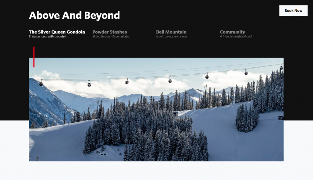
#3) SaaS-Like Promo Carousels
I’ve seen a couple resorts attempt this, but I think the way the new Aspen Snowmass site pulls this off is as good as I’ve seen. Common in other areas like retail or SaaS, these feature carousels are a great way to let folks explore groups of perks without taking up a ton of real estate or losing a solid visual companion for each. The asterisk here is that the visitor has to know right away that these are interactive or they’ll scroll right by. I think Aspen Snowmass’s new site does a good job of making that pretty clear.
The new brand continues to move forward and even though the gondola cabins are already rewrapped and they’ve been using their new mark on social for a while, this website makes it about as official as I’ve seen.
It’s got a lot of unique elements (like their semi-hidden top-right nav) and video that plays inside of a shape (their mark), so head over and take it for a spin.
About Gregg & SlopeFillers
I've had more first-time visitors lately, so adding a quick "about" section. I started SlopeFillers in 2010
with the simple goal of sharing great resort marketing strategies. Today I run marketing for resort ecommerce and CRM provider
Inntopia,
my home mountain is the lovely Nordic Valley,
and my favorite marketing campaign remains the Ski Utah TV show that sold me on skiing as a kid in the 90s.
Get the weekly digest.
New stories, ideas, and jobs delivered to your inbox every Friday morning.