The Lessons Behind Yesterday’s Facebook Engagement Numbers That Need a Closer Look
 Gregg Blanchard /
Yesterday on the Stash I shared this chart that compared the length of a Facebook post to the like rate (likes/fans) it received broken down by post type.
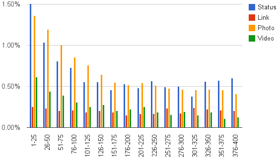
The takeaway was that shorter is better, but there’s much more to the analysis that I think is worth revisiting.
Takeaway #1 – Photos Are Most Common
If we break down the volume of posts by type, the pie chart would look like this.

While photos are big, they aren’t as big as I thought, honestly. And I was surprised to see video so far behind.
Takeaway #2 – Photo & Status Parity
The other thing that surprised me was how close the like rate curves of photos and status updates were to one another. Though line graphs don’t really work for grouped data like this, here’s that version as a better illustration of their similarity.
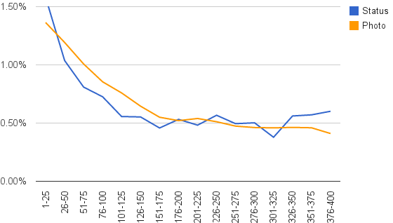
A picture may be worth a thousand words, but it doesn’t appear those words are necessary for engaging content.
Takeaway #3 – Say What You Want About Links
The hard part about the way I created that chart was the lack of details for links due to the scale. Here it is from 0%-0.3%.
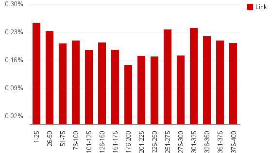
Yes, there’s a dip, but of all the content types this one showed the least variation and most recovery after the drop. In other words, length doesn’t matter quite as much for links in terms of engagement. In terms of click-rate (the point of links)? I’m not sure.
A Reminder
Facebook is getting trickier and tricker for organic reach and engagement.
Stuff like this seems simple and perhaps even nit-picky, but we’re at a stage where there are two choices: pay or look at the data and optimize.
While it may take both, I wouldn’t overlook the latter.