Three reasons I love the marketing behind Snowmass’ beautifully built cycling site.
 Gregg Blanchard /
Bike Snowmass just launched a new site (thanks again for the heads up, Owen) and it’s a beauty.
But even more impressive than the visual design is the marketing insights and features built into the new platform.
Specifically, three things.
#1) One Focus
Take a look at the main homepage and notice what the first four elements have in common.

The shared trait is that they are all promoting the exact same thing. The trail guide.
I love this.
So often you enter a website and have a dozen different things clamoring for your attention. This flips the script by identifying one common, yet valuable next step, and goes all-in on it.
#2) Visitor Segmentation
Once you get there (you may have noticed a similar widget on the home page that would also be an entry point), you can segment out your trails in two clicks by two important factors: road vs trail and skill level.
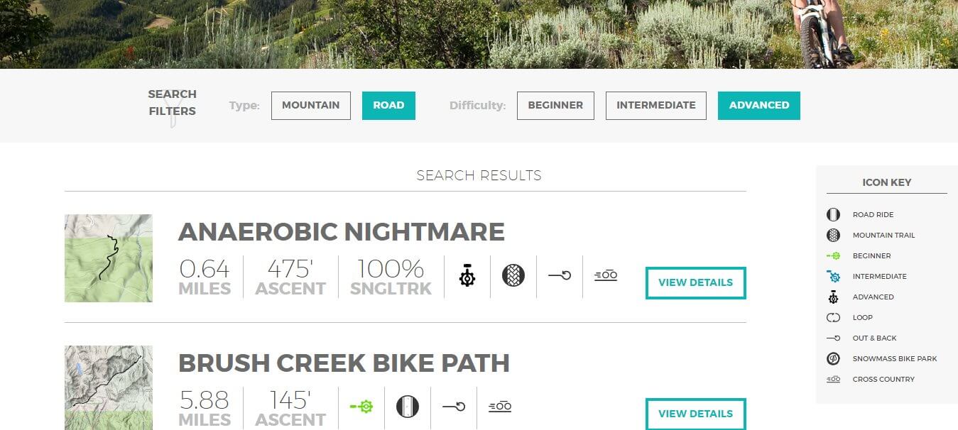
This is a beautiful, simple addition for a lot of reasons, but it’s especially so because it serves as a visual reminder that cycling is not just about hardcore downhillers or road riders with calves the size of tree trunks.
Like skiing, biking (especially mountain) often portrays itself as a little too extreme on non-segmented channels.
#3)Careful Thought & Detail
Maybe it takes being a cyclist to appreciate the nuance in some of the detail they’ve built in, but take a look at the icons in the search detail.

Milage, ascent, and, very smartly, how much of a rail is singletrack, is then followed by the type of trail.
Best of all, however, is an indicator of whether this trail is an out-and-back or a loop. Such a small thing, such a simple icon, but it really shows how hard they thought about what cyclists care about in a trail.
This is even more clear when you click on a full detail page.
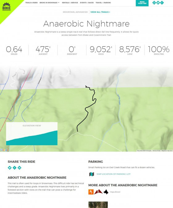
Because among some really useful information is a link directly to this trail’s segment on Strava.
Brilliant.
Even More
There’s much more about this site that I like – for example, the details about parking are often overlooked with these sorts of tools, but clearly displayed on Snowmass’ site – but I’ll stop there.
I love the thought process behind this. I love that the design was important, but the content even more so. And I love the way it is both thorough but simple at the same time.
Well done. Really, really well done.