Inspiration
Fifteen ski resort anniversary logos to inspire your own.


BLANCHARD
Anniversary logos can be a fun variation on the usual brand to celebrate key moments in your resort’s story. The trick can be finding a lockup that preserves your existing brand but also gives you something that’s just as useful and flexible to work with as you apply it to campaigns and designs.
So being, I rounded up 15 examples of resort anniversary logo designs to help inspire your own.
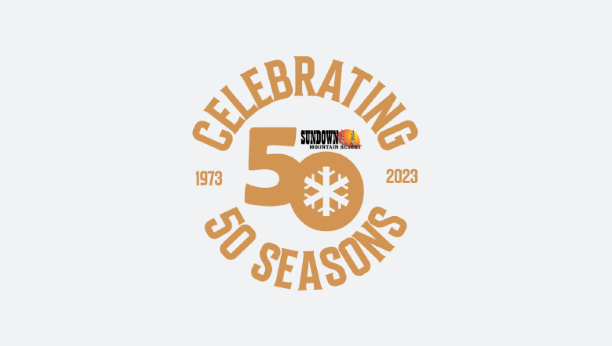
Sundown 50th Anniversary Logo
Leaning into a shade within their primary logo, this includes a small version of that current logo to make it a bit more recognizable.
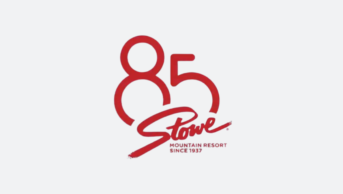
Stowe 85th Anniversary Logo
Nice and simple with the classic Stowe logo and a large version of the anniversary number floating behind.
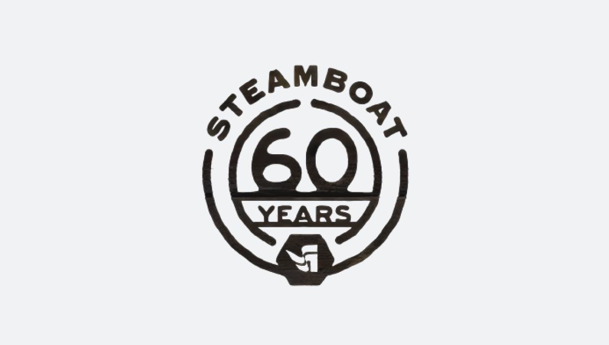
Steamboat 60th Anniversary Logo
I saw a few variations of this logo for Steamboat’s anniversary, but I like this one-color version that creates a nice tidy badge that’s easy to use.
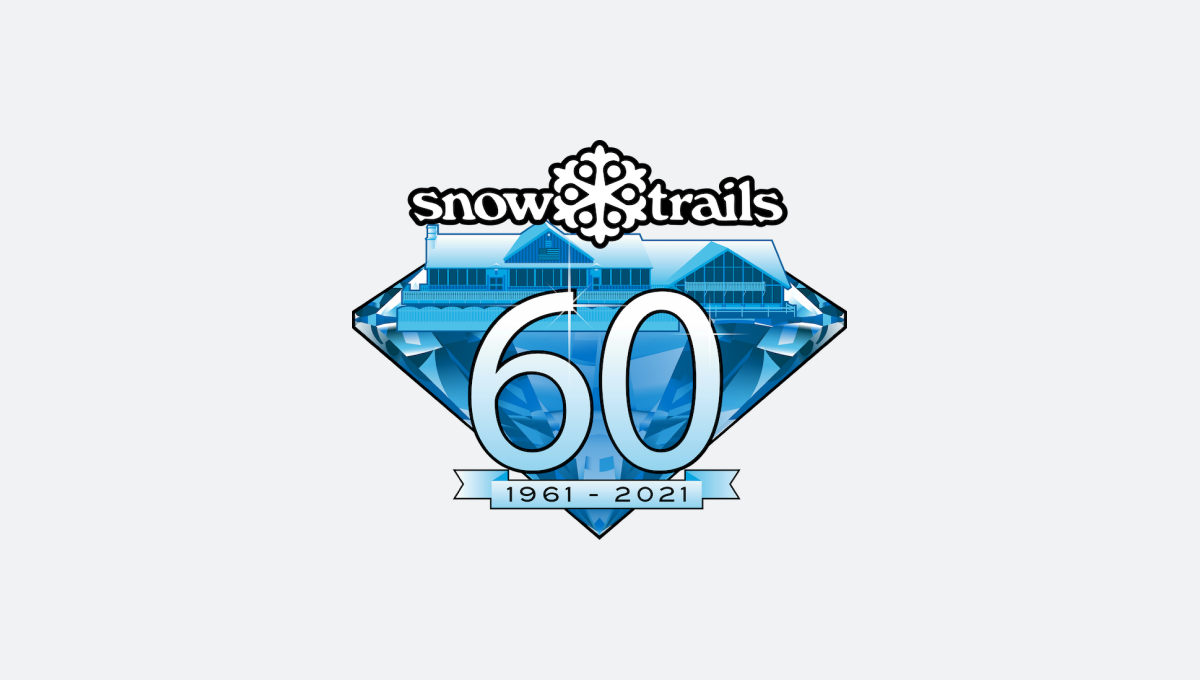
Snow Trails 60th Anniversary Logo
Using the logo color and a bit more details than other logos, this logo incorporates their lodge to add a layer of design that’s easy to recognize.
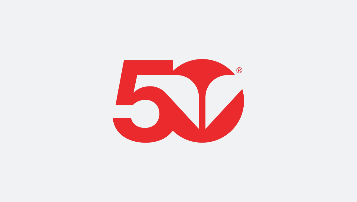
Snowbird 50th Anniversary Logo
Leaning into the red color that’s become more prominent in Snowbird’s marketing, a simple number 50 with the classic wings created a nice mark.
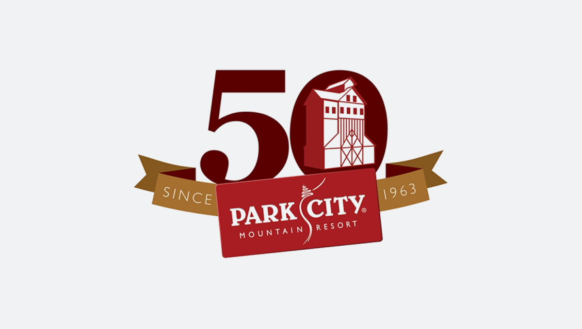
Park City 50th Anniversary Logo
This one’s a few years old, but it’s a classic from 10 or so years ago. Incorporating some of the on-mountain mining history, it’s was used fairly widely during that season.
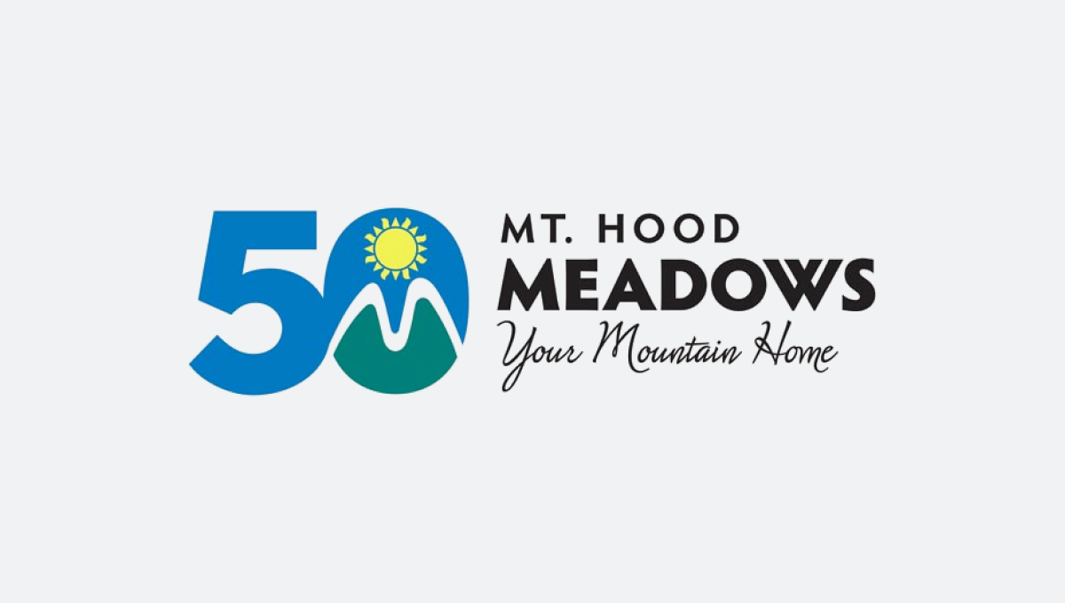
Mt Hood Meadows 50th Anniversary Logo
Similar to Snowbird, Meadows took their mark and combined it with a block version of their anniversary number. This also allowed them to use it as a full logo.
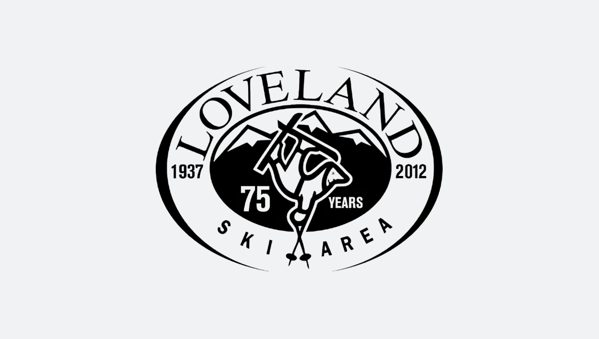
Loveland 75th Anniversary Logo
Loveland added a few tweaks to their existing logo to adapt it for their 75th anniversary. The logo was roughly the same size, shape, and weight, with made it really easy to swap with their classic logos.
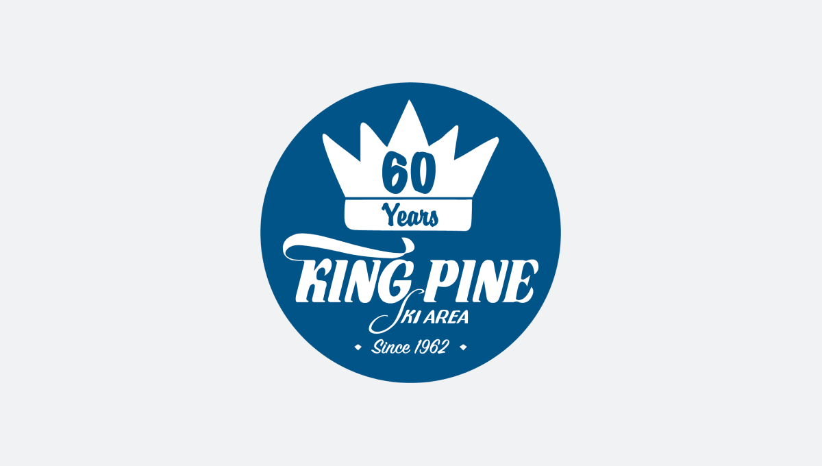
King Pine 60th Anniversary Logo
Going with a badge, King Pine leaned into their blue brand color and incorporated their traditional logo to make it easy to recognize. The round shape made it a perfect fit for social media avatars.
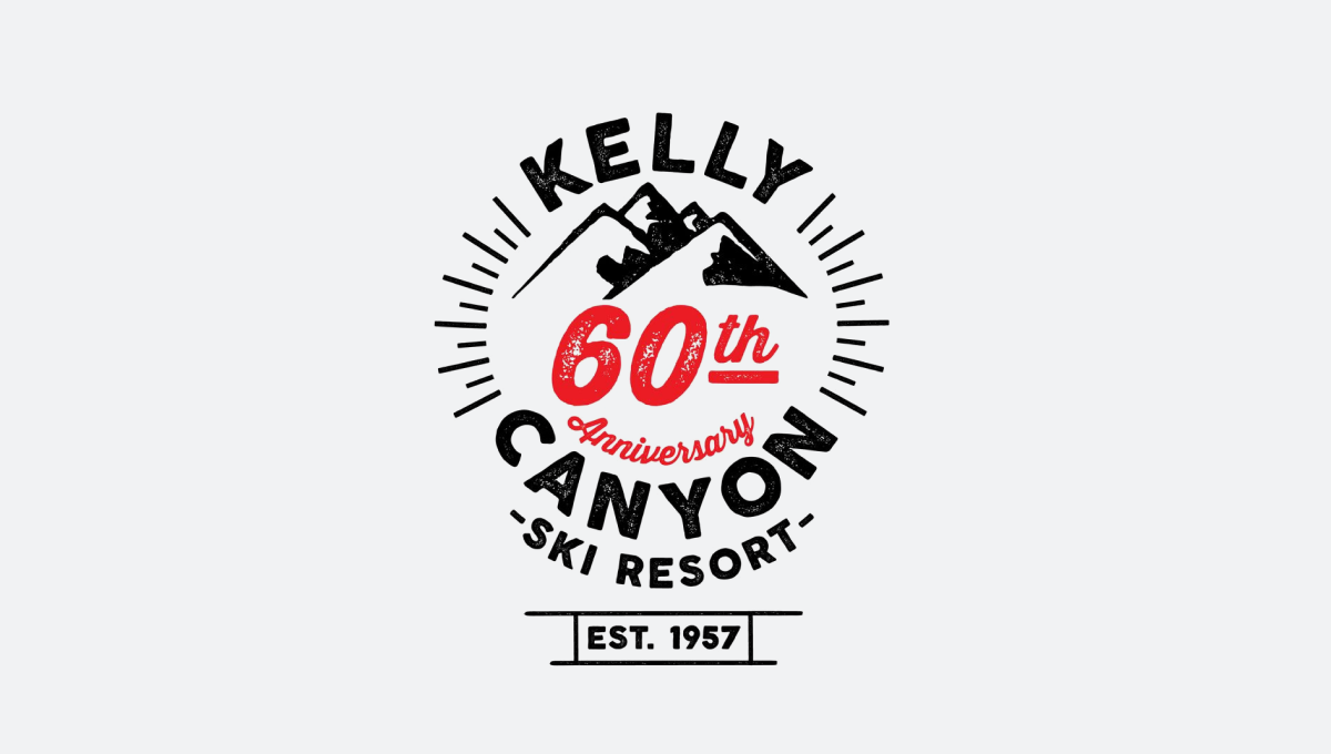
Kelly Canyon 60th Anniversary Logo
I love me some line art and this is a great example of that. Kelly Canyon gave themselves a blank slate for their 60th anniversary logo and the result is really clean.
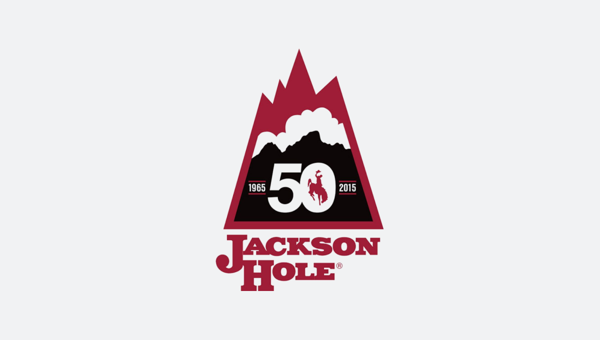
Jackson Hole 50th Anniversary Logo
Jackson Hole’s logo combines a mountain shape they commonly used during the first couple decades of the resort with the classic red, white, and black layers in the traditional logo to tie the past to the present.
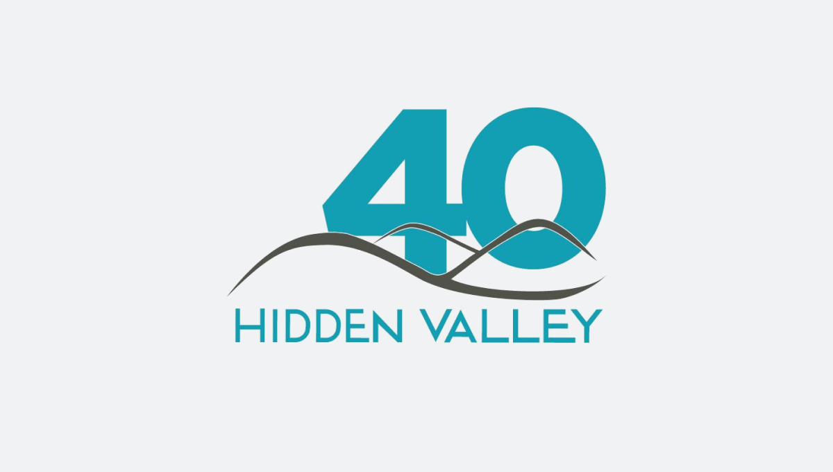
Hidden Valley 40th Anniversary Logo
Nice and simple, Hidden Valley used a block 40 in their word color layered behind their existing logo to create a simple, effective logo for their anniversary.
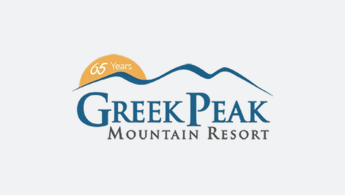
Greek Peak 65th Anniversary Logo
Similarly, Greek Peak used a yellow semicircle tucked behind their logo that called out their year. Similar to Loveland, it made it very easy to swap with their existing logo in marketing collateral.
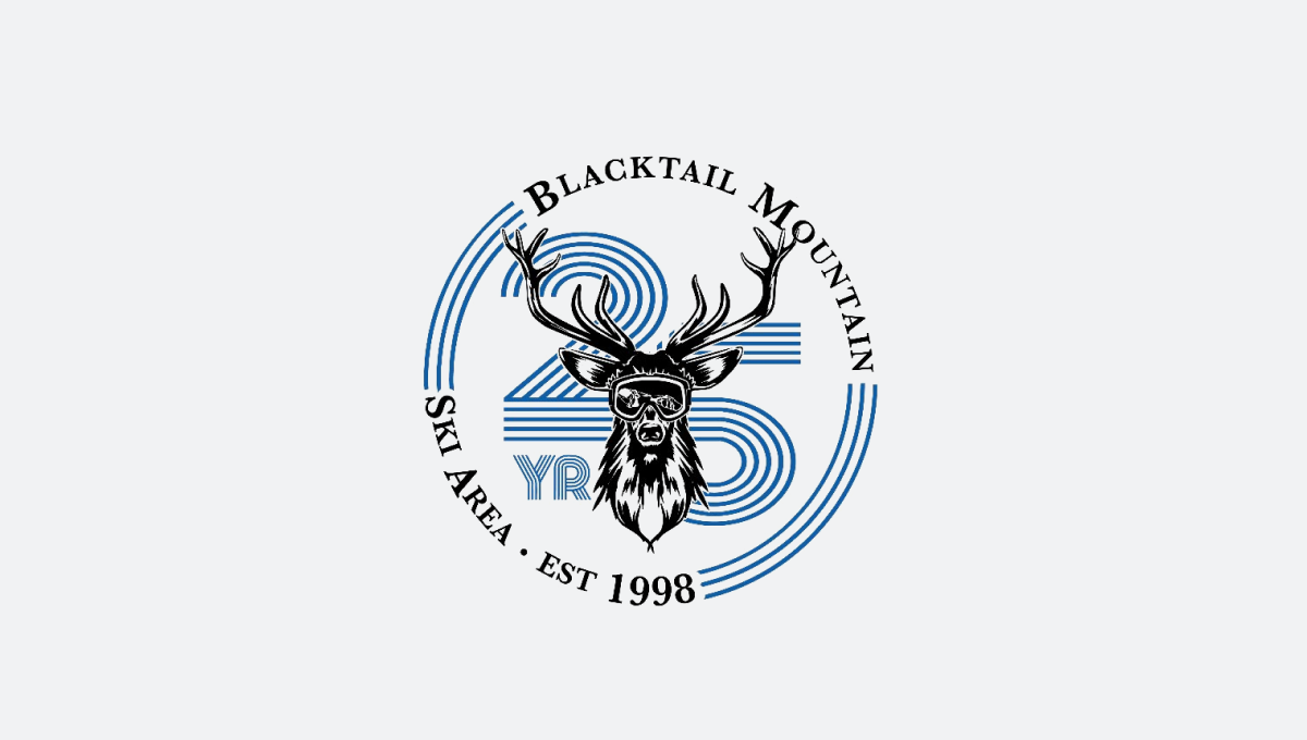
Blacktail Mountain 25th Anniversary Logo
Blacktail started from scratch with their logo and the result – a nice badge with line art and a retro 25 number placed behind – looks pretty sharp.
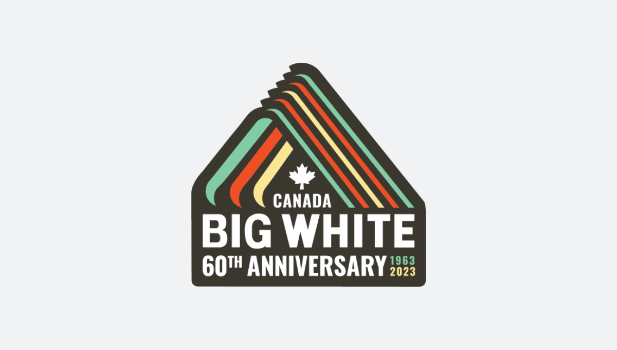
Big White 60th Anniversary Logo
Speaking of retro, Big White’s turned to one of their original logos with some modern elements to give this badge a nice die-cut sticker feel.
By the way, if need a little bit more inspiration, this post actual turned into a simple little side project where I collect anniversary logos.
About Gregg & SlopeFillers
I've had more first-time visitors lately, so adding a quick "about" section. I started SlopeFillers in 2010
with the simple goal of sharing great resort marketing strategies. Today I run marketing for resort ecommerce and CRM provider
Inntopia,
my home mountain is the lovely Nordic Valley,
and my favorite marketing campaign remains the Ski Utah TV show that sold me on skiing as a kid in the 90s.
Get the weekly digest.
New stories, ideas, and jobs delivered to your inbox every Friday morning.