Twenty three ski resort anniversary logos to inspire your own.
 Gregg Blanchard /
Anniversary logos can be a fun variation on the usual brand to celebrate key moments in your resort’s story. The trick can be finding a lockup that preserves your existing brand but also gives you something that’s just as useful and flexible to work with as you apply it to campaigns and designs.
So being, a couple years ago I rounded up 15 examples of resort anniversary logo designs to help inspire your own.
Going into the 2025/26 season there has been a huge spike in anniversary logo designs showing up at resorts across North America. So, with a bunch of great new examples to draw inspiration from, I figured I’d add 8 of the logos I’ve seen this season and keep this collection growing (speaking of collections, this original post actually turned into a larger collection of anniversary logos that my daughter and I work on together if you need more inspiration than this list provides).
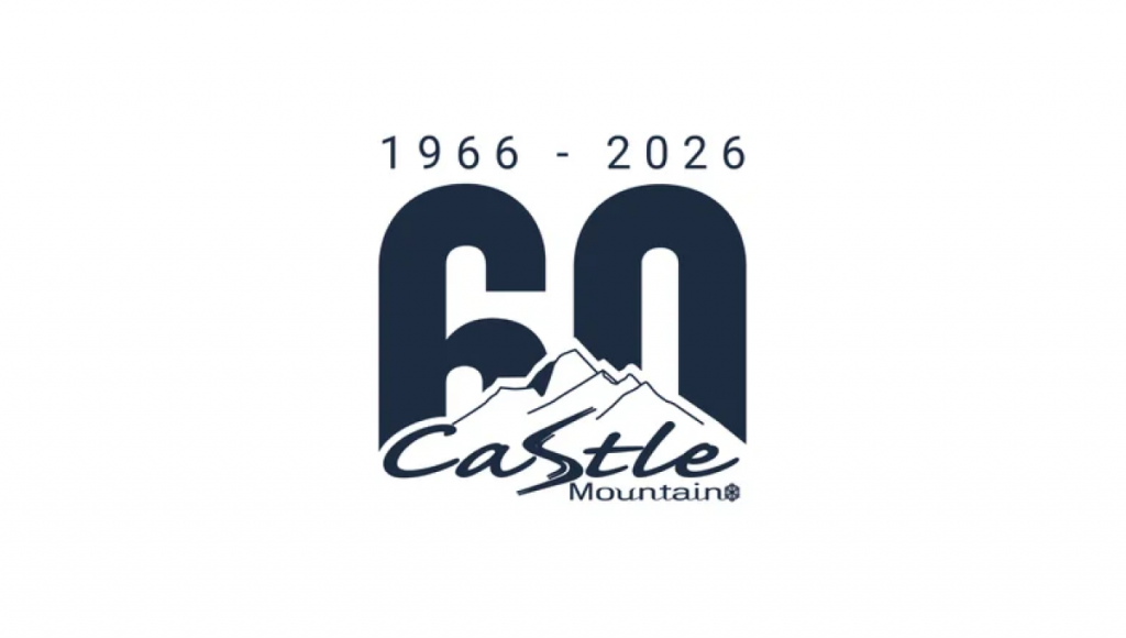
Castle Mountain 50th Anniversary Logo
A nice block 60 peeking up from behind their traditional logo makes for a clean, bold concept. Nothing fancy, but a solid design from Castle Mountain.
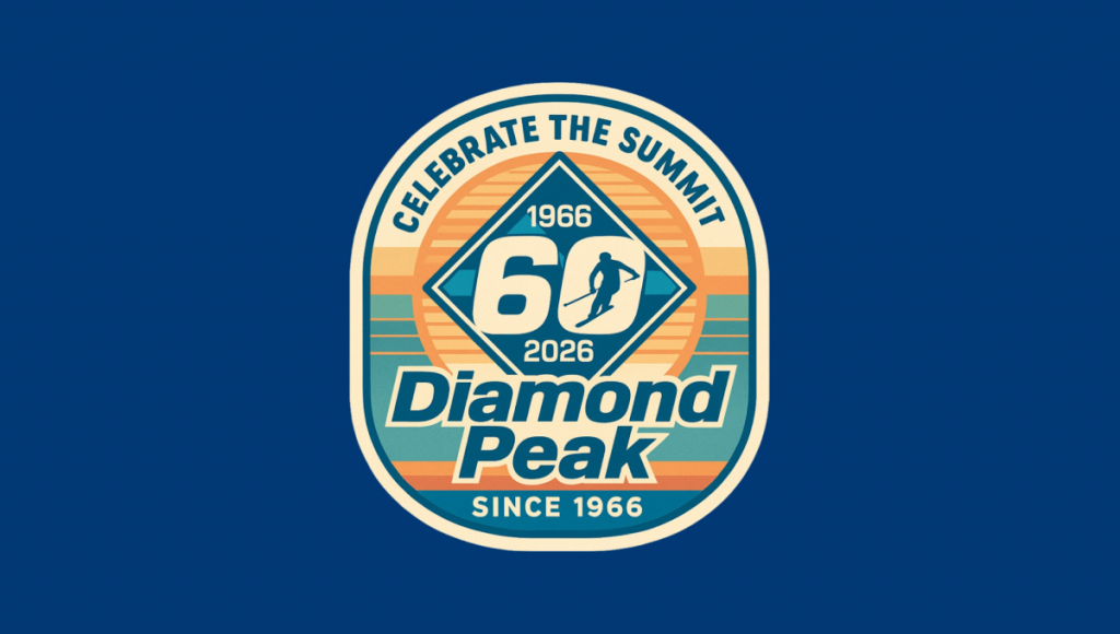
Diamond Peak 60th Anniversary Logo
Taking a more retro route, Diamond Peak, combined some throwback colors and styles, it’s got a lot going on compared to other designs but it all works really nicely together.
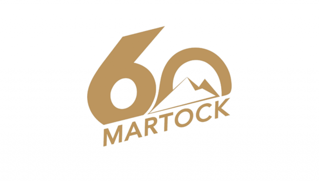
Martock 60th Anniversary Logo
I love a simple, clean anniversary logo and that’s exactly what Martock is rolling with this season. A big, block number 60 rising up behind their logo in a clean gold color.
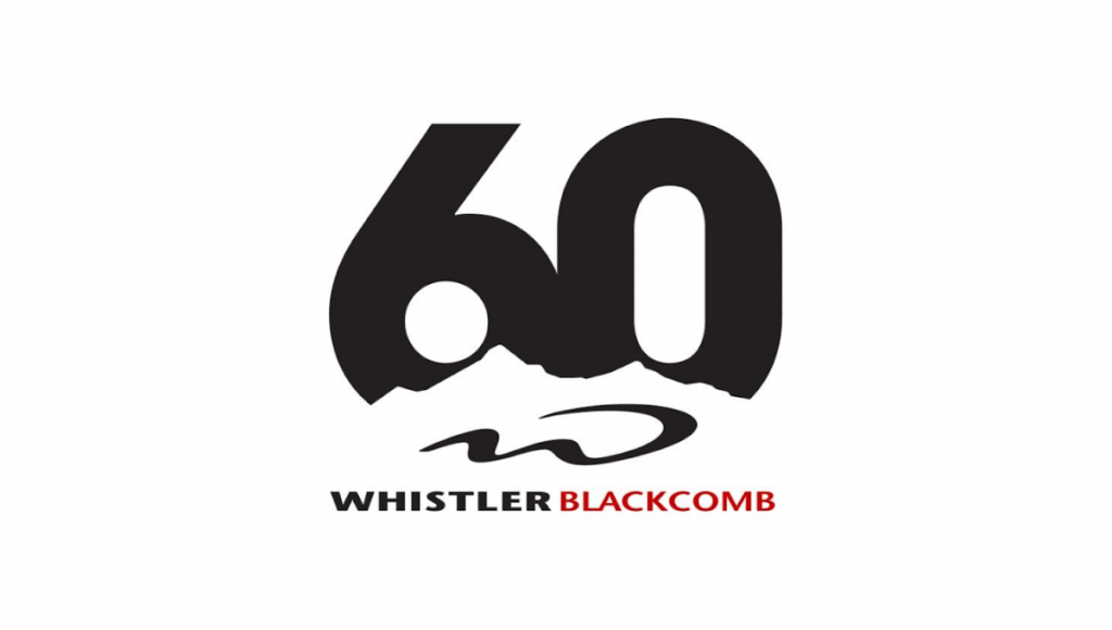
Whistler Blackcomb 60th Anniversary Logo
Speaking of rising up behind mountains, I love how Whistler’s logo uses negative space for the peaks that create space for their traditional logo to tuck into. It’s a really sharp, but simple design. I love it.
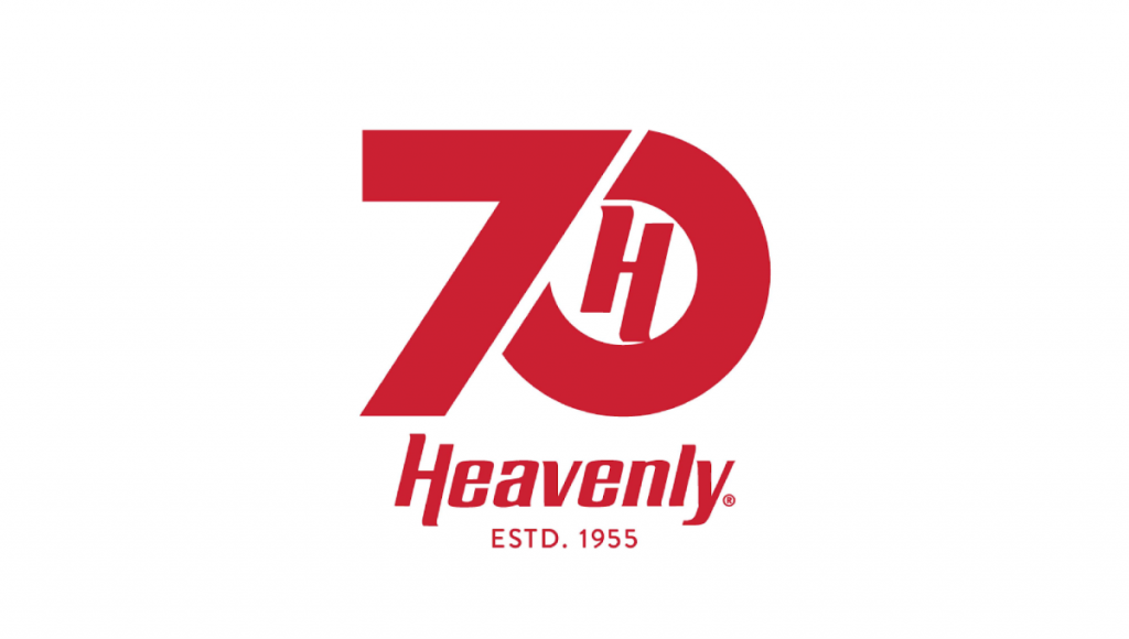
Heavenly 70th Anniversary Logo
A big number 70 with their classic H in the zero, plus some sharp angles on that seven to match the style of their word mark. I also love how they keep it simple with one color.
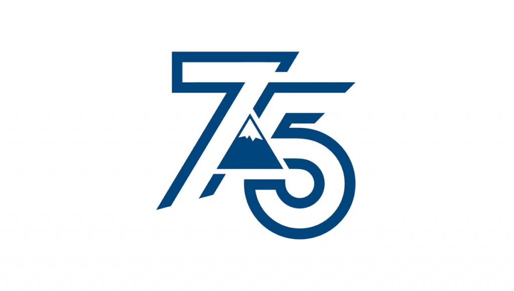
Sugarloaf 75th Anniversary Logo
When you have a mark as recognizable as Sugarloaf’s, you don’t need words. Set in the center of an open, line-art style 75 I really like how it lets the number fill a lot of space without feeling too heavy.
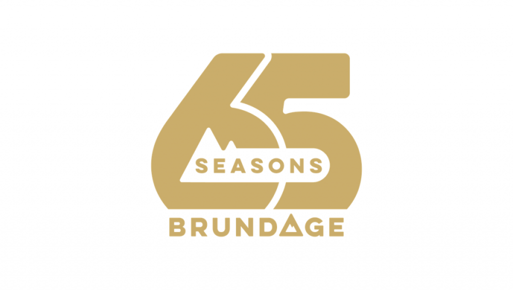
Brundage 65th Anniversary Logo
I’m a sucker for overlapping numbers and Brundage did this really nicely. I also like the little mountain peaks in the number 6 to tie it back to the peak they use in their logo.
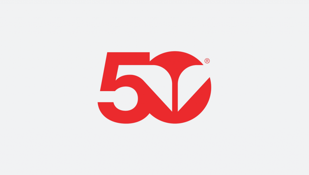
SkiUtah 50th Anniversary Logo
While not a resort, SkiUtah plays the same card as Sugarloaf by putting their well-known mark in the center of a bold number 50 in dark gold. I love it.
That’s all for today’s additions, the original list continues below…
—
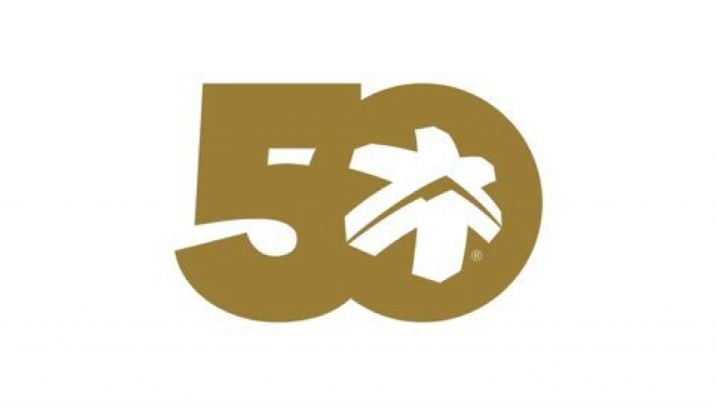
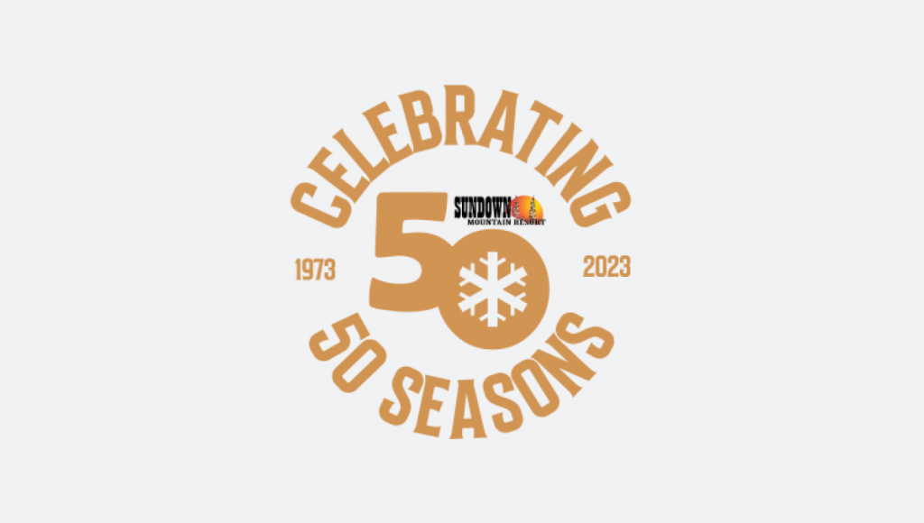
Sundown 50th Anniversary Logo
Leaning into a shade within their primary logo, this includes a small version of that current logo to make it a bit more recognizable.
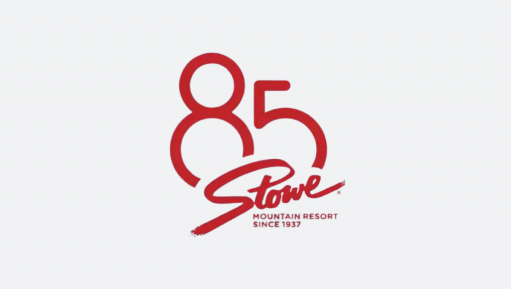
Stowe 85th Anniversary Logo
Nice and simple with the classic Stowe logo and a large version of the anniversary number floating behind.
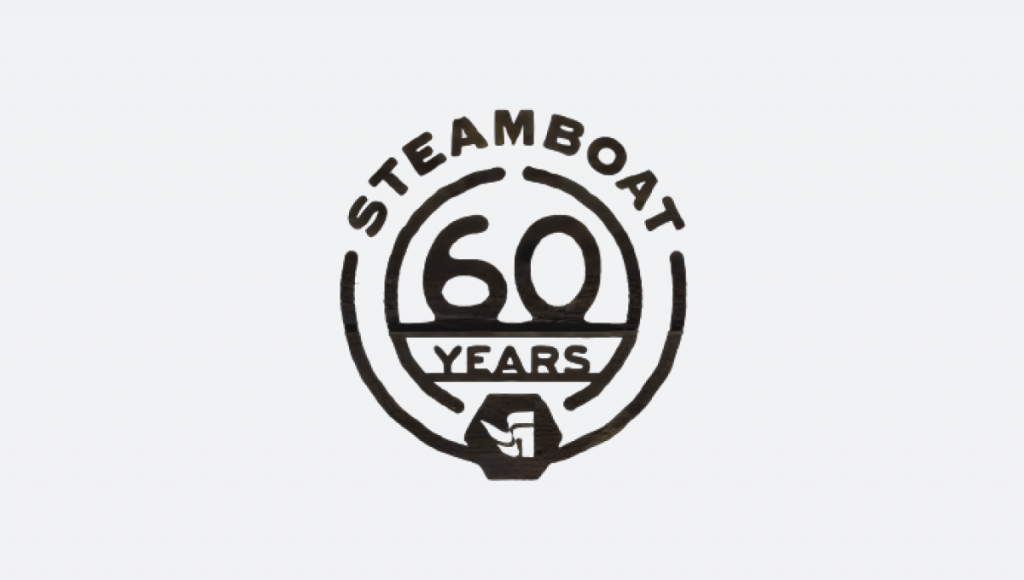
Steamboat 60th Anniversary Logo
I saw a few variations of this logo for Steamboat’s anniversary, but I like this one-color version that creates a nice tidy badge that’s easy to use.
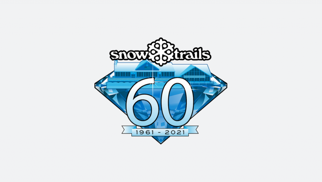
Snow Trails 60th Anniversary Logo
Using the logo color and a bit more details than other logos, this logo incorporates their lodge to add a layer of design that’s easy to recognize.
Snowbird 50th Anniversary Logo
Leaning into the red color that’s become more prominent in Snowbird’s marketing, a simple number 50 with the classic wings created a nice mark.
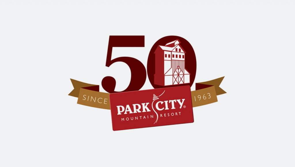
Park City 50th Anniversary Logo
This one’s a few years old, but it’s a classic from 10 or so years ago. Incorporating some of the on-mountain mining history, it’s was used fairly widely during that season.
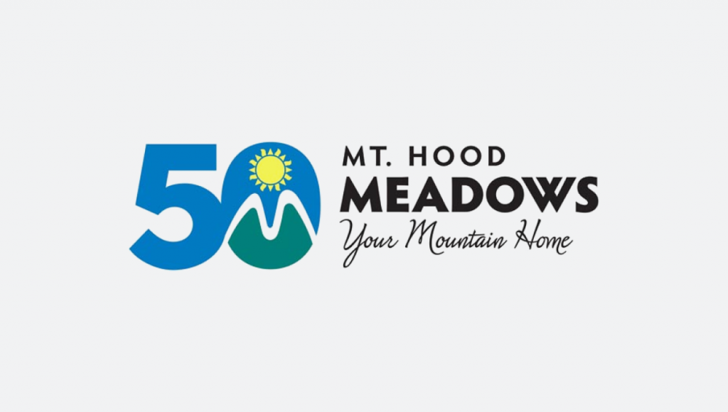
Mt Hood Meadows 50th Anniversary Logo
Similar to Snowbird, Meadows took their mark and combined it with a block version of their anniversary number. This also allowed them to use it as a full logo.
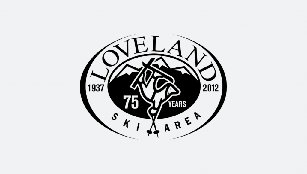
Loveland 75th Anniversary Logo
Loveland added a few tweaks to their existing logo to adapt it for their 75th anniversary. The logo was roughly the same size, shape, and weight, with made it really easy to swap with their classic logos.
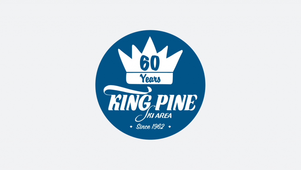
King Pine 60th Anniversary Logo
Going with a badge, King Pine leaned into their blue brand color and incorporated their traditional logo to make it easy to recognize. The round shape made it a perfect fit for social media avatars.
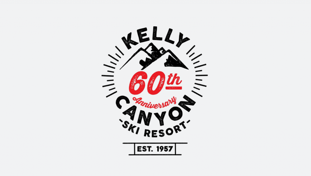
Kelly Canyon 60th Anniversary Logo
I love me some line art and this is a great example of that. Kelly Canyon gave themselves a blank slate for their 60th anniversary logo and the result is really clean.
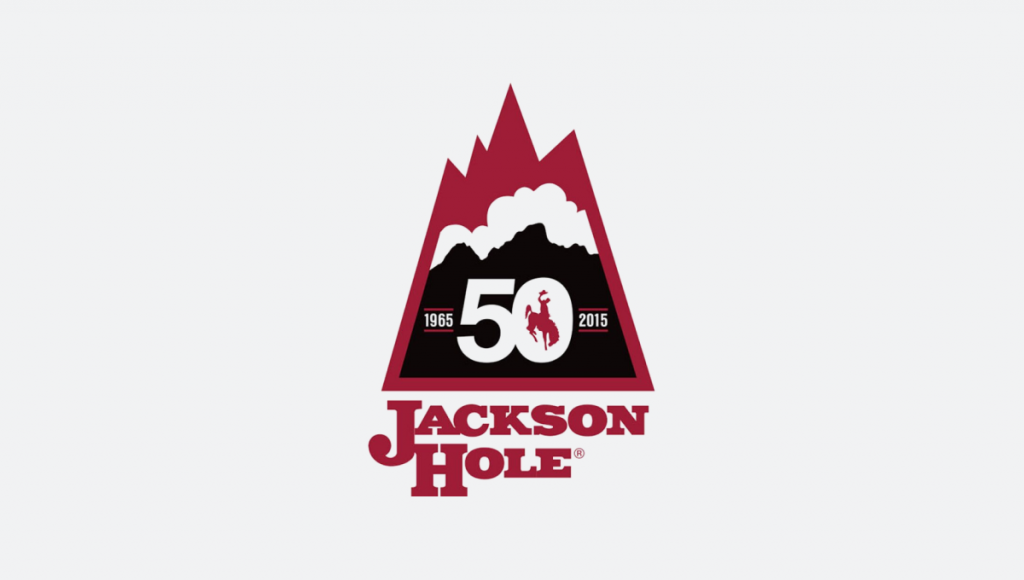
Jackson Hole 50th Anniversary Logo
Jackson Hole’s logo combines a mountain shape they commonly used during the first couple decades of the resort with the classic red, white, and black layers in the traditional logo to tie the past to the present.
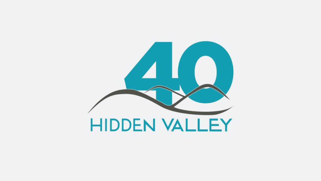
Hidden Valley 40th Anniversary Logo
Nice and simple, Hidden Valley used a block 40 in their word color layered behind their existing logo to create a simple, effective logo for their anniversary.
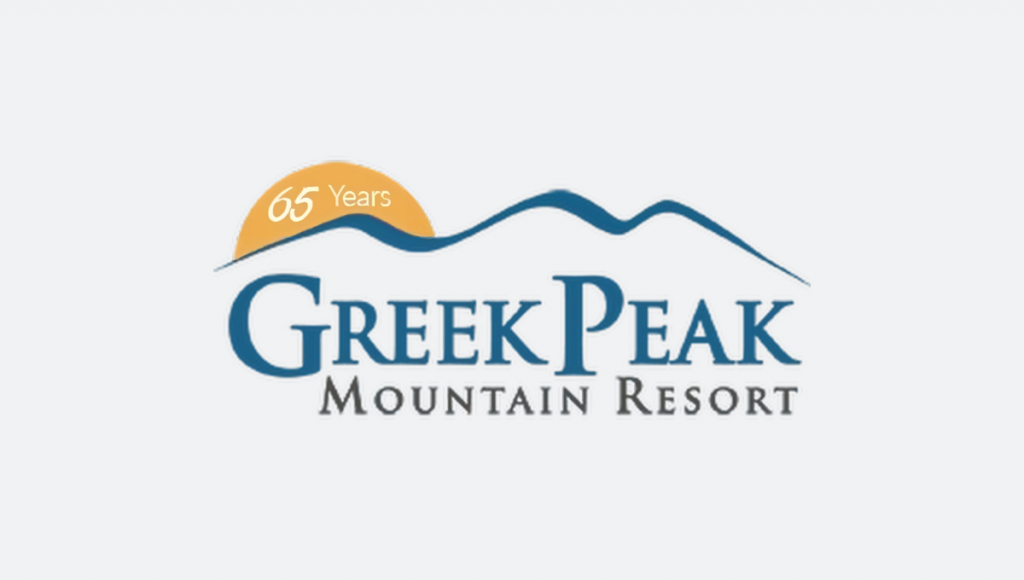
Greek Peak 65th Anniversary Logo
Similarly, Greek Peak used a yellow semicircle tucked behind their logo that called out their year. Similar to Loveland, it made it very easy to swap with their existing logo in marketing collateral.
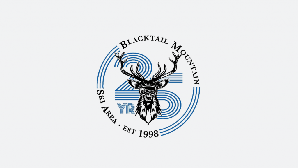
Blacktail Mountain 25th Anniversary Logo
Blacktail started from scratch with their logo and the result – a nice badge with line art and a retro 25 number placed behind – looks pretty sharp.
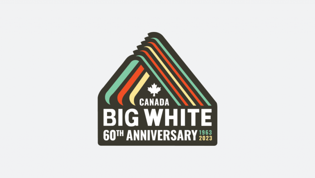
Big White 60th Anniversary Logo
Speaking of retro, Big White’s turned to one of their original logos with some modern elements to give this badge a nice die-cut sticker feel.
By the way, as I mentioned at the top, if need a little bit more inspiration, this post actual turned into a simple little side project where I collect anniversary logos that my daughter and I work on together.