Interviews
How Red Lodge Mountain tried to get ahead of the haters with last year’s rebrand.


BLANCHARD
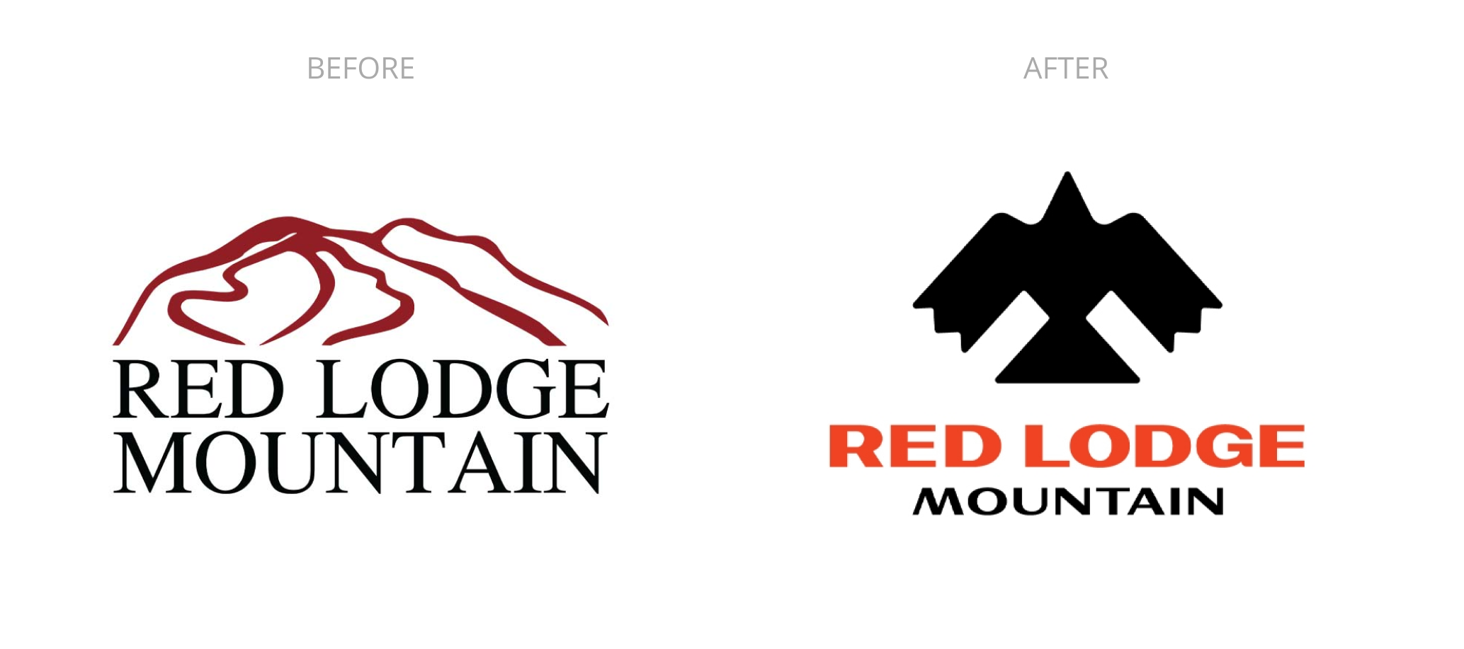
About 10 months ago Montana’s Red Lodge Mountain replaced the resort’s long-time logo with a new, minimal design that nodded to the culture and history of the region. Any rebrand comes with pushback, but in a small town and a design aligned with Native American culture, there was higher potential for this than usual. I chatted with Red Lodge Mountain’s new Marketing Director, Troy Hawks, to learn more about their strategy and plan ahead of flipping the switch.
–
Gregg: Take me back to the period leading up to the rebrand. What factors made the team say, “yeah, it’s time.”
Troy: RLM’s rebrand was well underway, and actually in the finalizing stages when I arrived here. The rebrand was led by JMA who hired a Canadian firm to come up with the new branding. JMA purchased RLM in 2007, and always had its sights set on evolving RLM from a local “mom & pop” ski area into more of a destination ski area. The rebrand came in close concert with the installation of the Stache Express, the largest capital improvement project to date under JMAs leadership, and I would say they saw it as a time to “up-market” RLM with a fresh look.
Gregg: Going in, walk me through your top few priorities for the rebrand. What were the needs or goals or ideas you were focused on?
Troy: The goal was two-fold: Develop branding that reflects a more refined outdoor Montana experience while also encompassing the whole of JMAs operation in Red Lodge, including the RLM Golf Course and retail store, Grizzly Peak Outdoors in downtown Red Lodge.
Gregg: There will never be a logo redesign that doesn’t come with a vocal group of skiers who are confident your marketing team are the possibly the worst humans ever to walk the earth. What was your philosophy or process for dealing with the haters?
Troy: We definitely prepared for the “haters” even to the extent of reaching out to local college professors to gauge what local cultural pushback against the logo might be. The ad firm landed on the image of a raven, that is technically a crow based on the shape of its tail. The Crow Agency is the predominant local tribe, and it was unclear how they might view the new logo. In addition to gaining insight from college professors, Spencer Weimer, the assistant general manager, invited members of the Crow Agency to meet with us to review our rebranding plans, explain how the idea was developed, and gauge their feedback. At least among the elected tribe members we met with, there were no concerns over the logo. That meeting also led to us agreeing to work together on an interpretive signage project on the mountain, and also re-engage local Crow Agency school kids in their annual ski days at the mountain.
In addition, I reached out to Ken Rider at Brundage, who also offered guidance and suggestions on the new brand launch, after having just went through the same exercise at Brundage. With Brundage and more recently Cracker Barrel as you probably saw, it certainly seems like the trend is a very simple, crisp, clean logo image these days. RLM’s previous logo was kind of messy old-school in that regard, so most people enjoyed a cleaner image, if not the raven image in its entirety.
Gregg: Was there anything you had ready ahead of time?
Troy: We developed talking points to use on an as-needed basis, but ultimately we did not respond to any negative comments on social media, as the nature of the comments just didn’t warrant a reply for the most part. In hindsight, we debated whether we should have posted the new brand reveal with comments off, or not.
There will always be the conspiracy theorists, the best we could do was share the ad firm’s thought-process behind the logo without alienating our parent company. We followed up the initial reveal post, with two follow up videos that took a deeper dive into the Brand Book in explaining the new look.
Also, don’t forget to update the favicon!
Gregg: If you got a phone call from your past self and he was asking for advice about their (then) upcoming logo redesign, what would you have told him to help the process to smoother or more effectively?
Troy: I’m all about the process. Yes, you certainly can get the job of rebranding done in a top-down way, where an off-site ad firm visits for a weekend and then 12 months and $100K later hands the marketing team their new look and brand book, but I think a rebranding effort stands a better chance of hitting it more on the mark when it involves the people: the people that work at the ski area, the people who ski there, the local community, the local stakeholders. In some respects it’s probably a gutsier move to open up a rebranding effort in such a way, but the rewards are huge in terms of stoking affinity for your brand vs lots of negative comments from folks who feel some form of ownership but didn’t otherwise have a chance to share their thoughts.
Gregg: What is something you’re really proud of with the redesign that you felt your team did a great job of?
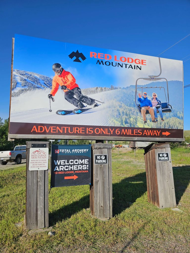
Troy: Biting our tongue and getting it done. Initial feedback on the new logo among longer term employees was not positive, but we swallowed it back, and cranked out resort-wide signage in just two months ahead of the coming season. We printed our larger format signs including 1 Billboard, and several trail maps via Signs.com that proved to be an affordable and fast solution. I was proud we took the steps to meet with elected officials of the Crow Agency, it was fascinating to meet and chat with them about local history and culture, a highlight of my career actually.
Gregg: Any advice to resorts who are saying, “Hmm, maybe we need a new logo or refresh?” and aren’t sure how to know when it’s time or what they need to be thinking of going in or may not be prepared for?
Troy: I would ask the Why? It seems like a new website and logo are on the top of the list when a new marketing director lands at a ski area, and while that was the case in my experience, there were larger priorities….a new website and logo would be “nice to have”, but weren’t immediate “need to have” items. Even if your current logo is a little tired, it’s not stopping people from buying your lift tickets or passes, so what is it that you expect a new logo to do for you?
Certainly a new logo can help stoke sales of branded apparel, but look at the NFL. I can buy a Packer hat with their 1930s logo, or their 1960s logo, or their current logo, and countless variations of those, in any color or pattern imaginable. To me, it seems like some companies have blown up the brand book in terms of the logo variations it offers on branded apparel, and while some marketers may not agree it’s a good idea, I think there’s opportunity for ski areas to sell apparel with their old-school logo even after a new version is developed.
At Sunlight, I had no intention of updating that logo, it was old school, but definitely beloved by its fans and still mostly on-point for the area in my opinion….the only struggle was that the rectangle format didn’t work well with profile images, and it was kind of a challenge with stickers. At most, I would have looked at a reformatting of the original logo, but mostly would have left it the same.
Gregg: Any last thoughts?
Troy: I would involve the Followers in the process. The fact that so many skiers and riders feel a sense of ownership in your ski area is a good thing, not an unwanted thing IMO. When you spring a new look on them that’s not aforementioned and without any explanation as to Why it was felt a new logo was needed, you can expect there to be more robust backlash and negativity. Haters are going to hate, it’s having the guts to follow a proper process, opening yourself up to feedback, and taking the important needed steps before a new logo reveal that can help silence and/or discredit negative commenters after the reveal.
About Gregg & SlopeFillers
I've had more first-time visitors lately, so adding a quick "about" section. I started SlopeFillers in 2010
with the simple goal of sharing great resort marketing strategies. Today I run marketing for resort ecommerce and CRM provider
Inntopia,
my home mountain is the lovely Nordic Valley,
and my favorite marketing campaign remains the Ski Utah TV show that sold me on skiing as a kid in the 90s.
Get the weekly digest.
New stories, ideas, and jobs delivered to your inbox every Friday morning.