Inspiration
A quick tip of the hat to Pleasant Mountain’s easy-to-read email.

BLANCHARD
Design does a lot of things, but there’s one thing design does that we marketers don’t talk about very much.
And it’s a type of design that is as much about what you put into a template as what that template looks like when you receive the final version from your agency.
I’m talkin’ bout design that makes copy/content easier to read.
You May Notice…
You may have noticed after 2,000 posts on this site (this is actually #2,001!) that I have a bit of a pattern I use in the design:
- Large font size
- Somewhat narrow content width
- Plenty of spacing between lines
But you’ll also notice that pattern extends to the way I write:
- Around 400 words total
- Chunks of 3-4 paragraphs then a subheader
- Rarely more than 5-6 lines in a paragraph (on desktop)
All of this is done for one reason: to (hopefully) make it easier to actually read my content. These attributes make it easier on the eyes to actually track lines and read the words, easier to feel like you’re making progress, and easier to get the point that I’m hoping to convey.
Which is important, because some days the words just don’t flow and a little bit of visual help creates the highest likelihood of a reader picking up what I’m putting down.
Email Campaigns
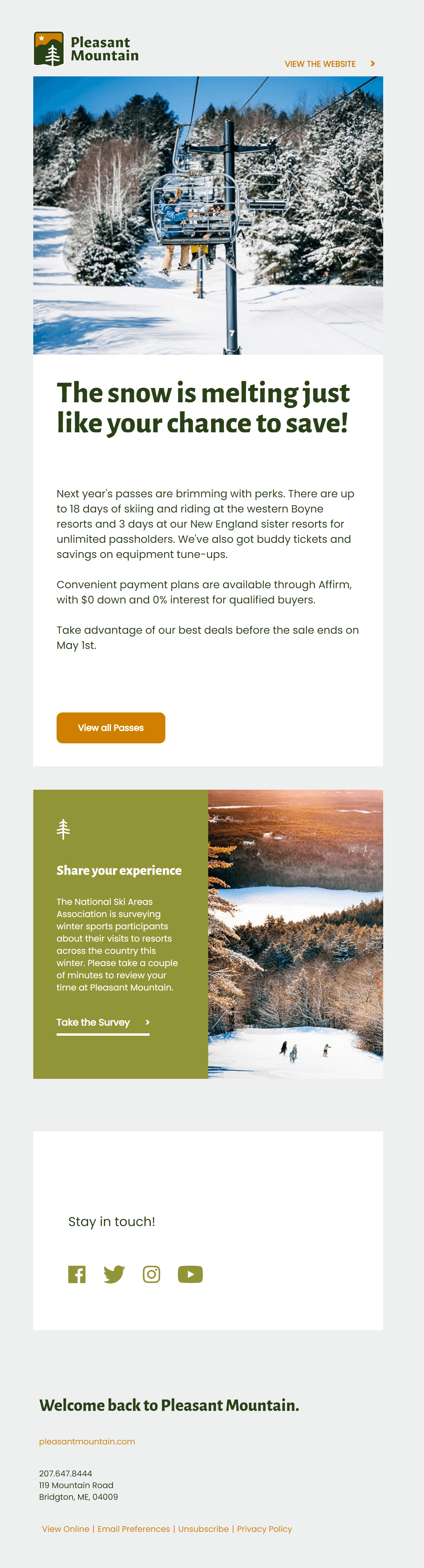
A few minutes ago I was reading the email below and it hit me – I was reading the email, not just skimming it like the other 50 I had in my inbox.
And once I noticed that behavior, paused, and zoomed out a little bit, I saw a similar pattern behind this template and the way the copy was written within it that made it clear why.
- Just 154 words
- Large text
- Narrow width
- Broken up into a few, tidy blocks
- Plenty of padding and space to breath
Take a look.
Either Way
What I love about design like this is that, just like my good and bad days of writing, it helps your content be consumed more no matter what kind of groove you’re in.
Some people can consistently crank out beautiful copy day after day.
And, well, some of us can’t.
Either way good design with both the template AND the stuff you put into it can help all those potential guests actually read and remember all the stuff you’d really, really, REALLY like them to read and remember.
About Gregg & SlopeFillers
I've had more first-time visitors lately, so adding a quick "about" section. I started SlopeFillers in 2010
with the simple goal of sharing great resort marketing strategies. Today I run marketing for resort ecommerce and CRM provider
Inntopia,
my home mountain is the lovely Nordic Valley,
and my favorite marketing campaign remains the Ski Utah TV show that sold me on skiing as a kid in the 90s.
Get the weekly digest.
New stories, ideas, and jobs delivered to your inbox every Friday morning.