If I Had to Build a Resort Mobile App, This is What I’d Create
 Gregg Blanchard /
The ideas that rattle around in my brain are approximately 80% rubbish, 19% potential, and 1% worthy of your time.
Unless I get them out, however, we won’t know which is which. So, after recapping some of the top mobile app platforms a few weeks ago, I decided to finally share what I’d do if I had to build a resort app.
The Pattern
More than the actual contents, I want to draw your attention to the pattern. Most resort apps have lots of great content but almost no focus.
The best way I can describe it is that these apps wait for the users to have a reason to open it rather than giving a reason to open it. Many of them also contain info that isn’t stored locally and redundant to their mobile site. So, here’s my four-step pattern:
- Give the app one, clear functionality
- Create a reason to open the app every day
- Indirectly tie that reason to the mountain
- Direct further inquiries to mobile site
I’d want the app to become a daily bus-ride, pooping, or mid-meeting habit. So, here’s what I did.
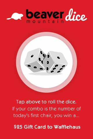
1) Main Screen
I used Beaver Mountain, UT as my guinea pig. The object is simple: roll the dice. If your combo is the number of today’s first chair, you win a prize that can only be redeemed by coming to the mountain. Here’s what the main screen would look like.
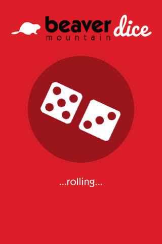
2) Rolling
Rolling the dice would take a few seconds. The rolling would secretly be a “loading” icon because while it was “rolling” the phone would be grabbing current conditions and info for the results screen.
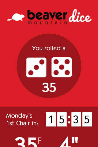
3) Results Screen
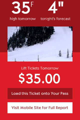
Next, the results screen would show their number and a few details that would both give them something to do as they wait for the results but also, at the same time, show them what it’s going to be like for the people who get first chair and give them something to do about it.
Keep in mind that I designed this in about 40 minutes so lots of pieces are missing and it’s rough, but if you keep in mind my pattern I think you get the gist.
Give the app a simple, focused reason to be used every day. Tie in information that brings their mind to your mountain for just a few minutes and creates some motivation. And, if possible, remove some of the redundancy between app and site by directing details to the mobile site rather than a full, in-app menu.