Why I Took Jay Peak’s Magazine on Vacation – #2: Eye Candy Corn of Magazines
 Gregg Blanchard /
Last week I spent a few days with my family in California.
If it wasn’t clear by now, I sorta have a crush on Jay Peak’s marketing style. So before packing underwear, a toothbrush, or socks, I packed their latest magazine.
I don’t get many resort mags, but here’s the second reason why I loved theirs.
Eye Candy
As long as I am divulging my not-so-perfect consumption habits, I might as well tell you that when it comes to candy, candy corn are hard to beat.
So when I want to identify a high level of eye candy, one is left to assume to that perhaps the highest designation of all in this field would be that of eye candy corn.
And that’s how I feel about Jay’s magazine.
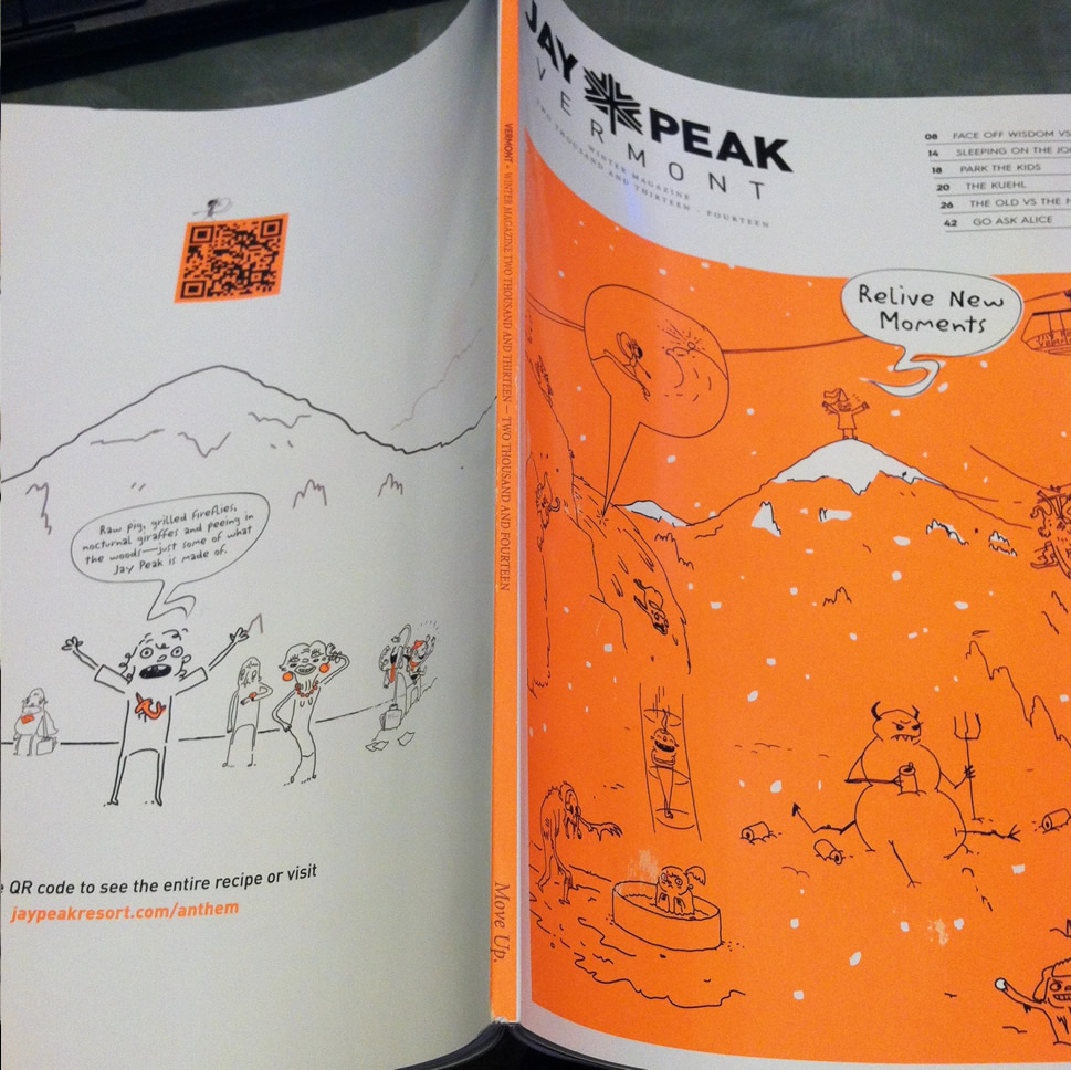
Pretty ‘n Orange
The theme-color of the magazine was a bright orange which should tell you right off the bat that either the designer has no clue about color or is so good at color they can design a whole magazine around this hue.
Origin is clearly the latter.
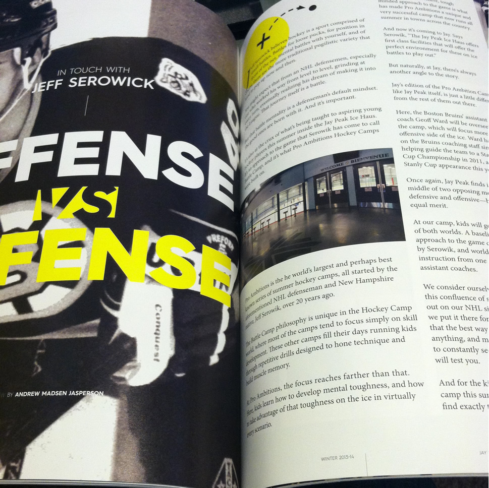
Take a gander at this spread for example. A piece about hockey at the Ice Haus. The simple layout with grainy photos and play-drawing-imagery was one of my least favorites. Which is sorta like saying “my least favorite powder day” because it’s still super clean and easy to read:
Way too often I see print design that’s cutesy but distracting. In a way it’s overdesigned.
What I loved about Jay’s mag was how little I noticed the design when I first read through it, but how impressed I was with the details when I looked closer.