Video
Video Logo Size: How big should the logo be on your videos?


BLANCHARD
Sometimes as marketers we search long and hard for big answers to big questions.
A noble cause indeed, this quest persists while we ask ourselves dozens – maybe even hundreds – of small questions every day. So I use this word or that? Should this be green or blue? Should I add this sentence or leave it off?
Today, with you help, I hope to answer one of these simple questions we as marketers often face.
How big should my logo be?
The question for today is simply this:
“How big should my resort’s logo be on video intros?”
I say video intros, but I mean intro or outro, anytime it’s just your logo and maybe a solid color of faded/blurred image behind. Something like the first few seconds of this:
Or the last few seconds of this:
The designers among us may have their own intuition for the size of these logos, but for the rest of us I was searching for a rule of thumb. Something that says, “if I have a logo like this and make it roughly this size, most people will feel it looks good.”
Method for Finding the Ideal Logo Size
Here’s how I broke it down. I started with three logo sizes:
- One logo sized much taller than a typical video frame (a round or square logo would fit this)
- One logo sized much wider than a typical video frame (a single line of text and a mark to the size/middle would fit this)
- And one logo with dimensions almost identical to a video frame (most stuff in between)
Then, I scaled them accordingly.
- The tall logo’s height was scaled relative to the height of the video frame
- The wide logo’s width was scaled relative to the width of the video frame
- The last logo was scaled relative to the both the width and height of the video frame
I then put these in a small survey, waited a week for the results and here’s what we found.
#1 Deer Valley (Tall Logo Sizing Example)
Here’s how the logos looked at each scale:
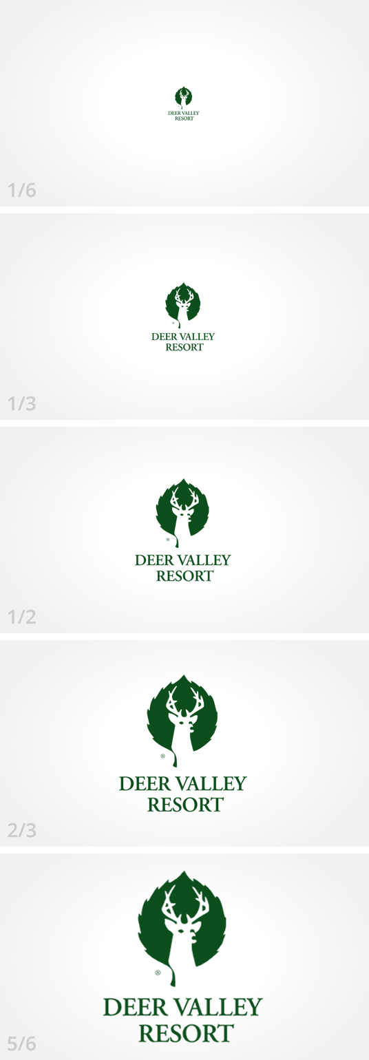
And here’s what the survey said in terms of what people like the best. From this sample, respondents said that a tall logo sized to exactly 1/3 the height of the frame looked the best. Any smaller was too small for these taller logos and any taller and the logo felt too heavy and out of balance.

#2 Killington (Wide Logo Sizing Example)
Here’s how the logos looked at each scale:
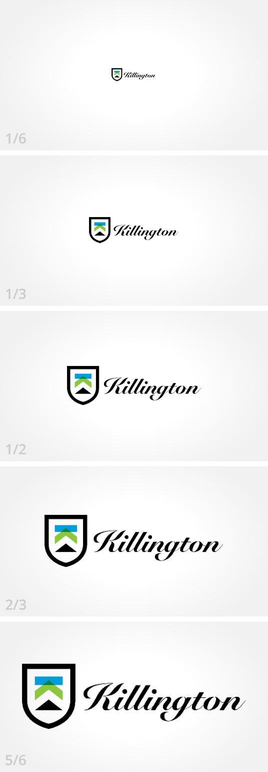
And here’s what the survey said in terms of what people like the best. In this case, a wide logo sized to 1/3 the width of the frame looked the best. Any wider felt like the logo didn’t have enough space on the sides. Any smaller and the logo started to be hard to read or look out of balance.

#3 Mt Bachelor (Proportionate Logo Sizing Example)
Here’s how the logos looked at each scale:
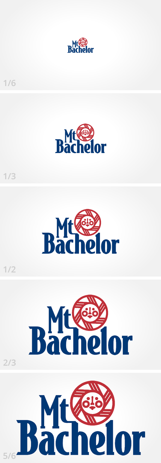
And here’s what the survey said in terms of what people like the best. In this case well over half of all respondents said that the logo sized to a maximum of either 1/3 the height and 1/3 the width looked right. This 1/3 rule seemed from the previous logo sizing styles seemed to hold true even when constraining both the width and the height.

Rules of Thumb for Sizing Logos
Interestingly, I got at least one vote for every size I included, but I was really happy to see a big cluster of responses around two of the logo sizes. This gives us three rough rules of thumb for sizing logos on video frames.
Tall Logos
For tall logos, scaling the height to anything from 1/3 to 1/2 of the video frame’s height is probably your best bet.
Wide Logos
For wide logos, scaling the width to anything from 1/3 to 1/2 of the video frame’s width is probably your best bet.
Proportional Logos
For logos with similar dimensions as the frame, scaling the width/height from 1/6 to 1/3 of the video frame size is probably your best bet.
Again, this is a small question that you probably barely notice yourself asking. But the next time you do, you’ll have a bit more insight into which size to go with.
Maybe there’s something to all that “rule of thirds” stuff after all.
About Gregg & SlopeFillers
I've had more first-time visitors lately, so adding a quick "about" section. I started SlopeFillers in 2010
with the simple goal of sharing great resort marketing strategies. Today I run marketing for resort ecommerce and CRM provider
Inntopia,
my home mountain is the lovely Nordic Valley,
and my favorite marketing campaign remains the Ski Utah TV show that sold me on skiing as a kid in the 90s.
Get the weekly digest.
New stories, ideas, and jobs delivered to your inbox every Friday morning.