Email Marketing
The Art & Science of Resort Email Design & Development (pt 2)


BLANCHARD
“About a month ago I asked designer extraordinaire, Joe Myers, for some thoughts on email template design and coding. At first the plan was to share a few common mistakes (and how to fix them) on the Ryan Solutions blog. A couple weeks later, Joe sent me a goldmine of information and insight. It was so good I had to share it here as well. Take it away, Joe!”
—
Part 2: Gittin’R Done
OK, fellow peons. It’s just us talking. The grown-ups have left the room. I’ve been designing email templates for years and I still learn something new each time. The imprecision is mind blowing and the lack of standardization is enough to push anti-social web professionals over the edge. But here are some tricks I’ve learned in addition to Gregg’s super-right-on “Ten Reminders for Coding HTML Email Templates.” (seriously start there.)
Basic Tips
Kick It Old-School
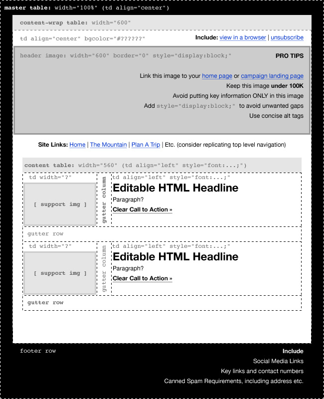
As Gregg says, “Code like it’s 1996 and test like mad.” That means, use tables. Use tables within tables. And then nest tables inside those tables. Sursly. I use a 100% width table to form the background, and then center a 600-ish pixel table in there for the content.
Keep It Stupid, Simple
No Flash, no Javascript, no video. While your desktop browser has no problem with these things, email clients see them as kryptonite. And while HTML5 video embed techniques work in some limited (mostly apple) browsers, you’re not sending emails just for a small percentage of your audience. Plus if you’re following the previous tip, that’s not an option.
Embed Yo CSS, FOO!
Most email clients will ignore external style sheets. Some programs may bring them inline upon publishing a draft, but it’s still not as reliable as embedding specific styles within each table cell as needed. This of course is a total pain in the ass and defeats the purpose of knowing CSS, but it will produce the most consistent results.
Use Words
If it’s important, make sure it’s readable in live, editable, HTML type. Use headline tags and style them with embedded css. But don’t use an image for important headlines if you can avoid it.
Put The Unsubscribe At The Top!
Yeah, that’s right. Make it easy for users to unsubscribe or better yet, “Manage Your Subscription”. Why? Because it establishes trust. (source) Hey, and while you’re at it, put a “View in a Browser” link up there, and perhaps a reminder “Add us to your contacts” to auto-load images. Putting all this stuff before the images shows confidence and respect for the user. And that’s good business, bro.
Rinse and Repeat
Structure your repeatable content elements so that their easy to isolate and repeat. Sometimes I’ll make each newsletter item a separate table (or at least a row) that can be easily deleted or copied to make the email scaleable. Mailchimp allows you to create repeating content items. I’d like to see other programs adapt that functionality.
Micro Tips
To set a background color or to center your content, start with a 100% width table and set the horizontal alignment and the background color in that table using <td align=”center” bgcolor=”#??????”>
And for victims of the Hotmail regime which sees fit to override your markup, strike back by placing this in your <head> tag (source):
<style type=”text/css”>
.ReadMsgBody {width: 100%;}
.ExternalClass {width: 100%;}
</style>
Set your basic content width to around 600 pixels. I’ve slowly and cautiously started rolling out templates as wide as 700px, but remember there are sidebars, and menus you don’t see in web browsers.
Get Responsive?
CSS Media queries work in mobile web design to the extent that true CSS does, which is to say not well, especially in Outlook. Honestly, I’ve already babbled enough but if you’re familiar with responsive design (dude, read this) and are interested in experimenting with it in email, here’s a link to get started.
Don’t rely on cellpadding or even CSS-based padding. Again, put on your Hammer-pants and think old-school. Use gutter columns or rows to add padding. Remember Gregg’s tip about line height screwing up your vertical agreement. If you only want 10px of height, include a spacer.gif (really) with a height=”10″ specified in the image and the parent table cell. To add lateral padding, use a gutter column with a fixed width and a non-breaking space for content. Or for a content area narrower than the parent cell, center a nested table that’s narrower than its parent cell.
To avoid gaps around your images, include a style=”display:block;” in the img tag. To avoid a default blue border around linked images, include a border=”0″ on the img tag. And to avoid going to hell, include a good, descriptive alt tag.
Conclusion
Well, that’s it for now. I’m sure there’s more, but it’s late and I have to wake up and be super-dad tomorrow. Please hit me up for more questions. Check my site or follow me on the Twitterz. Thanks again to Gregg for this rockin’ opportunity to play in his sandbox, and for creating such ballerific content every day. Beep it in the backcountry and scrub it in the slow zones, folks.
About Gregg & SlopeFillers
I've had more first-time visitors lately, so adding a quick "about" section. I started SlopeFillers in 2010
with the simple goal of sharing great resort marketing strategies. Today I run marketing for resort ecommerce and CRM provider
Inntopia,
my home mountain is the lovely Nordic Valley,
and my favorite marketing campaign remains the Ski Utah TV show that sold me on skiing as a kid in the 90s.
Get the weekly digest.
New stories, ideas, and jobs delivered to your inbox every Friday morning.

