Websites
Could One (Major) Change to Resort Websites Skyrocket Conversion Rates?


BLANCHARD
I’m a fan of simplicity. And by fan, I mean massive fan. Huge fan. Addict.
And that’s where this idea started: simplicity.
You see, the average resort website has 8.12 elements in their nav menu. I first published that number over two years ago, but ever since I’ve been wondering if there is a better way. These are my early thoughts on what I’ve come up with.
State of the Website
Picking on Solitude because it’s one of my favorite resorts on a powder day, I think their navigation bar is fairly representative of most resorts:
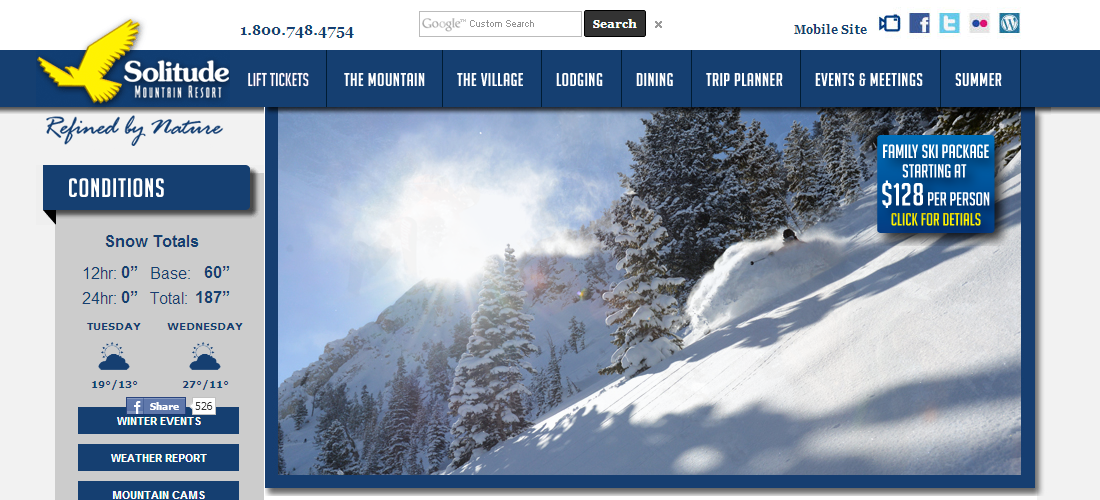
First, there are eight elements – lift tickets, the mountain, the village, lodging, dining, trip planning, events & meetings, summer.
The second thing I notice is that each of these items are nouns. What’s wrong with nouns? Well, nouns are boring. They don’t direct my path they’re just there, waiting for my thoughts to match a keyword in the nav.
The third thing is if I click on “lift tickets” what do you know about me? Virtually nothing. I could be a destination guest, a local, or a newbie and you’d have no idea. Because of this, the copy on the next page has to be super broad. Broad copy doesn’t convert well.
So, three problems: lots of options, boring nouns, and little info on the visitor.
A Better Way?
Below is my super-fancy mockup of what I’d do instead:
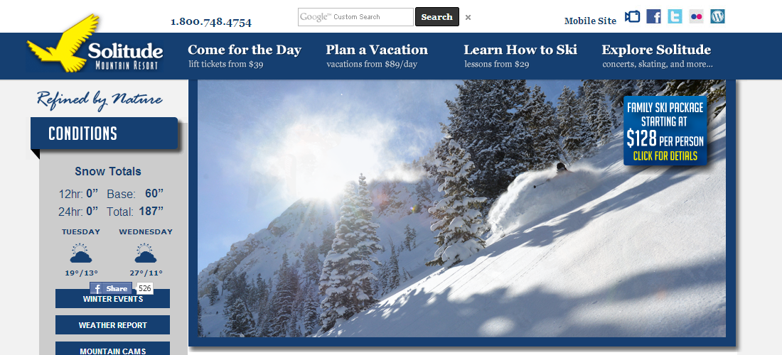
First, I’ve grouped these actions by visitor type rather than activity. Activities can overlap 4-5 times. Visitor type can be narrowed down to only one or two options (destination guest, local, newb, non-skier). Clicking on these links would be like the guest filling out a mini-survey about themselves. With that knowledge, I can customize the copy they see on the next page.
Second, instead of using nouns, I’ve used verbs to make each nav element a “call to action”. Calls to action direct the visitors thoughts and actions. They are active rather than passive. This alone should increase clicks on the nav menu (and in turn tell me more about each guest), but because actions are grouped by visitor type, I can now shrink that nav to just four elements, further increasing clicks.
The Bottom Line
So, group by activity to turn each link into an insight on the visitor, shorten the list and make every link a call to action to increase clicks, and use what we know about the visitor to write copy matched to their needs.
In other words, take more control over each visitor’s path and line it with relevant info and offers along the way.
Would it make a difference? I really think so. Everything I know about customized copy, calls to action, and simplified navigation tells me that bounce rates would drop, pages viewed would increase, and most importantly, website revenues would grow.
About Gregg & SlopeFillers
I've had more first-time visitors lately, so adding a quick "about" section. I started SlopeFillers in 2010
with the simple goal of sharing great resort marketing strategies. Today I run marketing for resort ecommerce and CRM provider
Inntopia,
my home mountain is the lovely Nordic Valley,
and my favorite marketing campaign remains the Ski Utah TV show that sold me on skiing as a kid in the 90s.
Get the weekly digest.
New stories, ideas, and jobs delivered to your inbox every Friday morning.