Branding
The How, Why, and What Behind LVSSR’s New Name and Brand


BLANCHARD
It’s rare that I get as excited about a logo as I did when Lee Canyon (formerly Las Vegas Ski & Snowboard Resort) released theirs a few weeks ago.
Huge fan of the @LeeCanyonLV logo. Hopefully their new website will have a store with logo Ts. pic.twitter.com/sFzxVTPQp2
— Gregg Blanchard (@slopefillers) November 3, 2015
There was something about the retro, clean, happy feel that I just…well…liked.
A lot.
But figuring that my superficial assessment of the change was just that, I took advantage of an email from Lee Canyon’s Jim Seely to find out a bit more.
Jim’s Goals
Let’s start with Jim’s perspective on things.
“Being a Winter and Summer Resort just under an hour out of Las Vegas is a unique situation, and it presents a unique set of circumstances. We simply cannot act and market as a traditional ski resort. We know this.
Of course for those Las Vegas locals we strive to create lifelong skiers/snowboarders in a traditional sense but we are more than that. The dichotomy of our market is so vast, that you could find a seasoned snow veteran sharing a chairlift with someone that has never even seen snow before in their lives.
Think Brazilian tourists.
Simply put, we are fun experience and want to provide that to everyone that visits. For locals we are a place to escape beyond “Vegas” for the day and for visitors we are an experience creating adventurous Las Vegas memories. We are not an olympic training facility for those serious about their snow. We are fun.”
So where did the name even come from?
“The resort was founded in 1963 as Lee Canyon. We have guests that have been coming up here since then. For them we’ve always been Lee Canyon. With the corporatization trends in the following decades we found ourselves trying to compete in both the ski industry as well as the hospitality industry of Las Vegas.
You can get caught up easily in the “Bigger and Better” mantras of big business. Going back to our roots and connecting us with our past means we prefer to manage by our core values as we did in the 60’s and 70’s.
Yes we are looking to expand our winter and summer operations and of course we want to be bigger and better, but not at the expense of our core beliefs of our brand as a fun, unpretentious experience for everyone. And that is why we want to expand and look to the future; to able to offer more fun here in Lee Canyon.”
Quick recap:
- Unique guest type.
- Desire to stand out from typical “Vegas” brand.
- Renewed focus on fun.
- Return to the ski area’s roots.
These were the core drive at the genesis of the process.
The Design(ers)
The group that was given the task of turning these goals into a new brand was Hovercraft Studio out of Portland, OR.
Presented with this concept, here’s what Hovercraft’s Ryan Haaland said about where they began.
“With Lee Canyon being reborn, so to speak, we focused primarily on the idea of heritage. Whether that was from the history of the area and native cultures, or from the nostalgia of winter sports back in the day.”
That direction was then aligned with the core goals.
“In terms of the branding itself we had 3 objectives. Make Lee Canyon friendly and approachable, create a system that can adapt to the current season (winter or summer), and to simply position it as an escape from the bright lights of the Vegas strip for both tourists and locals.”
Simplicity, a hat-tip to skiing’s past, friendly? I’m starting to see why I loved it so much.
The Results
Before I show you all the versions of the logo, let me quickly let Ryan talk a bit about how they arrived at the design they did.
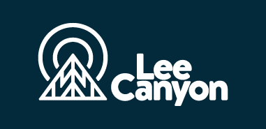
“The logo itself is inspired by the timelessness of old ski patches that skiers would sew onto their jackets or backpacks over the years as a reminder of the countless winters of fun and adventure. Season is denoted by 2 different yet complimentary color palettes that literally change the mountain from winter to summer and back again.”
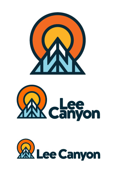
Here’s the winter version you saw earlier:
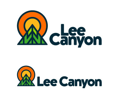
And here’s the summer version Ryan was referring to:
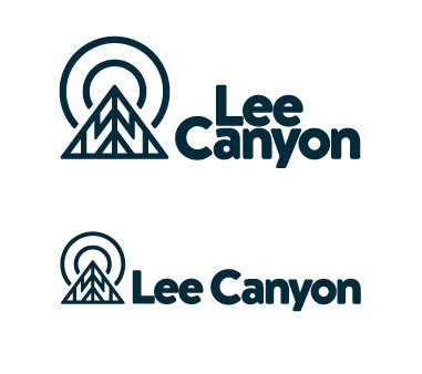
A couple one-color treatments:
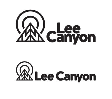
And the white version:
A new website is coming soon, but not quite ready (at least at the time this post was written).
Very Well Done
When you look back at that list of priorities and drivers behind this rebrand:
- Unique.
- Non-“Vegas”
- Fun
- Nostalgic
It’s hard to say anything but “well done” to the team at Hovercraft.
The design is clean, retro, approachable, and, at least in my eyes, a perfect representation of LVSSR’s new direction as Lee Canyon.
About Gregg & SlopeFillers
I've had more first-time visitors lately, so adding a quick "about" section. I started SlopeFillers in 2010
with the simple goal of sharing great resort marketing strategies. Today I run marketing for resort ecommerce and CRM provider
Inntopia,
my home mountain is the lovely Nordic Valley,
and my favorite marketing campaign remains the Ski Utah TV show that sold me on skiing as a kid in the 90s.
Get the weekly digest.
New stories, ideas, and jobs delivered to your inbox every Friday morning.